4 steps to creating concept art with extra depth
Michel Donzé shows how making up a backstory adds subtle realism to an initial character concept.
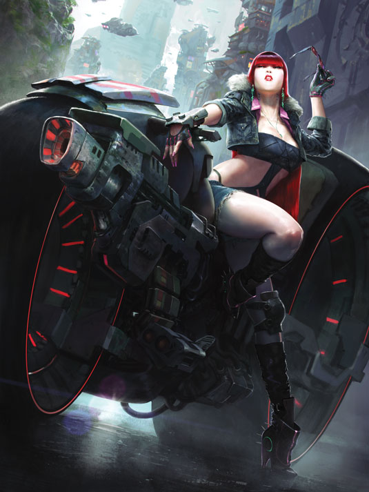
This image was commissioned by for a sci-fi card game. The brief was to show a long-haired woman taking off her sunglasses, leaning on her futuristic bike. The bike had to be mounted with huge pulse guns on the side of the front wheel. She also had to look like a rebel with a good fashion sense. Thankfully, this brief left a lot of room for design and personal interpretation of the character.
So what's her life like? She could be an armoured memory-drug dealer, helping the powerful keep the alienated masses in the slums of the lower megalopolis addicted to 'souvenir'.
In the end, making up a story helped me to add the subtle believability which I always look for in a character and which keeps me interested.
01. Concept sketches
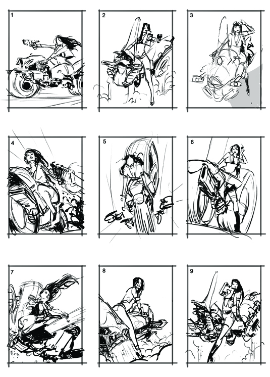
After taking a few days to think about the brief – letting ideas come, and gathering inspiration and references – I usually do a bunch of sketches to send to the client. It helps the company have visibility early in the process, and helps me understand what it expects in terms of composition and overall design.
02. Establish mass, mood and palette
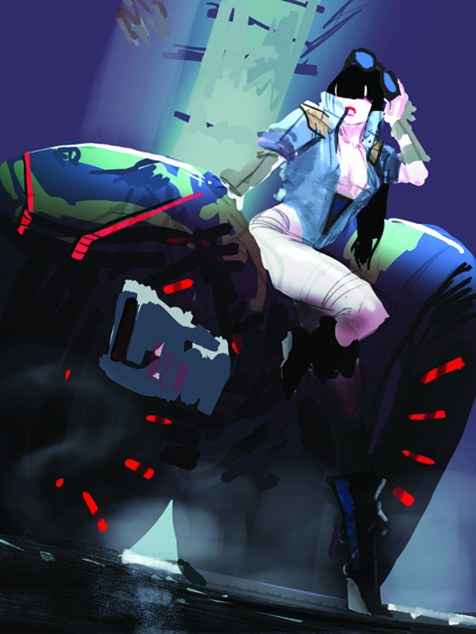
Of course, the client picks the sketch for which I have no clear vision of what the final render could look like. In such cases it helps if, early on, I paint a quick rough to establish the general masses, mood and palette. This will serve as a guide in the rest of the painting process.
03. Adding colour
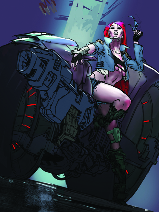
Now comes the time to draw a clean sketch of the bike and character, figuring out the design through a lot of trials and iterations, also making the bike and gun more imposing to contrast with the girl's shape. I apply the mood, painting colours with a few highlights, before starting the endless detailing and rendering process.
04. Get the lighting right
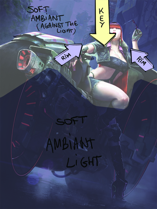
Lighting starts from the idea of a fashion-show mood in a grimy wet alley. I chose a bright top-down street lamp as key light, making the skin stand out, while the bike’s technological details are lost in darkness. I also add rim lights behind to separate the subject from the background elements.
Words: Michel Donzé
A graduate in 3D animation, Michel Donze went into concept art and illustration. He recently worked on Watch Dogs. This article originally appeared in Imagine FX magazine issue 101.

Thank you for reading 5 articles this month* Join now for unlimited access
Enjoy your first month for just £1 / $1 / €1
*Read 5 free articles per month without a subscription

Join now for unlimited access
Try first month for just £1 / $1 / €1
Get the Creative Bloq Newsletter
Daily design news, reviews, how-tos and more, as picked by the editors.

The Creative Bloq team is made up of a group of design fans, and has changed and evolved since Creative Bloq began back in 2012. The current website team consists of eight full-time members of staff: Editor Georgia Coggan, Deputy Editor Rosie Hilder, Ecommerce Editor Beren Neale, Senior News Editor Daniel Piper, Editor, Digital Art and 3D Ian Dean, Tech Reviews Editor Erlingur Einarsson, Ecommerce Writer Beth Nicholls and Staff Writer Natalie Fear, as well as a roster of freelancers from around the world. The ImagineFX magazine team also pitch in, ensuring that content from leading digital art publication ImagineFX is represented on Creative Bloq.
