I love the slick design of these baby name trend infographics
Data and design come together in style.
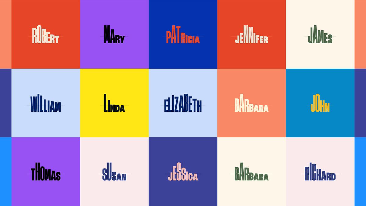
Data visualization designer & data scientist Karim Douieb has created an ingenious website that reveals the popularity of your name across the years. Blending slick typography with data analysis, the site creates a shapeshifting graph, using the letters of your name to form a dynamic visualisation.
The site's sleek design is certainly worthy of a spot on our list of the best infographics, thanks to its clean visuals and strong graphic appeal. Experimenting with variable fonts, the ingenious website is a perfect blend of classic design and typographical innovation creating a stunning reflection of modern graphic design.
A post shared by Karim Douieb (@karim_douieb)
A photo posted by on
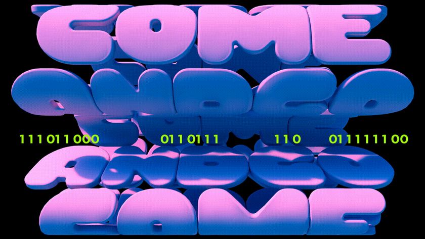
Taking data from the 1930s all the way to the present day, Baby Names creates dynamic animated typography that warps to map the popularity of your name over time. "This was an experiment combining typography and data using variable fonts. Each letter's height reflects the name's yearly popularity, turning trends into a micro-visual story. It's amazing how fonts can bring data to life!" Karim explains on Bluesky.
According to Fast Company, the immersive infographic uses the Flexible Variable Font by Stéphane Mattern which boasts adjustable height in addition to weight or size. The simplicity of the site paired with its sleek interactivity makes it a perfect intersection between data and design, bringing us into a new era of infographic creativity.
Here are the all-time most popular baby names in the US (male & female)! 👶 Each letter's height shows how trendy the name was over time. 📈✨ Check for yourself and search your name 👉 https://t.co/Y2qecAhuAb pic.twitter.com/xdS2q4sKI1November 25, 2024
For more interactive design check out A24's throwback movie campaign website that transports you straight back to the early 2000s. If you're after more typographic inspiration take a look at the typography design concepts every designer needs to know.
Get the Creative Bloq Newsletter
Daily design news, reviews, how-tos and more, as picked by the editors.

Thank you for reading 5 articles this month* Join now for unlimited access
Enjoy your first month for just £1 / $1 / €1
*Read 5 free articles per month without a subscription

Join now for unlimited access
Try first month for just £1 / $1 / €1

Natalie is Creative Bloq's staff writer. With an eye for trending topics and a passion for internet culture, she brings you the latest in art and design news. A recent English Literature graduate, Natalie enjoys covering the lighter side of the news and brings a fresh and fun take to her articles. Outside of work (if she’s not glued to her phone), she loves all things music and enjoys singing sweet folky tunes.
