Silence, brand: Why McDonald's meme marketing is a flop
It’s coming across as disingenuous and desperate.

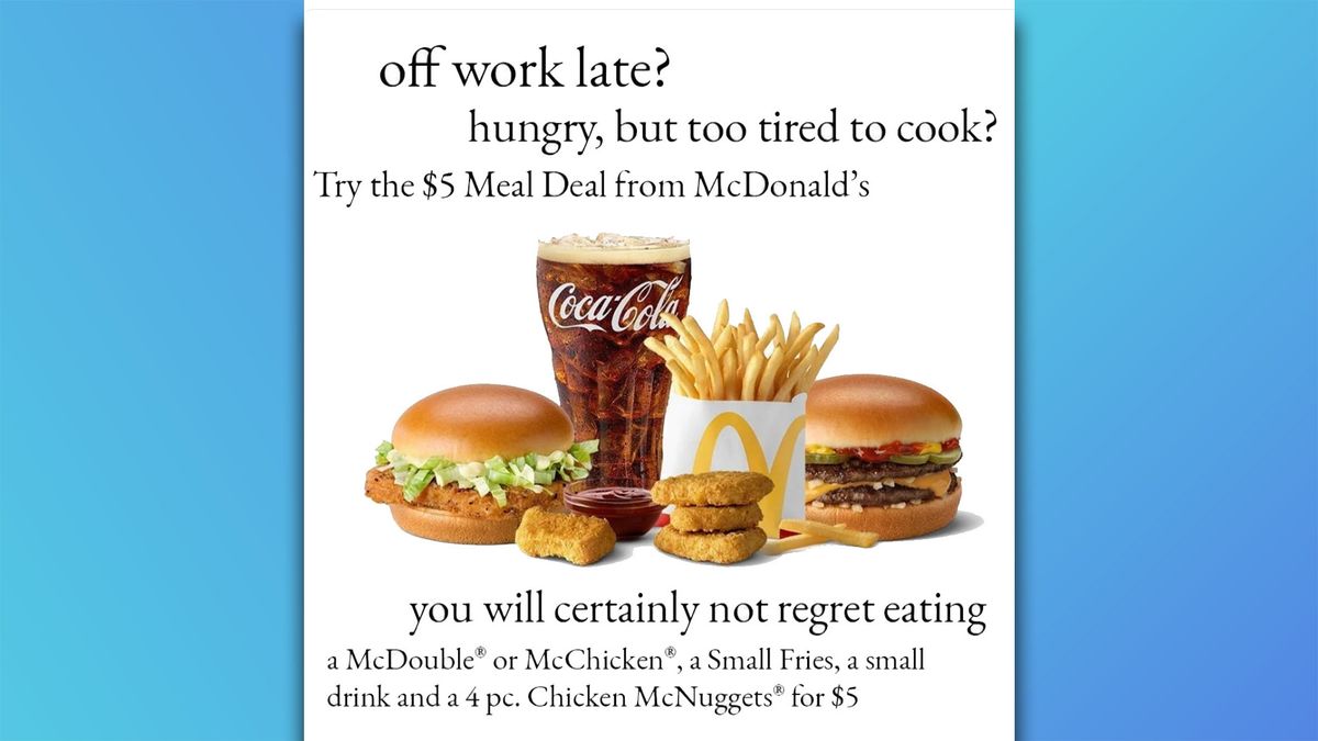
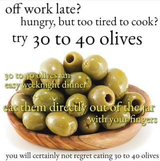
McDonald's has released a bizarre ad that ditches design trends in an attempt to capitalise on a stale meme. Inspired by the popular 'Hungry, But Too Tired To Cook? Try 30 to 40 Olives' meme of 2020, the offbeat ad flops when taken out of context. Honestly, to those not in on the niche joke, it looks like McDonald's just needs to hire a new marketing team.
Meme advertising is a tricky game – get it right and you've shown that your brand has a playful side, get it wrong and you run the risk of giving 'how do you do fellow kids?' – the cardinal sin of appealing to younger audiences. While the fast food chain is known for producing some of the best adverts, unfortunately, this one completely misses the mark.

The strange ad was highlighted by r/graphic_design user u/santiven0m on Reddit, who asked fellow users "How do you guys feel about this official McDonald's ad?". The simple design features all the hallmarks of anti-design memes, with awkward copy, outdated font and questionable composition. Responses were mixed, with some claiming the purposefully bad graphic design was attention-grabbing, while others said "It looks like someone forgot to actually design the ad."
One user felt that the fast food chain had misjudged the original meme, writing "What bothers me most is the lack of understanding of the meme. It just makes me think they had a boomer in there designing this thing with no context. It’s lazy and I hate it."
Sharing similar thoughts, another user commented "I think the problem with it is that they're playing off a fairly obscure meme, and the wording is pretty similar to actual, poorly-written ad copy. So the people who don't get it (and I'm thinking like 80% won't)... are just going to think they make amateurish ads."
how do you guys feel about this official McDonald's ad? from r/graphic_design
At the risk of overanalysing the joke, this McDonald's ad comes across as a tepid attempt to capitalise on meme culture. Anti-design has become a symbol of Gen Z humour, rejecting the pristine nature of corporate marketing, and for a mega-corporation like McDonald's to misappropriate this style comes off as disingenuous and desperate.
It's not to say that brands can't embrace less serious, stripped-back marketing – you only have to look at Surreal Cereal's design crime billboards to see that style excel. But with marketing getting oversaturated with fleeting trends and billboard advertising getting increasingly desperate, at least McDonald's isn't afraid to try something different in their ads.
Get the Creative Bloq Newsletter
Daily design news, reviews, how-tos and more, as picked by the editors.

Thank you for reading 5 articles this month* Join now for unlimited access
Enjoy your first month for just £1 / $1 / €1
*Read 5 free articles per month without a subscription

Join now for unlimited access
Try first month for just £1 / $1 / €1

Natalie is Creative Bloq's staff writer. With an eye for trending topics and a passion for internet culture, she brings you the latest in art and design news. A recent English Literature graduate, Natalie enjoys covering the lighter side of the news and brings a fresh and fun take to her articles. Outside of work (if she’s not glued to her phone), she loves all things music and enjoys singing sweet folky tunes.


