I love Tesco’s bold logo redesign ads
Produce speaks louder than words.
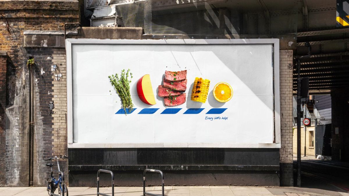
Tesco has unveiled a clever new campaign that lets its produce do the talking. In a stripped-back reimagining of its iconic logo, the supermarket demonstrates how simple design can have a big impact, enticing passersby with a quality-over-quantity approach.
Billboard advertising has the tricky task of catching a viewer's eye on visuals alone – a challenge in a digital age of flashy online campaigns. With bold imagery and simple composition, the classy campaign is a prime example of how an enduring brand identity can carry a campaign.
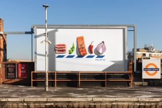
Created by advertising agency BBH London, Tesco's ICONS campaign replaces the letters of its name with various produce items in a bold reimagining of the classic logo. The campaign's simple yet striking imagery created by photographer Will Cooper, creates a playful interactivity, inviting passersby to puzzle over the items assigned to each letter.
While redesigning a brand's iconic logo might seem like design sacrilege, for BBH's deputy executive creative director Felipe Serradourada Guimaraes, it signalled fearless creativity. "You need to have icon status to be able to play with your logo with such confidence," Felipe says. "We at BBH are lucky enough to have one of the most iconic brands out there, Tesco, and to work with a team which is willing to throw away the rule book which dictates how it's used," he adds.


For more inspiring billboard campaigns, check out the simple yet effective billboard for parkrun that nails World Mental Health Day branding. If you're after more creative inspiration from BBH, take a look at the Burger King advert that caused some serious online controversy.
Get the Creative Bloq Newsletter
Daily design news, reviews, how-tos and more, as picked by the editors.

Thank you for reading 5 articles this month* Join now for unlimited access
Enjoy your first month for just £1 / $1 / €1
*Read 5 free articles per month without a subscription

Join now for unlimited access
Try first month for just £1 / $1 / €1

Natalie is Creative Bloq's staff writer. With an eye for trending topics and a passion for internet culture, she brings you the latest in art and design news. A recent English Literature graduate, Natalie enjoys covering the lighter side of the news and brings a fresh and fun take to her articles. Outside of work (if she’s not glued to her phone), she loves all things music and enjoys singing sweet folky tunes.

