How a few online portfolio tweaks can get you more work
Not getting enough freelance work? It's not you. Maybe your online portfolio isn't wowing potential clients or answering their questions. Don't worry. Here's how to fix it.

If you think that your portfolio website is underperforming, don't wait around. Now is the perfect time to hit it with a big hammer labelled 'OPTIMISATION'. Here are some quick and simple fixes; for more detailed look at portfolios, both online and off check out our feature Create the Perfect Design Portfolio.
1. Set up the right website for you
There are several ways that you can set up a portfolio website.
- Set up a hosted blog at Wordpress.com
- Create something a little more advanced using Squarespace.
- Use a dedicated portfolio platform like Behance, Carbonmade or Portfoliobox. (Over on .net mag, Oliver Lindberg and a cluster of creatives explore the pros and cons of these off-the-rack options.)

2. Show, don't just tell
By baking your talents into a site's DNA, it's an ideal way to show people what you can do before you even get around to telling them.
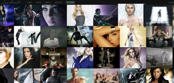
- So if you're a web designer, have a beautiful, quick-to-load online portfolio that showcases your coding and design talents.
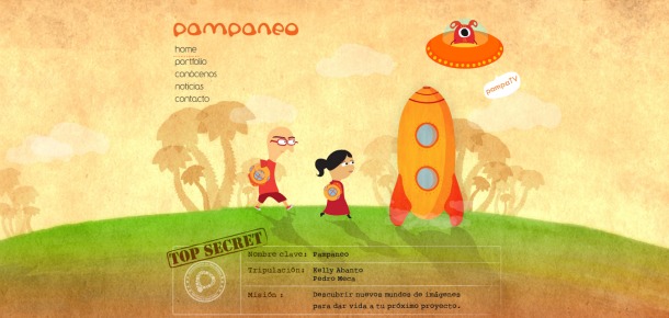
- If you're an illustrator, make your artwork part of the design.
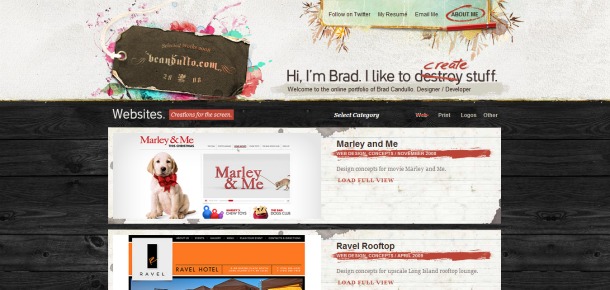
- If you're a graphic designer, impress the hell out of your visitors with great typography, a custom logo and easy-on-the-eye layouts.
3. Trim the online portfolio fat
Potential clients don't need to see EVERYTHING. Focus on your best stuff and the work you've done for high-profile clients.
4. Show the work you want to get more of
When showing your work, consider the sort of briefs that you'd like to tackle in the future. Show the sort of work that you want to do more of.

5. Give an insight into HOW you worked
Rather than just showing the finished design, artwork, logo or illustration, give an insight into how you did it. Out of context, no one will know whether it's good or not.
6. Label your portfolio examples
Clearly label the work. This will allow clients to reference individual designs or artwork when they speak to you.
7. Make your portfolio a downloadable PDF
Give potential clients a different way to browse through your work. Computer Arts has a great tutorial on how to do this here.

8. Publish testimonials
If no one knows you from Adam, getting testimonials from satisfied clients is a great way to show some 'proof' that you can deliver on what your portfolio promises.
9. Update your website regularly
Google loves a well-structured, regularly updated website that's stuffed with great content. The easiest way to provide fresh content is to start a blog on your online portfolio.
10. Screw you SEO!
It's easy to get obsessed by Search Engine Optimisation (SEO). In fact, you can spend too much time worrying about keywords when you should be concentrating on website content.
You will probably get better results by promoting yourself (and your website) through other web channels - Facebook, Twitter, Behance, deviantART, Pinterest etc.

11. Put your personality into it
You've only got a few seconds to make an impression when somebody visits your portfolio website. Don't waste it with a slow-to-load flash intro or a home page that doesn't immediately showcase your work and why it's different to all the other designers/artists out there. What's your biggest selling point? Quite simply, it's YOU.
12. Think about your 'funnel'
The best websites are structured in such a way that they funnel visitors to certain pages. Think about whether your current portfolio answers the main questions that your clients will be asking. Questions such as:
- Who is this person?
- Where are they?
- What have they done before?
- Are there examples of their work that I can view?
- Who else have they worked for?
- How do I get in contact with them?
- What do they charge?
Make sure that your online portfolio is easy to navigate and that there are clear goals for each page.
13. Give it a KISS
There's a lot to be said for the KISS approach when it comes to building a portfolio site. The acronym was coined by Kelly Johnson, a lead engineer at the Lockheed Skunk Works. It stands for: 'keep it simple stupid'.
- So don't make your online portfolio complicated to browse. Keep it simple, accessible, convenient and classy.
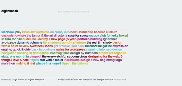
- Use an eye-catching logo or motif to make your site stand out
- Try adding a tagline that succinctly explains what you do
- Display prominent contact details so visitors are in no doubt as to how they can email you, follow you on Twitter or connect with you on Facebook.
- And if you want people to hire you, ASK THEM. Sometimes you can't beat a good CTA (Call To Action) button that just says 'Hire me'.
Got any tips about optimising an online portfolio site that you'd like to add? Let us know in the comments below...

Thank you for reading 5 articles this month* Join now for unlimited access
Enjoy your first month for just £1 / $1 / €1
*Read 5 free articles per month without a subscription

Join now for unlimited access
Try first month for just £1 / $1 / €1
Get the Creative Bloq Newsletter
Daily design news, reviews, how-tos and more, as picked by the editors.

The Creative Bloq team is made up of a group of art and design enthusiasts, and has changed and evolved since Creative Bloq began back in 2012. The current website team consists of eight full-time members of staff: Editor Georgia Coggan, Deputy Editor Rosie Hilder, Ecommerce Editor Beren Neale, Senior News Editor Daniel Piper, Editor, Digital Art and 3D Ian Dean, Tech Reviews Editor Erlingur Einarsson, Ecommerce Writer Beth Nicholls and Staff Writer Natalie Fear, as well as a roster of freelancers from around the world. The ImagineFX magazine team also pitch in, ensuring that content from leading digital art publication ImagineFX is represented on Creative Bloq.
