Create slick HTML5 animations
Modern browsers have several dedicated animation technologies built in. Martin Görner showcases the top four to try in your next project
Sign up to Creative Bloq's daily newsletter, which brings you the latest news and inspiration from the worlds of art, design and technology.
You are now subscribed
Your newsletter sign-up was successful
Want to add more newsletters?

Five times a week
CreativeBloq
Sign up to Creative Bloq's daily newsletter, which brings you the latest news and inspiration from the worlds of art, design and technology.

Once a week
By Design
Sign up to Creative Bloq's daily newsletter, which brings you the latest news and inspiration from the worlds of art, design and technology.
Once a week
State of the Art
Sign up to Creative Bloq's daily newsletter, which brings you the latest news and inspiration from the worlds of art, design and technology.

Seasonal (around events)
Brand Impact Awards
Sign up to Creative Bloq's daily newsletter, which brings you the latest news and inspiration from the worlds of art, design and technology.
Modern mobile operating systems have made animated user interfaces the standard of computer interaction – and have shown that fluid and well chosen animations create immersing effects and favour intuitive interactions. We all take for granted that you can set a list into motion with a flick of the finger and that it will keep going as if it had weight and inertia until it bumps against its end and bounces back a little. However, on the web we are not quite there yet.
Let’s face it, animations on the web have often been synonymous with UI disasters, starting with the <blink> tag almost two decades ago. Flash could have helped but its lack of integration into the HTML DOM turned most Flash sites into 800x600 unresizable pits of UI despair. Then JavaScript DOM manipulation came along with its signature five frames per second (fps) animation rate – so sweet!
In 2013, it’s time to sit back and relax. Modern browsers have several dedicated animation technologies built in, which run at 60 fps. Now is the time to forget about the past and start building UI experiences with tasteful animations that help the user feel at home. I would like to take you on a guided tour of the four animation technologies the modern web has to offer to help you decide which one is right for your project.
Starting a new 3D project? You'll need to choose the best 3D modelling software.
CSS3 animations - also in 3D
Let’s start with the easiest to use declarative technology: CSS3. No need for JavaScript here, just plain old CSS, with a few modern tricks.
CSS can be used to declare animations using two basic properties: transition and animation. The transition property tells the browser to compute intermediate frames between two states, each defined by its own CSS. The animation is triggered when the CSS of the element changes. For example, because you programmatically changed its class or because a :hover CSS has kicked in.
The image moves smoothly from one place to another when the class of the thumbnail changes from begin to end, typically as a result of a JavaScript DOM action.
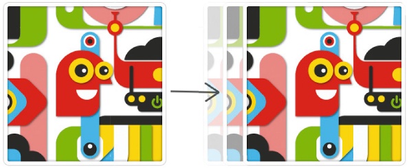
img { -webkit-transition: 1s; }
.begin { left: 0px; }
.end { left: 500px; }
The animation property is best used when you need a continuously running animation. It also lets you define intermediate steps in the animation.
To create a spinning image:
img {-webkit-animation: myAnim 3s infinite; }
@-webkit-keyframes myAnim
{
from {-webkit-transform: rotate(0deg) }
50% {/* possible intermediate positions at any %
*/}
to {-webkit-transform: rotate(360deg) }
}
Sign up to Creative Bloq's daily newsletter, which brings you the latest news and inspiration from the worlds of art, design and technology.
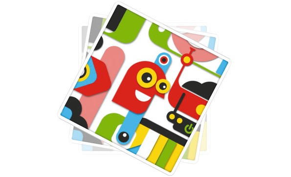
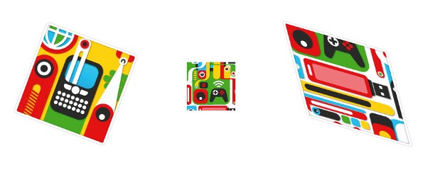
You can animate a surprisingly large number of CSS properties. Getting creative with an animated border-width is possible, if you feel so inclined. However, the most useful properties for animations are geometric transforms and opacity. CSS3 offers the full range of 2D geometric transforms through the handy transform property: translate, rotate, scale and skew.
To create 2D transforms with rotate, scale and skew:
-webkit-transform: rotate(30deg)
-webkit-transform: scale(0.5)
-webkit-transform: skew(-20deg, 20deg)
And here is where things get interesting. If you feel that adding 3D to CSS, a technology designed for bolds and italics, is complete lunacy, keep reading. It’s been done in a very natural way by extending geometric transforms into the third dimension. The same transform property can now also do translateX, translateY, translateZ, as well as rotateX, rotateY, rotateZ.
To rotate an image in 3D:
-webkit-transform: rotateY(45deg)
With a little bit more effort, and an animation thrown in, look, a spinning 3D cube.
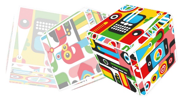
It wouldn’t be any fun if it really was this easy. The spec designers made sure to keep us entertained by leaving a couple of pitfalls on the road. If you try to rotate a single image, the image is rendered by default by the browser without perspective:
-webkit-transform: rotateY(45deg)
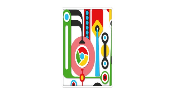
It can be added using the perspective property, which unfortunately defaults to an infinite value with the effect of no perspective at all. Objects close to the camera as well as far away are the same size.
To make things look realistic, you have to specify a finite value for the distance between the camera and the screen. Adding -webkitperspective: 1000px usually does the trick.
A bit of maths: what is perspective?
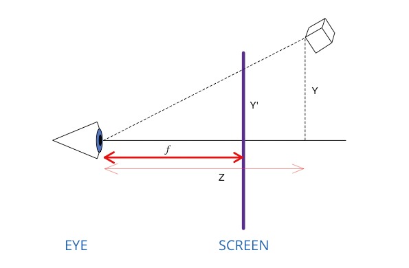
To represent a 3D object on a flat screen, you draw a line from the eye or camera to the point in 3D space you want to represent. Its intersection with the screen is where the corresponding pixel should be. In order to find the coordinates of the pixel on the screen, using the Thales’s theorem, you need the 3D coordinates of the point in space and the distance between the camera and the screen (f is also called the focal distance in optics). That is the distance provided through the perspective property. If that distance is infinite, you can see that all the rays (eye to 3D point lines) are horizontal and close and far away objects have the same size on the screen.
Now we think we have everything we need to set up a 3D cube, using six images and CSS 3D transforms, the next step is to make it spin.
Spin it
That should be easy: enclose it in a div on which we apply a 3D rotation. If we do so, here is what happens.
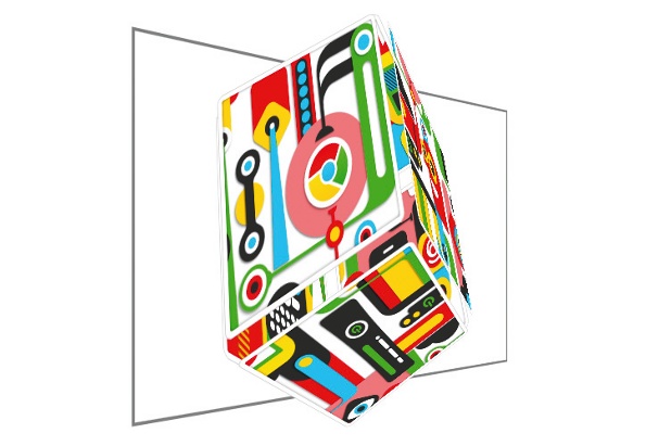
The browser does exactly what you tell it to do: it renders a 3D cube in the div, then applies a 3D rotation on it as if it was a flat picture. That is not what you want. Unfortunately, it’s the default behaviour. To tell the browser that you want to compose the 3D transforms applied to nested divs, you have to use the -webkit-transform-style: preserve-3d property. With that, we get the spinning cube we wanted.
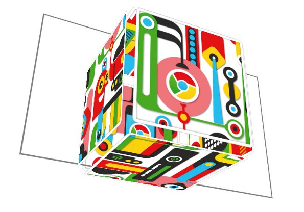
Getting it right
It’s easy to get lost in space. My recommendation is to start with a div that we will call the SCENE. That is where the perspective property goes. Inside, put a div called OBJECT. It should have the transform-style: preserve-3d property and this div is where you apply the transforms that will move the entire object. Finally, inside that div, use 3D transforms to place the faces as you wish to create the desired object – in our case, the six faces of the cube:
.SCENE { -webkit-perspective: 1000px; }
.OBJECT
{
-webkit-transform-style: preserve-3d;
-webkit-transform: rotateX(20deg rotateY(120deg) rotateZ(50deg); /* replace this with an animation property if you want movement */
}
.FACE1 { -webkit-transform:translateX(150px)
rotateY(90deg);}
...
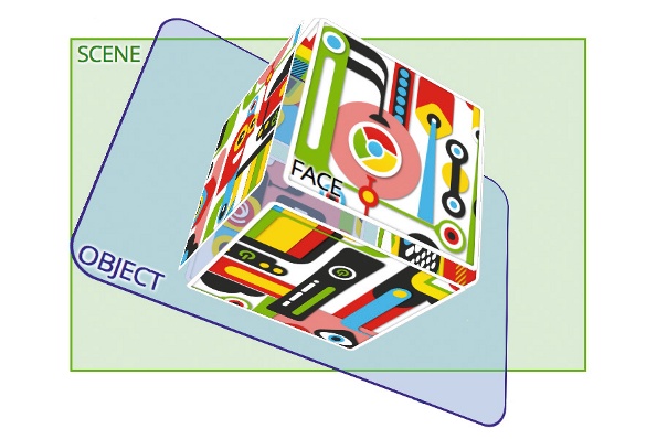
The great thing with 3D CSS transforms is that they work flawlessly with CSS animations and transitions. One exercise left is to animate a spinning cube and have it open up when the mouse cursor hovers over it. Quite easy: the transforms placing the faces of the cube place them at a certain distance from the centre of the cube. A second set of CSS properties with a :hover selector place them at a greater distance. By applying a transition: 1s property to the faces, you’ll see the cube open up on hover, even as it keeps spinning (see a demo).
Scalable Vector Graphics (SVG)
HTML and CSS are quite powerful as animation technologies but lack drawing primitives. This is what SVG is for and it comes with its own set of animation tags. The animation part of the SVG spec is called Synchronised Multimedia Integration Langugage (SMIL).
First, here is what SVG was invented for: vector primitives such as rectangles, circles and Bézier curves:
<svg>
<rect x="5" y="5" width="140" height="140" stroke="#000000" strokewidth="4"fill="#AAAAFF" opacity="1"/>
</svg>
Also available:
<line x1 y1 x2 y2>
<circle cx cy r>
<path d>
<image x y width height xlink:href>

One of those primitives, the <path> tag, is the Swiss army knife of SVG. It lets you define an arbitrary path using lines, arcs and Bézier curves. The path definition looks like an alphabet soup and is best left to be generated by a vector graphics software such as Inkscape. For SVG animations, you still have to understand it a little though, so here is a primer.
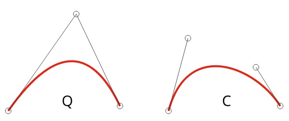
An example of quadratic and cubic Bézier curves:
<svg>
<path d="M 30,240 Q 170,40 260,230"
stroke="#F00" />
<path d="M 30,240 C 70,90 210,150 260,230"
stroke="#F00" />
</svg>
The syntax:
M x,y new pen position (Marker)
L x,y Line to
Q cx, cy, x, y Quadratic Bézier curve to (x,y)and one control point
C cx,cy, dx,dy, x,y Cubic Bézier curve to (x, y) and two control points
A elliptic Arc
z at the end of the string, closes the path
Let us put some life in those vectors. You can see a demo of a little SVG guy flying through the clouds on a surf board if you follow this link and click on the picture.

The surfboard is bobbing up and down and the mouth of the character alternates between a big and a huge grin while its eyes are rolling around with dilating pupils, like any good surfer’s. These are the four types of possible SVG animations.
The simplest SVG animation uses the <animate> tag to animate one parameter of a geometric shape, in this example, the radius of the eye.
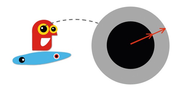
To make the pupil dilate, the values attribute lists radius values we want to animate between.
<circle cx="200" cy="205" r="80" >
<animate dur="3s" attributeName="r" values="80; 150; 80" repeatCount="indefinite" />
</circle>
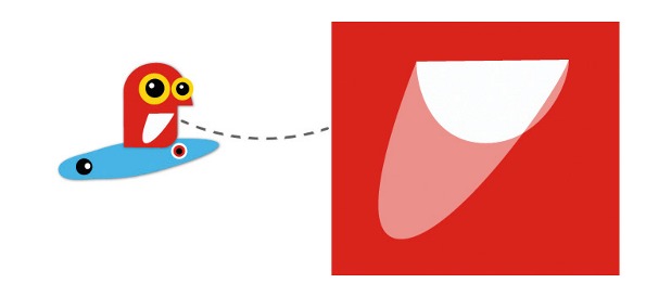
The nice thing is that the attribute you animate can also be the d of a <path> tag. This allows you to create an animated path. The only constraint is that the two curves you animate between must be of the same type and have the same number of control points; their definitions must be made of the same letters in the same positions, with only the numerical parameters changing. When moving the mouth of the character, only the “big smile” and “huge smile” positions are defined. SVG animations do the interpolation.
<path fill="#fff">
<animate attributeName="d" dur="2s" repeatCount="indefinite" values="m 0,0 c 1,15 -13,45 -45,45 -32,0 -44,-28 -44,-44 z; m 0,0 c -4,15 -66,106 -98,106 -32,0 3,-89 9,-105 z" />
</path>
Of course, SVG also has geometric transforms, which can be animated. The animation tag is, this time, called <animateTransform>. You have to tell it which transform you want to animate and provide a semi-colon separated list of values for all the key positions. Composing animated transforms is possible, too. You tell the browser to do so using the additive=”sum” attribute.
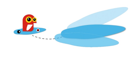
To animate geometric transforms:
<g> ... <!-- SVG primitives group -->
<animateTransform dur="3s" repeatCount="indefinite" additive="sum" attributeName="transform" type="translate" values="0,0; 200,-130; -100,200; 0,0" />
<animateTransform dur="3s" repeatCount="indefinite" additive="sum" attributeName="transform" type="rotate" values="0; 20; -20; 0" />
</g>
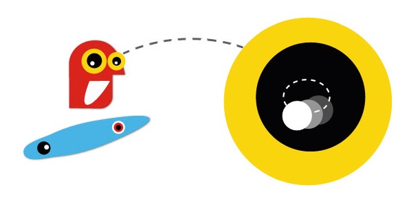
The third and last SVG animation tag is also the most valuable. <animateMotion> is used to instruct an object to follow a path. It has a hidden little gem called the rotate=”auto” attribute. This makes the object not only follow the designated path but also orient itself to always face forward, as a car following a road.
The revolution of the eye is implemented by sending the pupil on an elliptic path using the <animateMotion> tag.
<g> ... <!-- SVG primitives group -->
<animateMotion dur=”1s"repeatCount="indefinite" path="m 0,0 a 15,11 0 1 1 -30,0 15,11 0 1 1 30,0 z" />
</g>
Finally, SMIL has plenty of features for controlling an animation. It exposes the pauseAnimations(), unpauseAnimations() and setCurrentTime(t) functions in its JavaScript API to start/stop/resume an animation globally. It also specifies begin and end attributes on all three animations tags (<animate>, <animateTransform>, <animateMotion>). These can use, through a rather dated but functional syntax, a powerful combination of time stamps, user events and animation events. You can specify for example that an animation should start one second after a click or the end of another animation, whichever occurs first.
For example, this animated SVG button jumps with a moving drop shadow effect when clicked:
<g id="buttonID">
<!-- SVG button artwork here -->
<animate begin="buttonID.click" dur="1s"\
.../>
</g>

HTML5 canvas
Switching from declarative to programmatic animation techniques, the <canvas> tag is your first choice. Of all the technologies described in this article, it has the best cross-browser support and browser vendors went to a lot of effort to make it capable of 60 fps animation. Here is how you set up a canvas:
<canvas width="400" height="400" style = "width: 400px; height: 400px;"></canvas>
The first size (tag attributes) sets the resolution of the canvas. That is the size of the coordinate space you will be using. The second size (CSS properties) is the size of the canvas rectangle as it appears on the screen. Wouldn’t it be nice to set the physical size of the canvas to 100 per cent, keep the internal coordinate space unchanged, and have the browser render the drawing correctly for any window size? Unfortunately, browsers scale the contents of the canvas as a bitmap. Any upscaling results in a blurry mess of pixels. As a result, setting these two sizes to the same values is the only practical option.
You initiate a canvas by querying your <canvas> element in JavaScript and calling the getContext('2d') function on it. The drawing context object obtained is used for all calls to the Canvas API. The context is stateful and stores three types of state information: the drawing style, the current geometric transform and the accumulated drawing path. The way to draw something in canvas is to issue drawing commands, which do not produce anything visible but create a path in memory, and then to issue an ink command (ctx.stroke(), ctx.fill() or both) which makes the path appear.

Frame by frame animations
To animate the canvas, you need an animation loop, which you should base on the requestAnimationFrame() function (correctly vendor-prefixed!). This function gives the browser the ability to manage the frame rate or even stop the animation if the browser tab is hidden.
function runAnimation()
{
yourWorld.draw() // this is your drawing code
webkitRequestAnimationFrame(runAnimation);
}
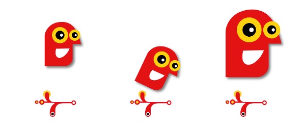
Typically, canvas is used for animations where the positions of objects have to be determined on a frame by frame basis, for example, because they result from a physics simulation. See a box2dweb.js demo. The simulation continuously changes the positions of objects in the simulated world and the animation loop periodically displays the current state of the world on screen.
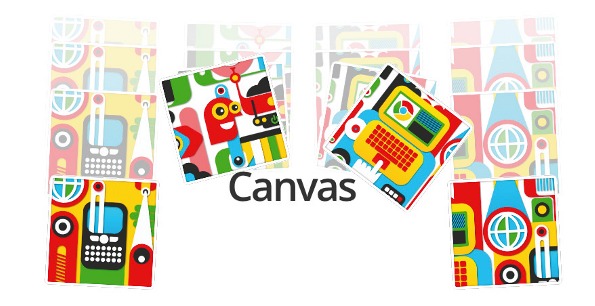
SVG sprites in canvas
A useful trick would be to use SVG sprites in a canvas animation. A static vector picture of any complexity is really verbose in canvas. Doing so is actually possible although not as simple as sending an .svg to ctx.drawImage(). For obscure security reasons, only inline SVG is supported and you have to get to it using the Blob API (get the code).
The SVG sprite will be displayed at any scale in its vector beauty, but sadly, only in Chrome.
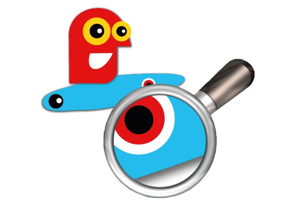
Using WebGL
WebGL exposes the OpenGL API to JavaScript apps running in the browser, without any plug-ins. Theoretically, all you need to do is call getContext(‘webgl’) on a <canvas> element (instead of 2d previously) and you’re good to go. However, WebGL is a very big and very low-level API. On top of that, the web version does not have a ‘default render path’ which means that you cannot give it a shape and tell it to display it using whatever defaults it sees fit. You have to write shaders, using the GLSL language for anything to appear on the screen.
Fortunately, Three.js comes to the rescue. Three is a library originally written by Mr.doob for a couple of Chrome demos (www.ro.me / www.chaostoperfection.com) but it lives on its own. It has all the basic as well as exotic shaders already built in so that you can focus on the useful things: camera, lights and action!
The first thing you need to use is Three glue code (not fun, but simple enough):
var renderer = new THREE.
WebGLRenderer({antialias: true});
renderer.setSize(width, height);
renderer.setClearColorHex(0x000000, 0); // color,
transparency
// the renderer creates a canvas elementfor you
document.whereeveryouwant
.appendChild(renderer.domElement);
So, before the lights and action, you create a camera and position it in your scene:
// arguments: FOV,
viewAspectRatio, zNear, zFar
var camera = new THREE.PerspectiveCamera(35,
width/height, 1, 10000);
camera.position.z = 300;
Next, let there be light:
var light = new THREE.DirectionalLight(0xffffff, 1);
//color, intensity
light.position.set(1, 1, 0.3); // direction
Then we need something to display. Why not a cube? 3D objects in Three are called meshes. These are made of a geometry and a material.
Here, we use a simple texture:
var texture = THREE.ImageUtils.loadTexture(‘Ferna
ndo Togni.jpg’);
var cube = new THREE.Mesh( new THREE.
CubeGeometry(100, 100, 100), new THREE.
MeshLambertMaterial({map: texture}) );
And then, finally, we add all those things into a scene and call the render function.
var scene = new THREE.Scene();
scene.add(cube);
scene.add(light);
renderer.render(scene, camera);
This will produce a static image of our lit and textured cube. To make it move, we wrap the render call in an animation loop as previously and change the position of the cube on each frame.
function runAnimation(t)
{
// animate your objects depending on time
cube.rotation.y = t/1000;
cube.position.x = ...
renderer.render(scene, camera); // display
requestAnimationFrame(runAnimation); // and
loop
}
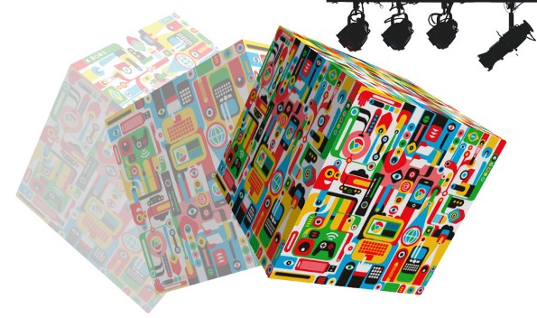
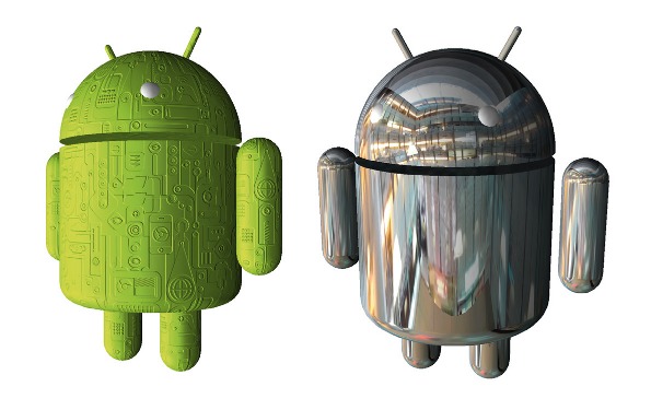
Using a 3D modelling software such as Sketchup is recommended. Three understands several 3D model formats, including COLLADA (.dae) which has broad industry support. Here is how you load a model in Three:
var loader = new THREE.ColladaLoader();
loader.load("Android.dae", function(collada)
{
var model = collada.scene;
model.position = ...; // x, y, z
model.rotation = ...; // x, y, z
scene.add(model);
} );

With a little more effort, you can re-skin the droid with all the fancy shaders Three has to offer, including Lambert and Phong illumination, normal mapping, bump mapping, environment mapping and more.
To keep experimenting with animations, follow the tutorials available here.

The Creative Bloq team is made up of a group of art and design enthusiasts, and has changed and evolved since Creative Bloq began back in 2012. The current website team consists of eight full-time members of staff: Editor Georgia Coggan, Deputy Editor Rosie Hilder, Ecommerce Editor Beren Neale, Senior News Editor Daniel Piper, Editor, Digital Art and 3D Ian Dean, Tech Reviews Editor Erlingur Einarsson, Ecommerce Writer Beth Nicholls and Staff Writer Natalie Fear, as well as a roster of freelancers from around the world. The ImagineFX magazine team also pitch in, ensuring that content from leading digital art publication ImagineFX is represented on Creative Bloq.
