Create slick abstracts with a limited palette
Graphic designer Dines reveals how to create an imposing mixed-media image using limited shades
- Software Photoshop CS3 or later
- Time needed 4 hours
- Skills-Use colour overlays-Work with grid structures-Play with colour treatments in Photoshop
Here, we’ll build a visually striking collage-style image using silk and material elements, and a limited colour palette. Focusing on my piece ‘Black on Black’, we’ll explore how to create an abstract feel with the addition of natural elements – such as a horse head and human hair – and experiment with a different grid structure to give the piece its ultimate impact.
In this tutorial I’ll also explain how to recreate one of the most striking aspects of this piece – its limited colourway – and how to achieve the right balance using limited shades. The images I’ve used here have all been selected from stock photography websites, so think about the kind of image you want to create before starting and have a look for some of your own.
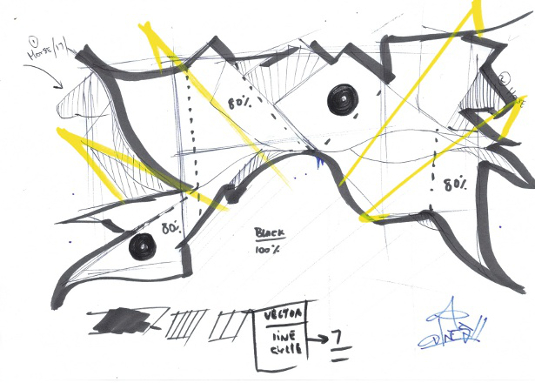
01 Start off by sketching the basic layout and grid structure of your piece. Here, I’ve gone for an arched structure, which is something I’ve wanted to play with for a while.
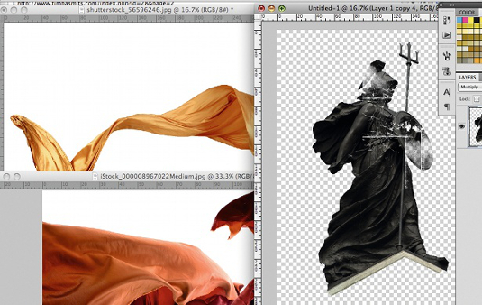
02 Select your stock images – choosing a variety of silk and material elements, and a few random objects (I’ve gone for a horse head and human hair) – and remove the white backgrounds in Photoshop. Using the Pen tool, create a path around the images. Ctrl/right-click the image once you’ve closed the path, before clicking Make Selection, hitting Ctrl/Cmd+Shift+I to invert the selection and then pressing Delete.
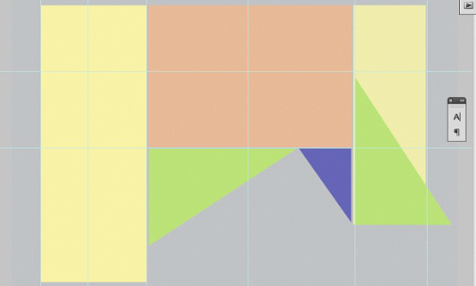
03 Once you’ve cut out the main images, it’s time to create a grid structure. Using your sketch as a reference, start creating your basic grid – I’ve created a simple colour grid. This will help you keep the shape and structure of the collage.
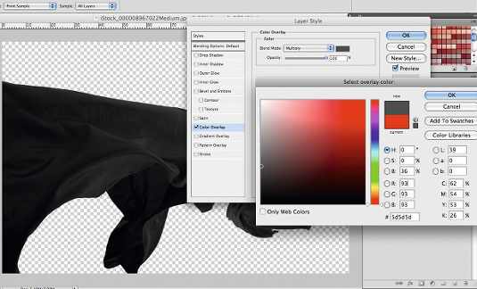
04 Next, we’ll sort out the colour overlays and levels. Start by changing the colours of the cut-out elements of the collage: desaturate them first, then simply go to Layer Style>Color Overlay and set Blend Mode to Multiply. Select a mid grey shade, hit OK and convert the elements into smart objects, adjusting the levels if need be.
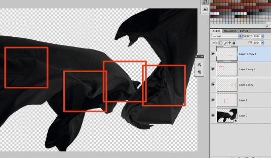
05 The beauty of this piece lies in the interesting elements hidden within each of your stock images –you’ll need a keen eye to spot these. With the material references, for example, I tend to go for the areas with the most ripples in each image. I also play with the colour contrasts to find other detailed sections within the silks.
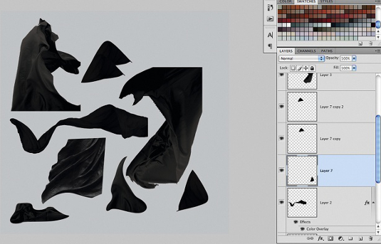
06 Create a new canvas with all the elements that you’ve cut out. This will serve as a palette from which you can easily construct your final image.
Get the Creative Bloq Newsletter
Daily design news, reviews, how-tos and more, as picked by the editors.
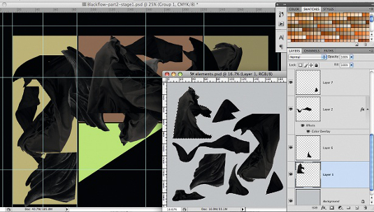
07 Open a new A4-sized document in Photoshop at 300dpi. Fill it with 100% black. Next, transfer your grid structure and place it over the new canvas. Group the guides, send this to the back (Ctrl/Cmd+])and lock the layer. Begin selecting your elements and start building up the structure.
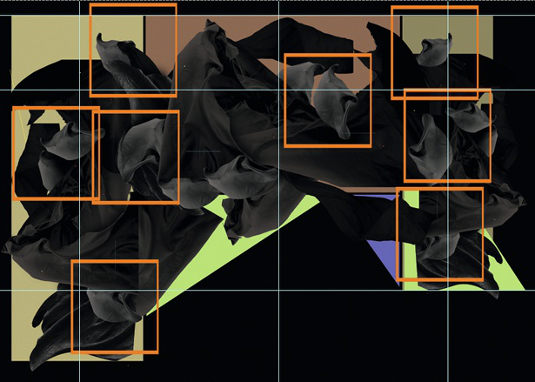
08 Fill any empty spaces with smaller, more detailed silk elements. Make these a lighter shade of grey to really give the image some pop. To achieve the light grey tone, simply adjust the levels by raising the whites. Duplicate the smaller elements and place them as you desire.
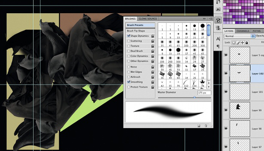
09 Adding a drop shadow to the silk elements will lend extra dimensions to the structure, so select the layer beneath the element you want, make a new layer, choose a soft brush and start to paint under the silk element. Adjust the opacity to around 50-60% and you’ll get a nice, even, drop shadow effect.
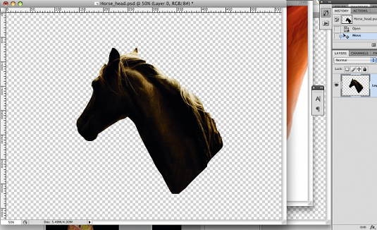
10 Now open your random images and repeat the process in step 04 to adjust the colour overlays and levels. Use these images to breathe some abstract life into your work.
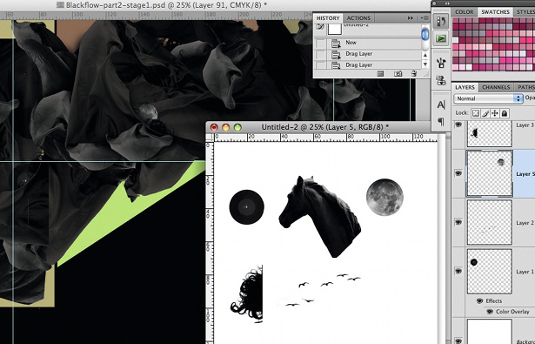
11 This next stage involves adding a sense of life and increasing the surreal feel of the piece. Start by collecting smaller imagery that will tell a story within the work – I’m depicting a new world in mine. Once again, I’ve arranged the new elements on a single page for ease of reference. When you’re ready, place your imagery onto the piece, duplicating any parts as desired.
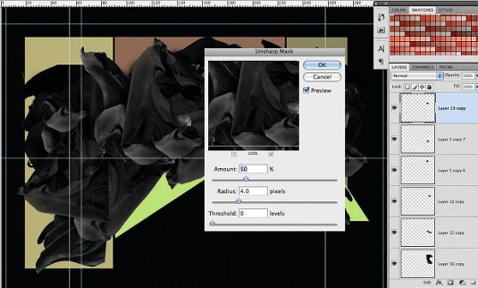
12 I’m also adding a hair element into my piece, which I’ve tucked nicely between the silks. The hair strands need to look sharp and crisp, so I’ve sharpened the image by going to Filter>Sharpen>Unsharp Mask. I set Amount to 50%, Radius to 40px and Threshold to 0, and hit OK.
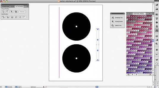
13 Let’s bring some vectors in now. Simplicity is the key to achieving a nice balance in the piece. Open Illustrator and create two simple circles on top of each other using the Ellipse tool. Select both circles, go to Pathfinder>Exclude and change the fill colour to black. Create more vectors, and copy and paste them onto your element sheet.
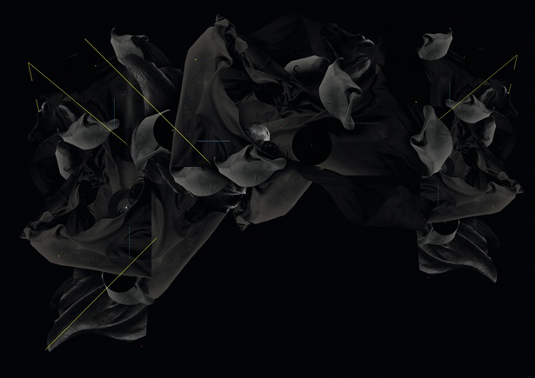
14 Drag your vector elements onto your artwork and place them into your desired position. Make sure you tuck a few of them behind the silk elements – this will add a real sense of dimension to your work. Now drag the horizontal line onto your artwork. Change the hue to a colour you think will work and rotate the line to 45 degrees. Remove the grid from the background and save the piece. Then flatten, rename and save the image again.

Dines
Since receiving a BA Hons in Graphic and Typography Design in 2007, London-based graphic designer Dines has built a firm client and fan base in London, working with clients such as MTV, Defected Records, Nike and Channel 4. He is also the founder of award-winning digital design group Studio Blup.
www.studioblup.com

Thank you for reading 5 articles this month* Join now for unlimited access
Enjoy your first month for just £1 / $1 / €1
*Read 5 free articles per month without a subscription

Join now for unlimited access
Try first month for just £1 / $1 / €1

The Creative Bloq team is made up of a group of art and design enthusiasts, and has changed and evolved since Creative Bloq began back in 2012. The current website team consists of eight full-time members of staff: Editor Georgia Coggan, Deputy Editor Rosie Hilder, Ecommerce Editor Beren Neale, Senior News Editor Daniel Piper, Editor, Digital Art and 3D Ian Dean, Tech Reviews Editor Erlingur Einarsson, Ecommerce Writer Beth Nicholls and Staff Writer Natalie Fear, as well as a roster of freelancers from around the world. The ImagineFX magazine team also pitch in, ensuring that content from leading digital art publication ImagineFX is represented on Creative Bloq.
