Create progressively enhanced 3D CSS rollovers
Christian Heilmann, principal evangelist for HTML5 and the open web at Mozilla, explains how to progressively enhance CSS rollover effects into the 3D space
Rollovers are a great thing. They make things more obvious that they are interactive and they allow us to show something different without giving up valuable screen estate. I remember one time when I won a pitch for my company by showing a rollover effect on a menu button. Granted, that was 1998 and nowadays we are less excited about them.
This is a shame though as we have a lot more things to play with in browsers these days. Here we'll take a look at using CSS, 3D CSS transformations, transitions and CSS animations to create some great rollover styles without telling people that they need to have certain browser. Instead, we'll fall back to a plain rollover for all CSS capable browsers. For brevity's sake we won't have all browser prefixes in the code examples here, but they are in the final product you can download:
All of the things we will talk about here are put together in a style sheet that you can just add to your sites called 3Drollovers.css available on GitHub. There you can also see it in action. For the best experience use Firefox Aurora, or a Webkit based browser (Chrome or Safari):
Setting the foundation: the markup
Let's start with the markup, the essence of whatever we do on the web. The classic rollover was done with an image and by changing its src attribute dynamically. This works, but limits us a bit. As browsers are much more capable these daysm, we can use an element with two different elements in it, one of which will be the first or front state of our rollover, and another, which will be the back state. These could be anything – as long as they have the same size. As an example, let's take a link with two images inside nested in a figure:
- <a class="rollover" href="https://developer.mozilla.org/en/HTML/HTML5">
- <figure class="cube">
- <img src="mdnface.png" class="front" alt="Mozilla Developer Network">
- <img src="htmlface.png" class="back" alt="HTML5">
- </figure>
- </a>
Shifting the z-index: a simple rollover for all browsers
The most basic way to turn these into a rollover is by giving them z-indexes and switching them around to achieve the effect. The CSS for that is very straight forward:
- .rollover {
- position: relative;
- width: 200px;
- height: 200px;
- display: block;
- }
- .front {
- z-index: 2;
- position: absolute;
- background: #fff;
- }
- .back {
- z-index: 1;
- position: absolute;
- background: #fff;
- }
- .rollover:hover .back,
- .rollover:focus .back {
- z-index: 2;
- }
- .rollover:hover .front,
- .rollover:focus .front {
- z-index: 1;
- }
We give the link dimensions, we position it relative and display it as a block element. We then position both the front and back elements absolutely which means they cover each other as they are positioned at 0,0 in their parent element. We give front a higher z-index than back. When we hover over the link or focus it with the keyboard (think accessibility) we switch the z-index of both the elements around. And thus, we have a rollover that works in all browsers that are in use today as z-index has been supported for a long time now.
Coming in smooth: adding a fade
After we had z-index, opacity got more wider support. This allowed you not just to hide and show things but make them "show-through". For rollovers we can use that to smoothly fade one state into another. This needs CSS transitions and a change in opacity. As we add to the original rollover class there is no need to mess with the z-index as a higher z-index with an opacity of 0 is still invisible. Notice you need to embed the rollover markup from earlier into another element with the class fade to get the result.
Get the Creative Bloq Newsletter
Daily design news, reviews, how-tos and more, as picked by the editors.
- .fade .rollover .front {
- opacity: 1;
- transition: 1s;
- }
- .fade .rollover .back {
- opacity: 0;
- transition: 1s;
- }
- .fade .rollover:hover .front,
- .fade .rollover:focus .front {
- opacity: 0;
- }
- .fade .rollover:hover .back,
- .fade .rollover:focus .back {
- opacity: 1;
- }
This is pretty straight forward: We set the opacity of the front to 1 and the back to 0 and reverse this in the rollover state. The transition: 1s tells the browser to do this in the time of a second and gradually. This means the two states fade smoothly into each other. As we didn't define what should be transitioned the browser just moves from one setting to another without us having to do anything.
Going deeper: a flip transition
For quite some while now, starting with Webkit on phones and Safari on the Desktop CSS also allows us to go into 3D space. We can use this to create a flip effect that looks like we are turning a card with each of our logos on the sides.
- .flip .rollover {
- perspective: 800px;
- }
- .flip .cube {
- height: 200px;
- width: 200px;
- transform: rotateX(0) rotateY(0) rotateZ(0);
- transition: 1s;
- }
- .flip .front {
- transform: translate3d(0,0,1px);
- }
- .flip .back {
- transform: rotateY(180deg) translate3d(0,0,0);
- }
- .flip .rollover:hover .cube,
- .flip .rollover:focus .cube {
- transform: rotateY(180deg);
- }
Now what is going on here? We're now going into 3D space, that's what it is. By giving our rollover a perspective of 800pixels we tell the browser that we want a 3D space 800 pixels away from the screen. The smaller this number is the more pronounced the 3D effect is, and more subtle when you use a higher number. We add a dimension to the cube element and preset it to no rotation around any of the axes. We also give it a one second transition.
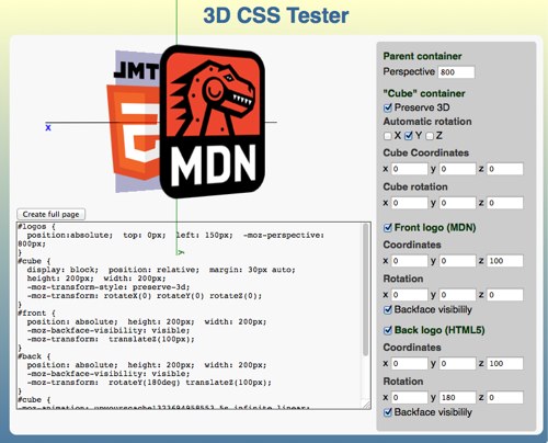
3D space consists of three axes, the X axis which goes from left to right, the Y axis which goes from bottom to top and the Z axis which goes into the distance. The translate3d transformation of CSS allows us to shift an element on any of these with the order being x, y and z. The rotateX, rotateY and rotateZ transformations rotate the element around the corresponding axis. There is also translateX, translateY and translateZ but using translate3d is shorter and triggers hardware acceleration.
If you want to play with this to get your head around it, go and check the CSS 3D tester by clicking on the image below:

Back? Or already with me? Good. Now for the flip effect, all we need to do is to move the front one pixel along the x axis and rotate the back by 180 degrees. This is needed as without it the logo would be shown from behind and mirrored. The rollover effect then rotates the cube element around 180 degrees and as there is a transition on it, it does it smoothly. Now we have a card flipping effect around the y axis.
Going up?
If you want to tilt the logos in space rather than rotating them left to right, we can do the same. Except we rotate both the cube and the back around the x axis:
- .up .front {
- transform: translate3d(0,0,1px);
- }
- .up .back {
- transform: rotateX(180deg) translate3d(0,0,0);
- }
- .up .rollover:hover .cube,
- .up .rollover:focus .cube {
- transform: rotateX(180deg);
- }
Giving it more depth: the cube rollover
Now, if we move the two images along the z axis then we can turn the flip effect into a cube effect. All we need to do is change the z value of translate3d to 100px and scale the images (as they are now moving further towards the viewer in 3D space):
- .box .front {
- transform: translate3d(0,0,100px) scale(0.85,0.85);
- }
- .box .back {
- transform: rotateY(180deg) translate3d(0,0,100px) scale(0.85,0.85);
- }
No looking at the behind!
It's rude to stare at people's backsides, so maybe the same is true for HTML elements? If you don't want to show the back of the elements you rotate you can set the backface-visibility to hidden. In the case of the rollover this means we will only see one logo at a time while the whole construct rotates:
- hideback .front, .hideback .back {
- backface-visibility: hidden;
- }
Holy rotation, Batman!
Transitions and transformations can get us quite far, but you can't use transitions to rotate an object several times. So if we want to make a more complex rollover effect we can use CSS animations:
- .nananana .rollover {
- perspective: 800px;
- }
- .nananana .rollover:hover .front,
- .nananana .rollover:focus .front {
- background: transparent;
- z-index: 10;
- animation: batman 1s 2 alternate linear;
- }
- @keyframes batman {
- 0% { transform: scale(1,1) rotateZ(0); }
- 100% {
- transform: scale(0,0) rotateZ(720deg);
- opacity: 0;
- }
- }
In order to do this old-school Batman animation on rollover we need the front to get a higher z-index and call a 1 second animation called batman. We run the animation two times and in alternate directions and in a linear fashion (ease, which is the preset would look odd in this case). In the animation keyframes we move the scaling from 1 to 0, thus shrinking the front and rotate it from 0 degrees to 720 degrees, which is two full turns.
Moving this further
Well, that is a start for now. Play with the CSS file and apply it to a few different elements. None of these need images, you might as well rotate a business card or videos. There are, of course, many more things we can do these days using the CSS matrix, multimedia, WebGL, gradients and many many more things. As with everything that is pretty and shiny, though, it might be good to moderate ourselves. I hope you got an idea where to go without telling people they "need browser X" or "phone Y". The great thing about web technology is that we can give what works to the environments where they work instead of relying on a certain status quo.

Thank you for reading 5 articles this month* Join now for unlimited access
Enjoy your first month for just £1 / $1 / €1
*Read 5 free articles per month without a subscription

Join now for unlimited access
Try first month for just £1 / $1 / €1

The Creative Bloq team is made up of a group of art and design enthusiasts, and has changed and evolved since Creative Bloq began back in 2012. The current website team consists of eight full-time members of staff: Editor Georgia Coggan, Deputy Editor Rosie Hilder, Ecommerce Editor Beren Neale, Senior News Editor Daniel Piper, Editor, Digital Art and 3D Ian Dean, Tech Reviews Editor Erlingur Einarsson, Ecommerce Writer Beth Nicholls and Staff Writer Natalie Fear, as well as a roster of freelancers from around the world. The ImagineFX magazine team also pitch in, ensuring that content from leading digital art publication ImagineFX is represented on Creative Bloq.
