Create the perfect design portfolio: 30 pro tips
Here's how to make a great physical or online design portfolio, to win you that dream job.
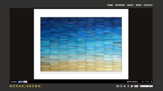
These days if you’re looking for work as a designer, whether a full-time job or a freelance gig, you need an online design portfolio as well as a physical one.
An online design portfolio is your creative shop window. It's always on – 24 hours a day, 7 days a week, 365 days a year – and it's always working to showcase who you are and what you can do.
But is this silent sales machine working hard enough? Have you set it up correctly? Are you showing off your best stuff? Is it generating enough enquiries? If you think that your design portfolio website is underperforming, tackle it now, with these tips...
11. Choose your online portfolio platform
How do you physically set up an online design portfolio? The good news is that you have a number of options.
If you're technically-minded, get yourself a personalised domain name, invest in some hosting and set up a WordPress website. WordPress is easy to use, extraordinarily flexible and enjoys massive community support. In fact, we'd recommend you give it a try, even if you don't think of yourself as 'technical'.
If you really don't have time, though, you can always pay somebody to do all of the above.
Alternatively, consider using a done-for-you web platform. You could set up a hosted blog at WordPress.com, using one of the best WordPress portfolio themes, in a few minutes. Or create something a little more advanced using the drag-and-drop loveliness of Squarespace.
Get the Creative Bloq Newsletter
Daily design news, reviews, how-tos and more, as picked by the editors.
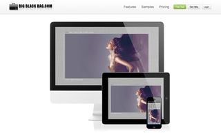
You could instead use a dedicated design portfolio platform like Behance, Carbonmade, Portfoliobox or Big Black Bag. In other words, there are no shortage of options, so you have no excuse for building yourself an online design portfolio!
12. Consider your aims
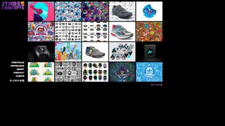
Before you rush in to build your design portfolio site, think about why you're doing this. Many designers think having an online design portfolio is an end in itself – but if you don't know what you're trying to achieve with your design portfolio, you won't know whether it's succeeding.
"Think about the goal of your design portfolio," advises Seattle-based illustrator Jared Nickerson. "In the beginning I just wanted constructive feedback, so would only post one image of the core work.
"Nowadays I try to showcase different usages of a design or placement on products, and give some insights into the process."
13. Be selective
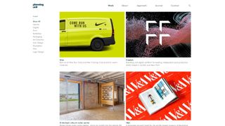
As with a physical design portfolio, don't make the mistake of trying to show off too much of your work. Potential clients don't need to see everything. Instead, be more selective. Focus on your best stuff and the work you've done for high-profile clients.
When showing off your work, consider the sort of briefs that you'd like to tackle in the future. Show the sort of work that you want to do more of and that illustrates the full set of your skills and abilities.
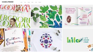
"The work that you choose to showcase should be the type of work that you want to be hired to produce," reasons New York-based designer and type artist Sasha Prood.
"Be selective, and only show the projects that you can really stand behind. A great way to develop your design portfolio further is through self-initiated projects."
14. Curate work carefully
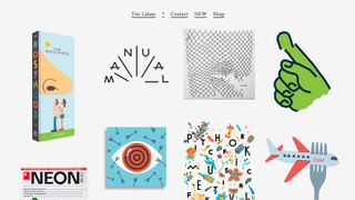
There's another aspect to the artwork you choose to put up - how well it works together.
"Curate the work you put up carefully," adds London-based illustrator Malika Favre. "Online folios need the same rhythm as printed ones: you need to tell a story, and order your projects so that they feel fluid and complement each other.
"If it means that an old project has to be removed to fit the new story, so be it."
15. Show, don't just tell
The website you build can say a lot about you in the first few seconds if you design it properly. In other words, you show people what you can do before you even get around to telling them.
So if you're a web designer, for example, have a beautiful, quick-to-load online design portfolio that showcases your coding and design talents. If you're an illustrator, make your artwork part of the design. If you're a graphic designer, impress the hell out of your visitors with great typography, a custom logo and easy-on-the-eye layouts.
These subtle cues can often make or break any connection with your web visitors. We recently found a marketing agency who built mobile-optimised websites, yet their own site wasn't optimised for mobile...
16. Keep adding new work
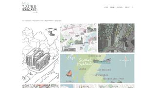
"By far the most important thing for me is making it easy to put new work up there," reflects illustrator Laura Barnard, who uses the Squarespace platform. "You could have the fanciest site in the world, but if it was last updated five years ago it looks a bit lazy."
Mexico-based designer and illustrator Christopher Mooij agrees that regular updates are crucial – and not just those showing finished work:
"Let people know what you're working on, or what you've done over the past few weeks," he says. "Obviously those posts shouldn't be filled with your personal diary: make it smart."
17. Streamline updates
The advice in the previous point is easy to give, not so easy to carry out in practice. Speak to some of the world's leading designers and you'll hear them bemoan the fact that their online portfolio needs work but they're too busy.
"Completed projects can start ganging up, and it ends up being a project in itself to get your portfolio sorted," says Jeff Knowles.
His solution is to make a versatile template, and a concise system for naming and describing your projects: "At the end of each one, simply select your best images and populate the templates."
18. Photograph printed work
"One of the biggest challenges is figuring out how to display printed material on screen," points out New York-based designer Derek Chan.
"While digital versions of your work will help, photography is definitely the best way to show these off. It's all about the context, and showing your designs as they were intended to be seen."
"If you do photograph your work, invest time and resources into making the images as good as possible," adds Emmi Salonen, creative director at Studio EMMI.
"Just as spelling mistakes do, images with no contrast, bad focus and so on take attention away from your work, and make the viewer focus on how the presentation could be improved."
19. Label your portfolio examples
As we mentioned on the previous page about indexing physical portfolios, it's a good idea to clearly label the work in your online portfolio. This will allow clients to reference individual designs or artwork when they speak to you.
20. Give an insight into how you worked
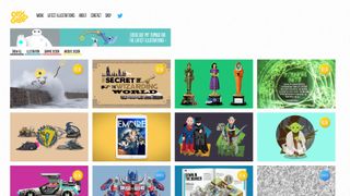
Rather than just showing the finished design, artwork, logo or illustration, give an insight into how you did it. Give a short description of the brief and how you interpreted it to fulfil the wishes of the client.
21. Avoid long intros
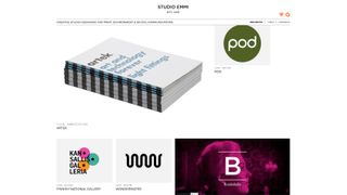
You've only got a few seconds to make an impression when somebody visits your portfolio website. Don't waste it with a slow-to-load flash intro or a home page that doesn't immediately showcase your work and why it's different to all the other designers/artists out there.
If you work in Flash or animation, create something that showcases what you can do and make it part of your portfolio. If you don't then why would you need a long intro in the first place?
22. Consider making it a PDF
To give potential clients a different way to browse through your work, consider offering your work as a downloadable PDF as well as a website.
23. Encourage action
The best websites are structured in such a way that they funnel visitors to certain pages and invite them to take some sort of action. This might be to fill in a contact form or send you an email. It might be to buy some of your work.
Think about whether your current portfolio answers the main questions that your clients will be asking. Questions such as:
- Who is this person?
- Where are they?
- What have they done before?
- Are there examples of their work that I can view?
- Who else have they worked for?
- How do I get in contact with them?
- What do they charge?
Make sure that your online portfolio is easy to navigate and that there are clear goals for each page.
24. Make it simple to navigate
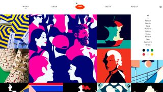
People's attention spans are short. Your online portfolio needs to be quick and easy to browse. This is not as straightforward as it sounds. You need to:
- Keep the design simple, accessible, convenient and classy.
- Use an eye-catching logo or motif to make your site stand out
- Try adding a tagline that succinctly explains what you do
- Display prominent contact details so visitors are in no doubt as to how they can email you, follow you on Twitter or connect on Facebook.
- Make it clear you want people to hire you (don't assume they can read your mind. Sometimes you can't beat a good 'Hire me' button.
25. Publish testimonials
If shopping on Amazon has taught us anything it's that people love to know what other people think. Getting testimonials from satisfied clients is a great way to show some 'proof' that you can deliver on what your portfolio promises.
26. Cater to diverse tastes
"One of my best-selling prints is quite frankly one of my least favourite pictures," admits Stan Chow, who sells his work online through Big Cartel.
"Potential clients and buyers look for different things, and sometimes you have to put up images you don't like so much, because the chances are that somebody else will."
27. Promote your portfolio
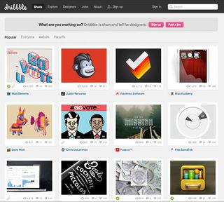
There's no point in having a great portfolio site if nobody is visiting it. Be active on Facebook, Twitter and Google+; deploy portfolio pieces to Behance, Flickr, Dribbble and deviantART.
Film yourself working and put the video on YouTube. Put together a PDF brochure and upload it to Scribd. The more places you share your content, the more you'll drive people towards you and your portfolio website.
Read our guide on How to make social media work for you for more tips.
28. Add a blog
For Jonathan Edwards, a regularly updated blog keeps people coming back: "Set yourself a task, like updating your blog every day for 100 days," he suggests.
"It may seem a pain to have to find something new to post every day, but in the long run you'll thank yourself. You'll have 100 new drawings, for a start."
29. Update your blog
Google loves a well-structured, regularly updated website that's stuffed with great content – and the easiest way to provide fresh content is to keep your blog updated.
You can write about the projects you've worked on, share your thoughts about art and design trends and reveal your favourite tools.
In general, the things that make visitors happy are the things that make Google happy. However, striking a balance is always important – in other words...
30. Don't get hung up on SEO
It's easy to get obsessed by Search Engine Optimisation (SEO), the art/science of trying to get your site high in the Google rankings. In fact, you can spend too much time worrying about keywords when you should be concentrating on website content.
Online portfolio sites typically feature fewer words so traditional SEO is often ineffective. You will probably get better results by promoting yourself (and your website) through other web channels.
Related articles:

Thank you for reading 5 articles this month* Join now for unlimited access
Enjoy your first month for just £1 / $1 / €1
*Read 5 free articles per month without a subscription

Join now for unlimited access
Try first month for just £1 / $1 / €1
- 1
- 2
Current page: Make a great online design portfolio
Prev Page Make a great physical design portfolioCraig Stewart is a writer, SEO strategist and content marketer, and is a former editor of Creative Bloq. Craig has written about design, typography, tech and football for publications including Creative Bloq, T3, FourFourTwo and DSG, and he has written a book on motoring for Haynes. When he's not writing, you'll usually find Craig under his old car learning about DIY repairs the hard way.
