Create an impactful slab-serif poster
Get more from bold slabs with pro advice from Vilaz’s Pedro Vilas-Boas and Cátia Oliveira.
Skills:
Set up a suitable grid in InDesign; master kerning and leading with chunky slabs; work with bold, vibrant colours and shapes.
Slab-serif fonts have plenty of shout, and grab your attention like a slap in the face. Here, we've played on that concept, using the phrase ‘slab me in the face' as the basis for a vibrant, high-impact poster to contrast the classic serif design here.
Often used in newspaper headlines, slab-serif typefaces (also called mechanistic, square-serif or Egyptian) are distinctive for their thick, block-like serifs. Some consider slabs to be a subset of modern serif typefaces. Despite sometimes being referred to as ‘Egyptian' they have nothing to do with Egypt, and instead reflect the 19th century fascination – following Napoleon's Egyptian campaign, and publications such as Description de l'Égypt – with all things Egyptian. Slab-serifs gained popularity thanks partly to their resemblance to the chiseled lines of Egyptian hieroglyphs, and also to their use on posters – an essential way of communicating to the masses in the days of the Industrial Revolution.
In this tutorial we reveal some cool techniques for blending type and illustration in InDesign. While it's tempting to get straight to the creative aspects of arranging text and images, we need to get the basic parameters of the document set up first.

01 Open a new document, select the Master text frame and create an A3 document. Set up the margins, five columns with a gutter of 3mm and five rows with 0mm gutter. Make sure to use CMYK colours, for an easier conversion to print.
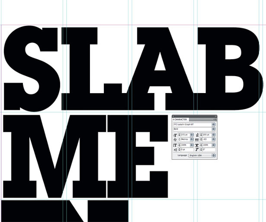
02 Go to Window>Type and Table>Character. In this panel edit all the character options. Find a suitably chunky slab-serif: here, we've used ITC Lubalin Graph Bold. Add some stacked text (‘slab me in the face'), and customise the options for font size (272pt), leading (205pt) and tracking (-63), to get a compact effect.
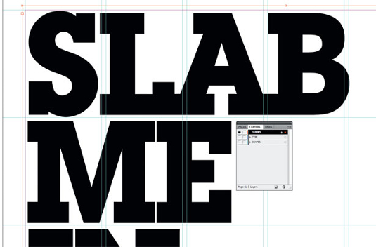
03 Create three layers in the Layers menu; one for guides, a second one for type and a third one for shapes and graphic elements. Lock the guides layer.
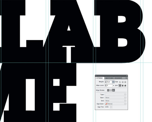
04 You can give your text an extra bold effect by creating a outline. Select your text and give it a 6pt stroke. You can do this by using the toolbars on the left-hand side, or by going to Window>Stroke.
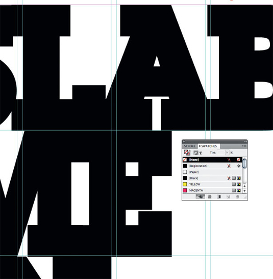
05 Use bright colours. Go to the Swatches menu and create a new colour. Double-click on the thumb, and set it to C:0% M:0% Y:100% K:0% for a pure, bright yellow. Do the same to create magenta with a touch of yellow (C:0% M:100% Y:50% K:0%). Now select your text, and apply these colours on alternate lines.
Get the Creative Bloq Newsletter
Daily design news, reviews, how-tos and more, as picked by the editors.
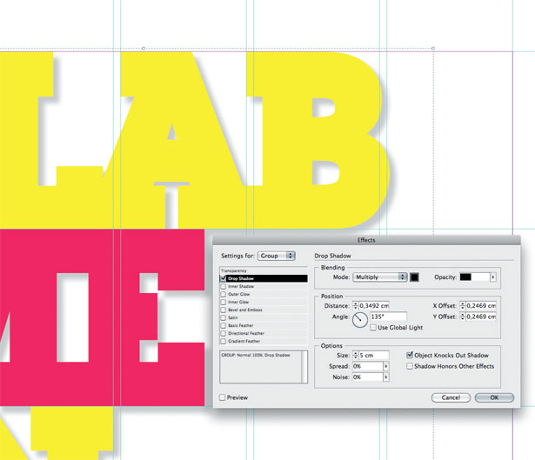
06 In order to bring the text out from the background, apply a shadow effect. Ctrl/right-click, select Effects>Drop Shadow, and set it to 20% Opacity.
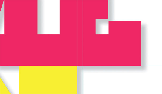
07 Select the Direct Selection tool and play with your vectors, adjusting them within the constraints of your grid. This will help you to keep your composition balanced. If you want to add a new element to the composition, everything will be aligned and in the same structure.
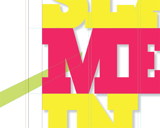
08 Making sure that you are in the Shapes layer, select the Pen tool and start adding shapes to your design. Be sure to make full use of the Gradient Swatch tool.The Smooth tool can help a lot too, by simplifying the shapes and removing extra edit points.
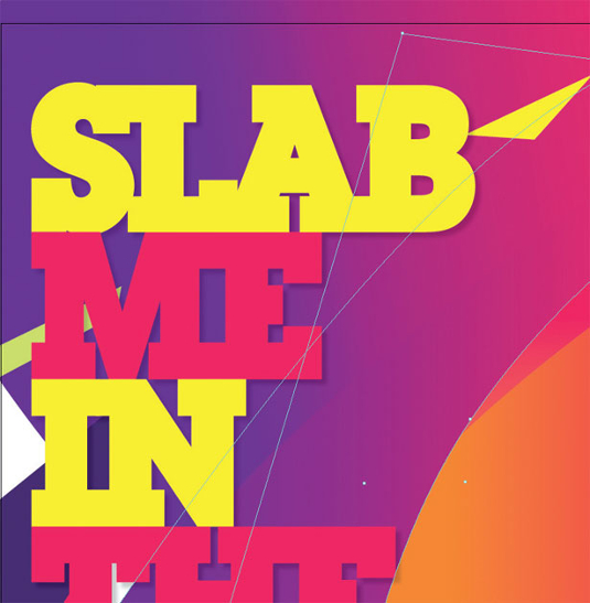
09 Remember that you can import elements directly from, for example, Illustrator with a simple copy-and-paste. Pay attention to your colour swatches and ensure that they're all named to prevent any later confusion as you switch between programs.
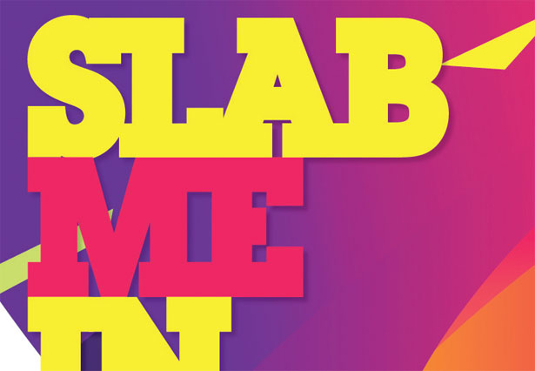
10 Clean up your Swatches palette: select any unused swatches and delete them, then add unnamed colours and name them. Now go to Document setup, select Bleed and Slug, and apply 3mm all around the document – ensuring that your background shapes bleed off the edge of the canvas. You're now ready to PDF your poster for print.

Vilaz
Founded by Pedro Vilas-Boas and Cátia Oliveira, Vilaz is based in Lisbon but with a client network around the globe. The studio is always on the lookout for new ideas and concepts, crossing traditional methods with new technology.
www.vilaz.tv

Thank you for reading 5 articles this month* Join now for unlimited access
Enjoy your first month for just £1 / $1 / €1
*Read 5 free articles per month without a subscription

Join now for unlimited access
Try first month for just £1 / $1 / €1

The Creative Bloq team is made up of a group of art and design enthusiasts, and has changed and evolved since Creative Bloq began back in 2012. The current website team consists of eight full-time members of staff: Editor Georgia Coggan, Deputy Editor Rosie Hilder, Ecommerce Editor Beren Neale, Senior News Editor Daniel Piper, Editor, Digital Art and 3D Ian Dean, Tech Reviews Editor Erlingur Einarsson, Ecommerce Writer Beth Nicholls and Staff Writer Natalie Fear, as well as a roster of freelancers from around the world. The ImagineFX magazine team also pitch in, ensuring that content from leading digital art publication ImagineFX is represented on Creative Bloq.
