Create an HTML newsletter
Daniel Bramhall explains how to better engage potential customers with your newsletters, and looks at why outdated solutions are still so often used these days
Applying HTML and CSS to your emails can make a massive difference to the impression you give potential customers – and in the past couple of years, HTML support within email clients has progressed a long way.
However, owing to the sheer number of email clients out there, it’s hard to get things perfect for each one and, as a consequence of this, outdated practices can get forced upon developers. You’re probably aware of the importance of ensuring website cross-browser compatibility – but making sure your email looks right across all clients is a whole different ballgame!
Things to understand
There’s a shed-load of nuances involved with HTML newsletter design. It can be tiresome and, in some cases, very frustrating. Before we begin implementing, coding or designing a template, it’s worth examining some basic principles that apply when creating HTML and CSS emails.
On the technical side, most email clients don’t support CSS floats, so there’s a need to use tables for layout. Many clients also strip out the HTML, head and body tags, including any CSS styles in them. This means that all of your CSS should be inlined.
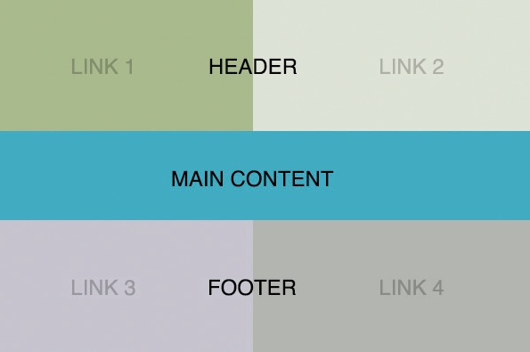
One the design side, you should keep your email 600px wide or less, to fit common widths of email clients’ preview panes. Many email clients also block images by default, so if you rely on images for your content, your recipient may not see it. A good rule of thumb is that the more important the content, the more likely it is you should use text to display it. Finally, your creation will break at some point, even if you follow all the correct methods – if you have 20,000 email subscribers it’s guaranteed that the email won’t display properly for every last one of them.
So, HTML emails can be inconsistent and somewhat fickle – but it’s still possible to use them to achieve effective marketing for you and your clients. With the above ideas ingrained in your mind, let’s begin. We’ll be creating an email from scratch, meaning we won’t use any templates or third party services – just HTML and CSS, and Photoshop for the graphics.
The basic structure
To begin with, we’re going to set up a simple HTML file. Be sure to brace yourself because, as mentioned, emails made in HTML and CSS seem to go against everything you consider good practice:
<html>
<head>
<title>Introducing Something New!</title>
<meta http-equiv="Content-Type" content="text/html; charset=utf-8">
<meta name="robots" content="noindex,nofollow"></meta>
<style>
a {color: #bebbb8;}
img {display: block;}
</style>
</head>
<body>
<table bgcolor="#FFFFFF" leftmargin="0" topmargin="0" marginwidth="0" marginheight="0" style="background-color:#e4e4e4; fontfamily:' HelveticaNeue', 'Helvetica Neue', Helvetica, Arial; color:#bebbb8; padding-top:40px; padding-bottom:40px; padding-right:0; padding-left:0; lineheight: 22px; -webkit-font-smoothing:antialiased; ">
<!-- Body of email -->
</table>
</body>
</html>
So far, we have the very basic structure of our email: we have properly specified and populated all the appropriate meta tags, and styled our content. Now we need to actually populate our email with the content.
Adding content
Let’s add our content. We’ll be using HTML tables, starting with a simple line of text giving the user the ability to preview the email in their browser. Insert the following in between the <body> tags:Here we’ve added the first of our tables, styled it and used the <tr> tags to populate it with rows of content (in this case text), and then closed the table. If you were to save your HTML file and open it in your browser, you’d find a simple line of text – something that could have been done without any tables – but you’ll see why they’re so vital for an email in a moment.
Get the Creative Bloq Newsletter
Daily design news, reviews, how-tos and more, as picked by the editors.
<table cellspacing="0" cellpadding="0" border="0" align="center" style="padding-top:8px;padding-bottom:8px;padding-right:2px;padding-left:2px;" >
<tr align="center">
<td style="font-size:13px;" >Does this email look a bit obscure? <a href=”http://mysite.com/email/01.html" style="color:#979696;" >View it in your browser.</a>
</td>
</tr>
</table>
Designing graphics
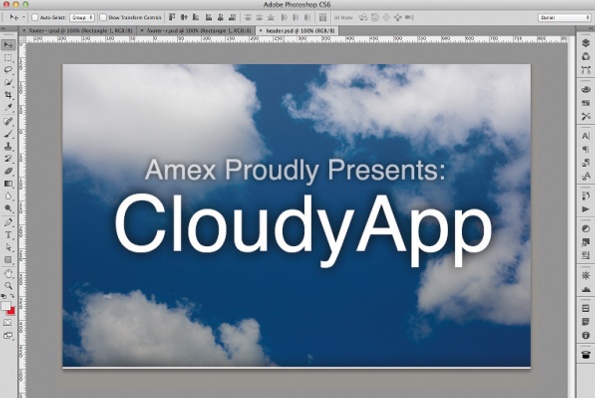
When designing graphics for an email, remember that width is a real constraint – so think thin. For our graphics, we’ll create a Photoshop document 600x400px (call it header.jpg) and, within the canvas, simply include the top graphic you’d like to display. For this article we’ll simply include an image with a shadowed border at the bottom and some text. Repeat the above process, but this time call the graphic middle.jpg and populate it with the main body of your email.

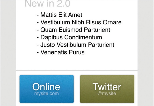
Next we’ll create two graphics, each acting as one side of the footer; for example, we’ll make a left-hand side that will link to the website and a righthand side that will link to a Twitter page. To do this, create two blank canvases, one at 300px width and 200px height called footer-l.jpg and another the same size called footer-r.jpg.
With our graphics created, we now need to position and place them in the email. To implement this, we’re going to create a variety of tables and then populate them accordingly, adding the following code just below the closed table tag (</table>):
<table id="Table1" width="600" height="auto" border="0" cellpadding="0" cellspacing="0" align="center">
<tr>
<td colspan="1" rowspan="1">
<img src="header.jpg" width="600" height="400" border="0" alt="" style="display:block;" >
</td>
</tr>
</table>
<table id="Table2" width="600" height="auto" border="0" cellpadding="0" cellspacing="0" align="center">
<tr>
<td colspan="2" rowspan="2">
<h1 style="font-size:36; font-family:Helvetica; padding:20px; color:grey;">New in 2.0</h1>
<ul style="margin-top:-30px; padding-left:100px; fontfamily:Helvetica; line-height:24px; font-size:18px;">
<li>Vivamus sagittis lacus</li>
<li>Vel augue laoreet rutrum </li>
<li>Faucibus dolor auctor faucibus dolor aucto</li>
<li>Vivamus sagittis lacus sagittis lacus</li>
<li>Vel augue laoreet rutrum laoreet rutrum </li>
<li>Faucibus dolor auctor</li>
</ul>
</td>
</tr>
</table>
<table id="Table3" width="600" height="200" border="0" cellpadding="0" cellspacing="0" align="center">
<tr>
<td colspan="1" rowspan="1">
<a href="http://mysite.com/">
<img src="footer-l.jpg" width="300" height="200" border="0" alt="" style="display:block;" >
</a>
</td>
<td colspan="7">
<a href="http://twitter.com/">
<img src="footer-r.jpg" width="300" height="200" border="0" alt="" style="display:block;" >
</a>
</td>
</tr>
</table>
Here we’ve positioned each of our images in their correct position using HTML tables, and then added links to the footer images. You should notice one of the reasons we use tables for HTML emails: the fact that you’re able to position images where you want.
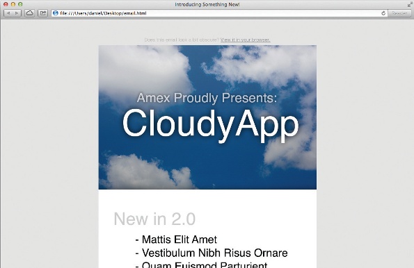
Whatever the position, a table makes it easier for you to lay out images. You can then link them to specific locations, which is a fundamental motivation for creating HTML emails.
Sending the email
When it comes down to sending your email, things boil down to which client you are using – here we’ll cover three popular desktop options:
- OS X Mail Sending an email using OS X is straightforward – open up your HTML file in Safari, go to File > Share > Email this Page (or press Cmd+I). The Mail app should open with your HTML file nicely positioned in the body of the email.
- Outlook To send an HTML file as an email body using Outlook, move it to C:\ Documents and Settings\*userid*\Application Data\Microsoft\Stationery (Application Data is a hidden folder). Once you’ve done that, go to Action > New message using… > More stationery and select the HTML file as the body.
- Thunderbird Thunderbird also makes it easy to send HTML emails. Compose a new message, then select Insert > HTML… and copy all the code from the HTML email to the dialog that opens. You should upload your images to an online directory to prevent them getting lost, and change the paths within the HTML code to the new online locations. Now, simply send as usual.
Why so outdated?
The main reason HTML emails are so out of date, and use old technologies, is that there’s such a range of clients an email has to comply with. In addition, the purpose of an email client isn’t to be a web browser, nor is it to render HTML documents: it’s to display (mainly) text – so when a client is developed, HTML compatibility is typically not a top priority. When compatibility is included, it’s usually limited and doesn’t take advantage of the language’s latest advances.
Hopefully this article has given you a taste of where enhancements can be made. Regardless of whether you think HTML emails should be used, they’re an often-overlooked Achilles heel of modern clients. It’s less that client developers don’t care, and more that HTML itself is underestimated. This situation needs to improve, otherwise dated techniques will continue to be forced on developers – leaving them less time to concentrate on what matters most: content.

Thank you for reading 5 articles this month* Join now for unlimited access
Enjoy your first month for just £1 / $1 / €1
*Read 5 free articles per month without a subscription

Join now for unlimited access
Try first month for just £1 / $1 / €1

The Creative Bloq team is made up of a group of art and design enthusiasts, and has changed and evolved since Creative Bloq began back in 2012. The current website team consists of eight full-time members of staff: Editor Georgia Coggan, Deputy Editor Rosie Hilder, Ecommerce Editor Beren Neale, Senior News Editor Daniel Piper, Editor, Digital Art and 3D Ian Dean, Tech Reviews Editor Erlingur Einarsson, Ecommerce Writer Beth Nicholls and Staff Writer Natalie Fear, as well as a roster of freelancers from around the world. The ImagineFX magazine team also pitch in, ensuring that content from leading digital art publication ImagineFX is represented on Creative Bloq.
