Create an elegant graphic illustration
Celeste Prevost reveals how to design simple-but-smart vector artwork in Illustrator, using a series of icon-like shapes.
Bold shapes and bright colours tend to be a prevalent force in my work, and over time simplification has become the root of my philosophy.
The exercise of limiting one's colour palette and shapes can yield unique opportunities as a designer, helping you solve a design brief simply and elegantly - and can even prove economical with a budget-strapped client.
Creating a graphic illustration can sometimes seem complex and even daunting, but if you set constraints on what you allow yourself to use, it can easily turn into a quick and playful way to share a message. In this tutorial, I'll walk you through the process of creating an illustration that is graphically simple with a limited palette of bright colours. Let's make magic!
Click here to download the support files (973KB)
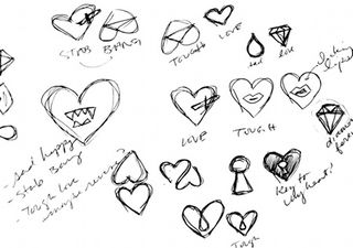
01 When taking a graphic approach to illustration, strong concepts and restraint always bring the best results. First, determine the concept for your illustration. Sometimes an idea comes quickly, while other times it may require a bit more planning to develop an idea. In this case, we'll be recreating an illustration that was made for a zine project.
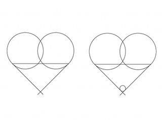
02 Once you've decided on your idea, you can get to work. Let's start with creating the heart - there are a number of methods for this, but a good way is to use the Ellipse tool (L) when you want perfect 45° angles. Select the Ellipse tool and create two slightly overlapping circles. Then with the Line tool (\), create two lines at 45° - one on the outside edge of each circle. With the Direct Selection tool (A), select the top points of each line and join them (Ctrl/Cmnd+J).
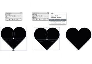
03 Using the Ellipse tool, create a circle the same width as the overlap and place it inside the base of the heart. Select the heart and change your stokes to a fill (Alt/Opt+X), and divide the shapes using the Pathfinder palette. Now you can delete all extraneous shapes and the pointed base of the heart. Select again, and create a compound shape via the Pathfinder palette and expand. Now set the finished heart shape aside for later.
Get the Creative Bloq Newsletter
Daily design news, reviews, how-tos and more, as picked by the editors.
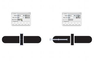
04 To create the knife, select the rounded Rectangle tool from the toolbar, and draw a long horizontal rectangle. Next, draw a smaller vertical rectangle halfway through the horizontal rectangle, add a 6pt white stroke and align it to the outside of the shape. Using the Line tool, draw a 6pt white line from the left side of the horizontal rectangle to just before the vertical rectangle. Round the stroke by selecting the Round Cap option from the Stroke palette. Select all the shapes and then align them vertically using the Align palette.
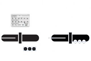
05 The next thing to do is create the knife's grips. Begin by making a small circle using the Ellipse tool. While selected, hold the Alt/Opt key and drag another circle next to it. Repeat this until you have three identical circles. Now you need to select all three circles, align them vertically and then distribute them horizontally via the Align palette. Group (Ctrl/Cmnd+G) and align the centre of the circles with the base of the horizontal rectangle on the right side. Once aligned, you need to change the colour (or fill) of the circles to white.
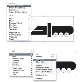
06 For the blade, create a 45° rectangle and place it over the left side of the horizontal shape. Select all the shapes and Expand the Appearance to maintain the outer stroke on the vertical rectangle. While selected, outline the strokes and merge the shapes via the Pathfinder. Once merged, delete any remaining white shapes. Now you have a knife. Again, set it aside for later.
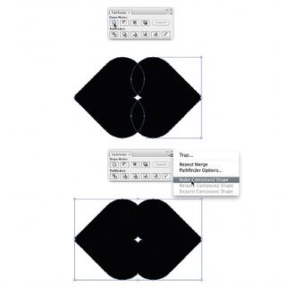
07 Now you'll make the final shape: the lips. Duplicating the heart you created earlier, make two additional hearts. Select and rotate each by 90° (one clockwise; the other counter-clockwise). Overlap the hearts slightly and merge both shapes using the Pathfinder palette. Once merged, create a Compound Shape to eliminate the centre shape. With the Pen tool (-), delete the bottom centre point.
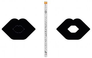
08 To make your lips more convincing, you'll need to make them appear as if they are slightly open. Copy and Paste in Front (Ctrl/Cmnd+F) the lip shape you've just created. While selected, and holding both the Shift and Alt/Opt keys, drag from a corner node towards the centre to reduce the size of your newly created shape proportionally. Change the colour of this shape to white.
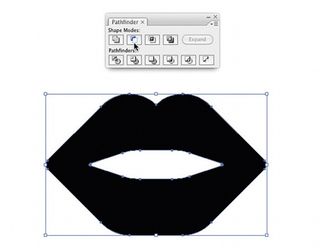
09 Using the Pen tool, delete the top centre node of the inside shape. Now you can stretch the inside shape horizontally and vertically across the background shape. Align both shapes vertically and horizontally. While selected, use the Pathfinder to subtract the inside shape from the outer shape. Now we have believable lips.
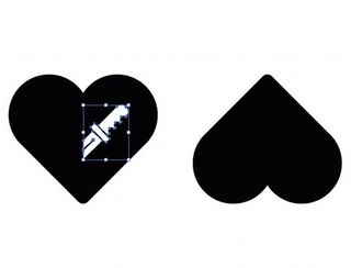
10 Next we need to bring all the elements of the heart design together. First of all, duplicate the heart you created earlier and rotate it by 180°. Next, place the upright and upside-down hearts side by side. Grab the knife you created earlier and reduce its size. Change its fill to white, and place it over the upright heart with the blade aligned to the centre, as if it's stabbing through it.
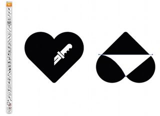
11 Using the Pen tool, create a triangle that connects the bottom centre point of the heart to about midway on the left and right sides. This will be the woman's underwear. Convert the anchors on the upper part of the triangles (Alt/Opt+C) and adjust the curves to your liking. Grab the lips you created earlier and place them wherever you see fit.
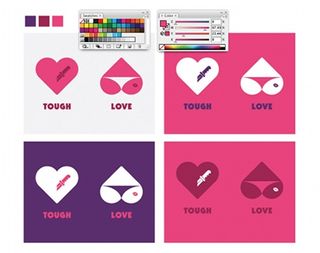
12 Now that you have your core elements, experiment with colours, type treatments and composition to complete your illustration. Remember that less is more - limiting the elements used can help to create a more compelling message.
Words: Celeste Prevost
A designer living in San Francisco, USA, Prevost's mission is to keep it simple. She creates identities for stores, restaurants, products and anything else thrown her way. When not working, she enjoys a good fish taco, with ice cream to follow. www.designisfine.com

Thank you for reading 5 articles this month* Join now for unlimited access
Enjoy your first month for just £1 / $1 / €1
*Read 5 free articles per month without a subscription

Join now for unlimited access
Try first month for just £1 / $1 / €1
The Creative Bloq team is made up of a group of design fans, and has changed and evolved since Creative Bloq began back in 2012. The current website team consists of eight full-time members of staff: Editor Georgia Coggan, Deputy Editor Rosie Hilder, Ecommerce Editor Beren Neale, Senior News Editor Daniel Piper, Editor, Digital Art and 3D Ian Dean, Tech Reviews Editor Erlingur Einarsson and Ecommerce Writer Beth Nicholls and Staff Writer Natalie Fear, as well as a roster of freelancers from around the world. The 3D World and ImagineFX magazine teams also pitch in, ensuring that content from 3D World and ImagineFX is represented on Creative Bloq.
