Create an ambigram-style logo
Graphic artist and ambigram pioneer John Langdon reveals how to bring rotational symmetry to your work
- Software Illustrator
- Skills-Explore the complex relationship between letters-Develop glyphs and ligatures that fulfil dual purposes~-Refine your ambigram into an eye-catching logo
Many people are totally taken by surprise when they see their first ambigram. They have the unique characteristic of being readable from two points of view, and are inherently interesting, but after a while the inevitable question arises: so what? Is there more to ambigrams than mere decoration, or are they just a fad?
When I first began to develop ambigrams, as they're known now, I did so to explore a new and unique artform and communicate a personal philosophy. The main focus of my book, Wordplay, is the phenomenon of harmonious polarities and the complementary opposites that surround us. A corporate or institutional logo need not attempt to represent a principle on that scale. But if an ambigram can represent the unique combination that an entity possesses - a great product and great customer service, for instance - it can make that duality a highly memorable aspect of that entity's brand.
Here, I'll demonstrate my working process using a recent logo I developed for the charity Action Africa. What starts as single pencil strokes develops through complex shapes and, with the help of Illustrator, into a unified ambigram design.
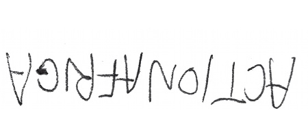
01 The process of creating an ambigram to be used as a logo is not very different to creating an ambigram for any other purpose, but the logo needs to be easily readable. Start by writing the word upside down in simple caps. I write in pencil, in simple, single strokes. Style and aesthetics are not important at this stage, as you're only trying to develop an underlying substructure that will eventually be invisible.
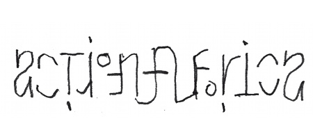
02 Next look at it upside-down and try to perceive the first letter in the upside-down version as the first letter in the actual word, and follow suit with each subsequent letter. Then scribble in a version of a glyph that contains the elements of both letters. The more ambigrams you do, the easier this will be - I was familiar with some of the glyphs needed here having developed them for previous ambigrams, although most have some requirements that I haven't encountered before.

03 A lot of ungraceful forcing needs to happen next, so experiment to see how your letters best fit together. The 'NAF' ligature here works for now, but the 'O' wouldn't cooperate on its own so I initially tried to force it in at the top of the word 'ACTION' - we usually tend to read the tops of letters more than the bottoms. However, I then noticed a similarity between the bowl of the 'R' and the 'O', so I tested this coincidence.
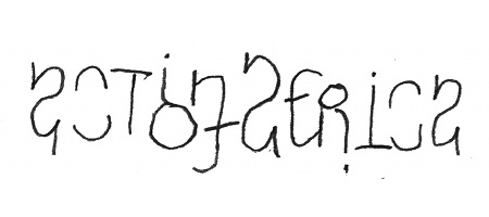
04 With the 'O' now at the bottom of the word 'ACTION', I made it larger to ensure it would be included in the reading of the word. The 'ION'/'FR' solution looked promising, so I experimented with simplifying the middle of the word with a free-standing 'A' in 'AFRICA' - like a central medallion. I tried the same 'A' as at the beginning of 'ACTION', but realised I wanted a capital form here, if possible. If you lack the luxury of a word space, capitals are a nice way of indicating the beginning of a new word.
Get the Creative Bloq Newsletter
Daily design news, reviews, how-tos and more, as picked by the editors.
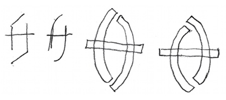
05 Returning to the idea that people read the top of letters more than the bottom, I decided to experiment with creating an invertible capital 'A' - and tried some with two 'tops'. I was a little reticent to close the bottom too much so my first two attempts (single stroke) were pretty open at the top as well. However, I began to think it might work, so my next attempts (with some weight) closed the gaps significantly. As seen, one version lets the left-hand stroke dominate the top, while the other one reverses that relationship. Both seem successful, so it comes down to my personal preference.
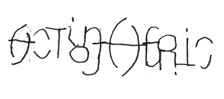
06 Once you're happy with your experiments, put them into context and play around. I tried out a smaller version of the 'A' at the start but I felt it stole some of the charm from the larger one
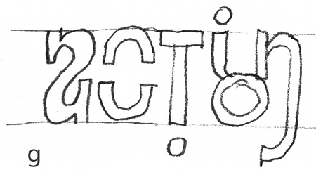
07 Now experiment with different weights. Having gained a feeling for weight in step 5, I tried applying the same weight to the whole word, and for the first time realised that the capital 'T' looked out of place with the lower case forms of the 'A', 'I' and 'N'.
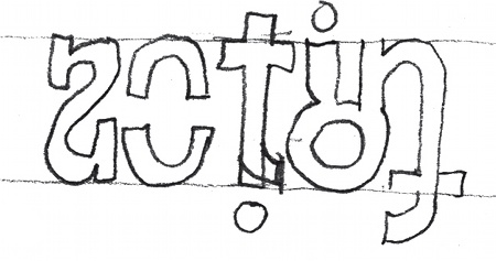
08 Now is a good time to experiment with the style of your letterforms. I made the 'T' lower case, which gave the option of having a Helvetica-like hooked bottom, or a straight, cross-shaped Futura-esque ending.
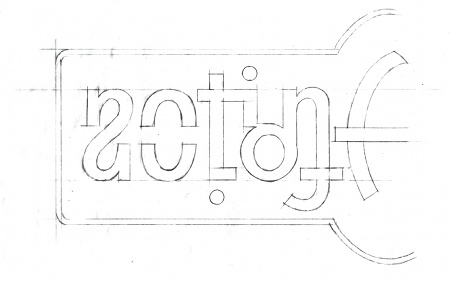
09 When you've established the structure, weight, proportion and some of the finer aspects, scan in your sketch and print it at a much larger scale so that you can finalise even the minutist details. Execute a final drawing in pencil, on tracing paper with the enlarged sketch underneath. Scan this in and bring it into Illustrator. There's no need to draw more than half your ambigram at this stage: when the vector art has been created it'll be copied, flipped and joined together to yield a completed, 100 per cent symmetrical, ambigram.
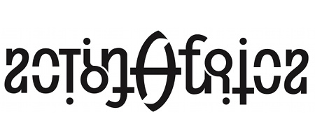
10 A situation like this, where there needs to be an opening at one end of an ambigram and a closing at the other, is very common. Aside from the capital 'A', there are several of these in the ACTION AFRICA logo seen here: in the lower case 'A', we expect an opening on the left and a closed right side, for example. We also expect the 'C' to be closed on the left and open on the right, and we think of 'I', 'O' and 'N' as separate letters, but 'R' as a single, united letter.
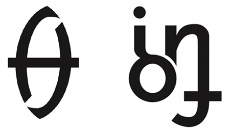
11 Here the central capital 'A' demonstrates one solution: a stroke ending in a pointy, flared style of tail that's reaching for a connection. It almost completes it, simultaneously leaving enough white space to ensure the impression of an opening. Another approach is simply to make the two pieces very, very close, but leaving a small space to separate them, as seen here in the 'ION'. This solution can seem quite artificial and is aesthetically unsatisfactory here, however. The flared terminal where the 'N' flirts with the 'O' is out of keeping with the rest of the forms in this ambigram.
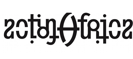
12 The long flare in the previous version of the central 'A' is also foreign to the style of the rest of the lettering, so I minimised it - but didn't completely eliminate it - and reconnected the 'ON'. Serifs on the initial (and last) 'A' are necessary, because the bottom serif visually completes the back of the lower case 'A'. The other letters have all been sans serif, but I added serifs to the 'T', 'R' and 'I' to increase their family resemblance to the initial 'A'. At this point, the least satisfactory letter was the 'C': the top-to-bottom and left-to-right symmetries were much more characteristic of a stencilled 'O' than any kind of a 'C'.
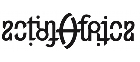
13 Continue pushing at the stylistic details of the terminals. I found that slicing off the end of the upper right and lower left strokes of the 'C' at a 45-degree angle made the glyph much more 'C'-like. This also gave me a precedent - a reason to apply that same angle to several other strategic locations throughout. Here, the initial 'A' is now nearly closed at the lower right, while presenting a wide-open approach from the left (in sync with the direction we read) at the top. Adding those angles to the 'T' is less functional, but stylistically acceptable. Where the 'I' meets 'O' the angle allows an actual connection, and again, an open approach from the left. In the central 'A' and the 'F' that follows, the angles are again not functionally significant, but add a bit of left-to-right movement: the crossbars were more static earlier. While the 'I' and 'O' seem clearly distinct, the 'R' now looks entirely united. The ambigram has finally reached a stylistic unity.
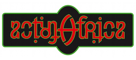
14 There's now a kind of harshness - a choppy feel - to the logotype. It's time to choose your colours. I've brought in the traditional colour scheme of the pan-African flag: red, black and green. Using this trio of hues, I added a close-valued but highly-distinctive contour around the basic letters to provide a glow-like effect, which helps to soften the harsh edges.
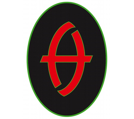
15 The client was so charmed by the central cap 'A', and its resemblance to a traditional African warrior's shield, that he decided to use it as a more concise alternative version of the completed Action Africa ambigram logo.

John Langdon
Langdon pioneered the current ambigram phenomenon in the early 70s. His book Wordplay led to him creating ambigrams for Dan Brown's Angels & Demons; the character Robert Langdon is named after him.
www.johnlangdon.net

Thank you for reading 5 articles this month* Join now for unlimited access
Enjoy your first month for just £1 / $1 / €1
*Read 5 free articles per month without a subscription

Join now for unlimited access
Try first month for just £1 / $1 / €1

The Creative Bloq team is made up of a group of design fans, and has changed and evolved since Creative Bloq began back in 2012. The current website team consists of eight full-time members of staff: Editor Georgia Coggan, Deputy Editor Rosie Hilder, Ecommerce Editor Beren Neale, Senior News Editor Daniel Piper, Editor, Digital Art and 3D Ian Dean, Tech Reviews Editor Erlingur Einarsson, Ecommerce Writer Beth Nicholls and Staff Writer Natalie Fear, as well as a roster of freelancers from around the world. The ImagineFX magazine team also pitch in, ensuring that content from leading digital art publication ImagineFX is represented on Creative Bloq.
