World's flags turned into a beautiful new font
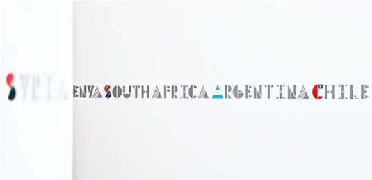
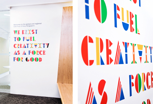
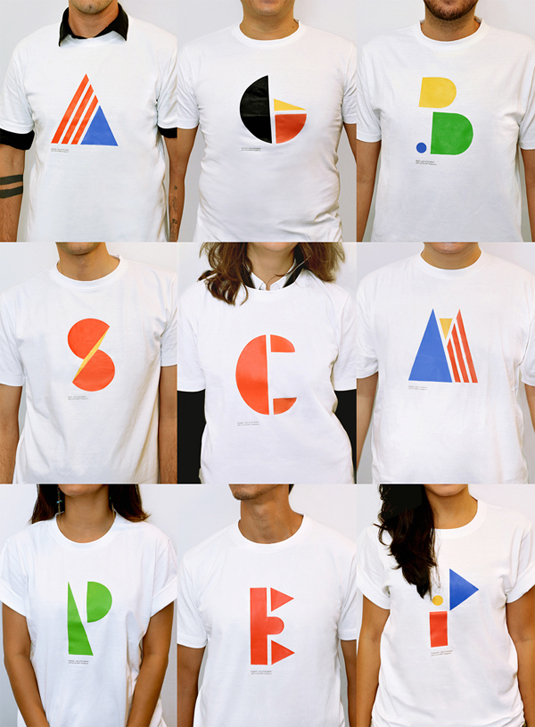
A team of designers have created a font based on national flags by breaking them down into basic shapes.
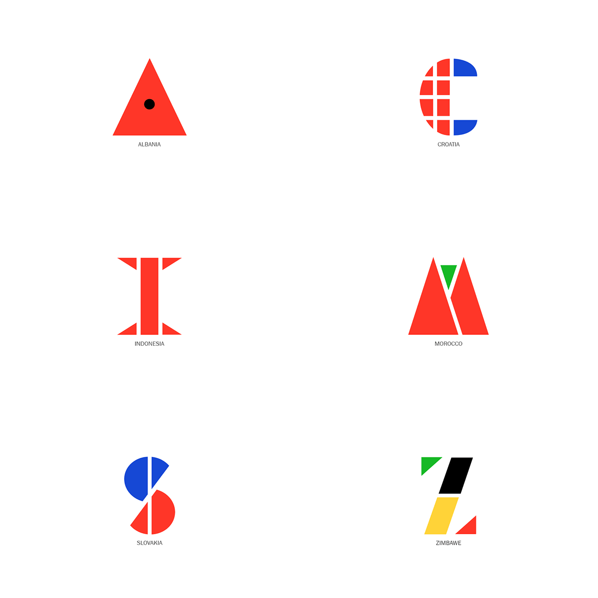
With the various rules and commandments of typography, creativity and imagination still reigns supreme when it comes to producing an inspiring new font. Using the world flags in a way we've never seen before, this multinational font plays on geometric patterns to showcase something really rather beautiful.
"When you set up a new hub to work with the rest of the world, it kind of makes sense to install a multinational team to do so," explains designer Luis Fabra. "Not just a local setup running a global account, but a team that has got a clue about the world out there. We invented a design tool to brand this team, and to communicate our mindset and vision - the world's first multinational typeface."
Created by Fabra and Leong Darren Abriel, this font is both creative and unique, proving that you can produce something new out of an inspiration that has been used plenty of times before. Is this going to be the world's first multinational font?
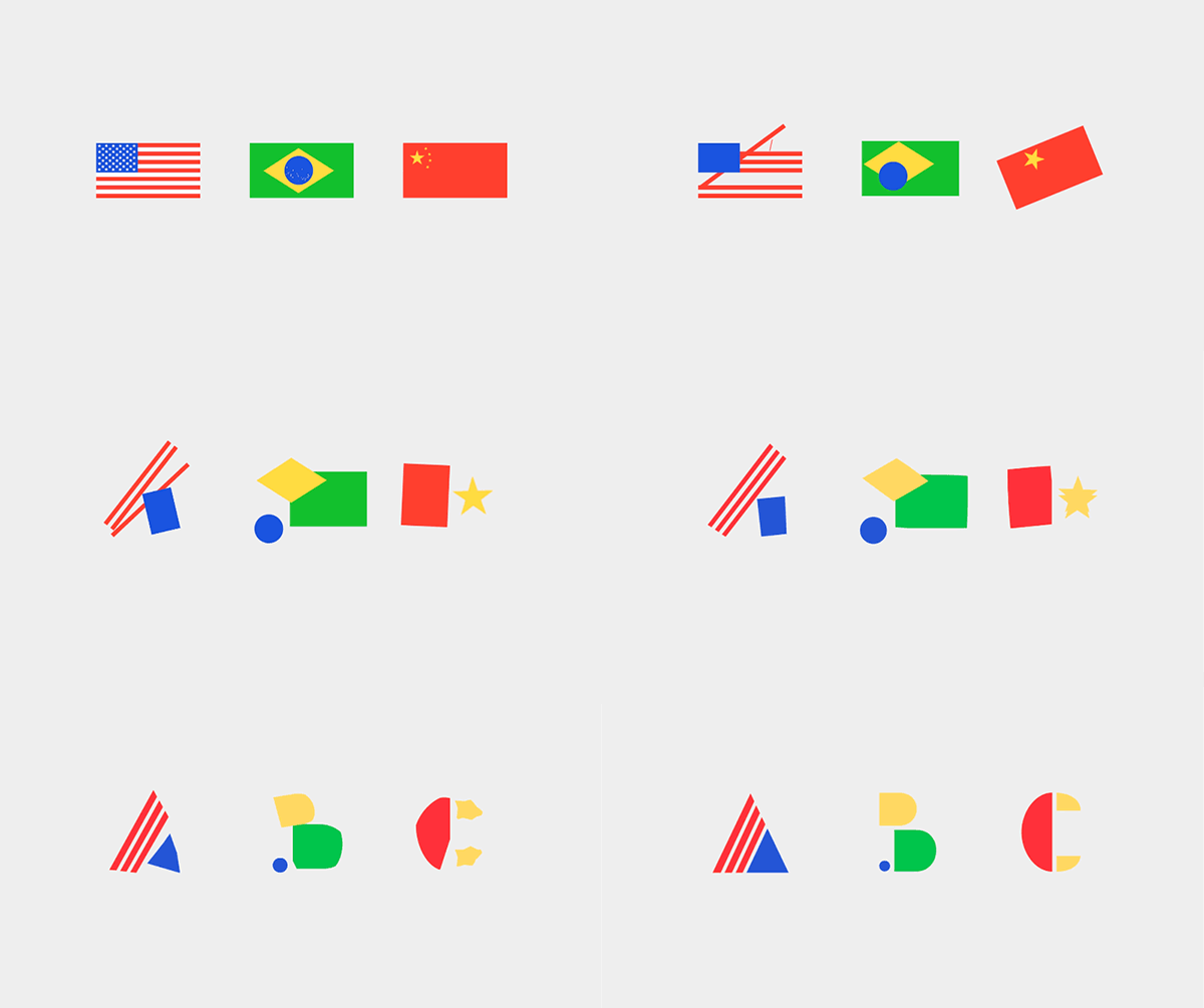
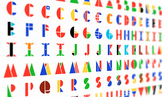
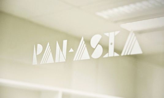
See more of the font over on the Behance page.
What do you make of this multinational font? Let us know in the comments box below!

Thank you for reading 5 articles this month* Join now for unlimited access
Enjoy your first month for just £1 / $1 / €1
*Read 5 free articles per month without a subscription

Join now for unlimited access
Try first month for just £1 / $1 / €1
Get the Creative Bloq Newsletter
Daily design news, reviews, how-tos and more, as picked by the editors.

Sammy Maine was a founding member of the Creative Bloq team way back in the early 2010s, working as a Commissioning Editor. Her interests cover graphic design in music and film, illustration and animation. Since departing, Sammy has written for The Guardian, VICE, The Independent & Metro, and currently co-edits the quarterly music journal Gold Flake Paint.
