Why the expressive typography guru avoids Helvetica
Alan Peckolick explains why he believes designers should stop letting the same old fonts do the talking.

I have spent my 40-year-long career in design purposely avoiding Helvetica. The cleanliness and neutrality of the letterforms has always made me uncomfortable, as if the typeface was conspiring to take over the world with conformity.
The need for compatibility between different digital platforms has created a trend of sterile, uniform design - the 'Helvetica aesthetic' that rules anything from signs to labels to logos today. There is almost a reverse movement to make the type become invisible or mute.
A letterform is at its best when the reader can really feel what the word means, not just read it
I always had more faith in type. Letterforms can handle a lot more than just spelling out words. They can actually express rage, joy, impatience; they can show movement, flexibility and plumpness; they can be critical or praiseworthy. A letterform is at its best when the reader can really feel what the word means, not just read it.
Expressive typography
Fresh out of design school, I started working with Herb Lubalin, the father of American graphic design, who later became my partner before I set off on my own. As partners in crime, we strived to make type talk, make people laugh, dance, or move, depending on the needs of the project. Others called this style 'expressive typography'. Through my work - creating countless book covers, movie posters, corporate logos - I worked to show the power of the letterform by making it the medium for the message.
Let me be clear that expressive typography does not equate to an ornate style. It is less about stylistic tricks than conveying a meaning through movements in the design of the letter. The Revlon logo, for example, does not create a literal reference to beauty or femininity. Instead, the joining of the 'L' and the 'O' is a subtle suggestion of the Revlon lifestyle identified at the intersection of glamour, excitement and innovation.

Nowadays, when I collaborate with young designers, at the beginning of any project I grab my pen and pad and start drawing new letterforms. I often hear the same surprised question: "Are you drawing a letter?" When hundreds of fonts are at your fingertips to play with, how do you isolate the real communication problem? How do you not pigeonhole your design challenges into general ideas that can be solved by easily selecting from what's available on the computer? How do you make your work stand out and not be predictable?
Creative type, with all its twists and turns, is not incompatible with today's world. It is more a limitation designers impose upon themselves. Most designers I encounter today think they are only as creative as the number of fonts available on their computers. Considering new forms and expressions beyond what's immediately available to them seems to be out of their realm of possibilities. To that end, technology and the wealth of design software around can hinder creativity rather than augment it. This paradox may not be obvious to the inexperienced designer.
Most designers I encounter today think they are only as creative as the number of fonts available on their computers
A new type approach can present the much-coveted solution to a communication problem, be it in a logo, movie poster, corporate brochure or an eBook cover. More importantly, it can make a solution stand out in today's design world so plagued by groupthink. With imaging technology so advanced, creating new expressions can actually be a much more efficient process than it was before.

Drawing sheet after sheet of studies by hand, though still my favourite way of brainstorming for a solution, is not how I propose everyone spend their time. I find the important trick is to be able to step away and to find any appropriate tools, be it a pen and paper or an iPad, to give one's mind the freedom to delve into the problem until you identify a solution.
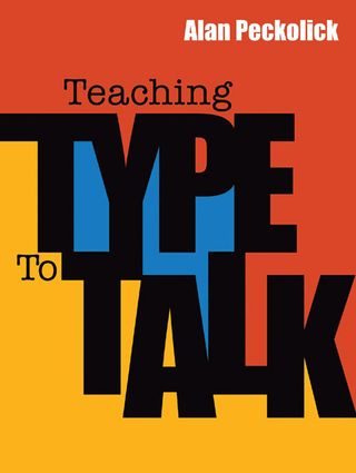
For the cover of my recent book, Teaching Type to Talk, I designed over 50 covers until we chose the one that worked perfectly. Instead of discarding the studies this time, we decided to pay homage to all of the solutions that were not chosen for the cover by displaying them in the opening and closing spreads. Sometimes the process of searching is as satisfying as finding the solution, and a designer should be driven by that search.
Words: Alan Peckolick
American designer Alan Peckolick heralded a conceptual movement in graphic design known as expressive typography. His recent book, Teaching Type to Talk, is the first ever compendium to span the typographer's career.
This article originally appeared in Computer Arts issue 222.
Liked this? Read these!
- Create a perfect mood board with these pro tips
- The ultimate guide to logo design
- Illustrator tutorials: amazing ideas to try today!

Thank you for reading 5 articles this month* Join now for unlimited access
Enjoy your first month for just £1 / $1 / €1
*Read 5 free articles per month without a subscription

Join now for unlimited access
Try first month for just £1 / $1 / €1
Get the Creative Bloq Newsletter
Daily design news, reviews, how-tos and more, as picked by the editors.
The Creative Bloq team is made up of a group of design fans, and has changed and evolved since Creative Bloq began back in 2012. The current website team consists of eight full-time members of staff: Editor Georgia Coggan, Deputy Editor Rosie Hilder, Ecommerce Editor Beren Neale, Senior News Editor Daniel Piper, Editor, Digital Art and 3D Ian Dean, Tech Reviews Editor Erlingur Einarsson, Ecommerce Writer Beth Nicholls and Staff Writer Natalie Fear, as well as a roster of freelancers from around the world. The ImagineFX magazine team also pitch in, ensuring that content from leading digital art publication ImagineFX is represented on Creative Bloq.
