Why everything starts with Helvetica for Experimental Jetset
The reclusive, obsessive Dutch trio discuss how the neutral typeface has paradoxically come to define them.
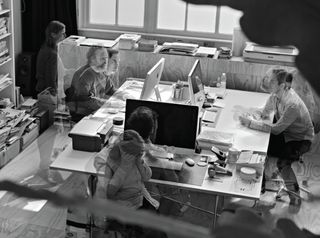
The clean lines, monochrome colour palette and Helvetica-flavoured simplicity of Experimental Jetset's body of graphic design work can be deceptive. For beneath every bold geometric shape and clever twist of wordplay you'll find a rich layer of thought-provoking concepts and often obscure cultural touchpoints that reward further exploration.
In some cases, these references are subtle enough to be missed by all but the most attentive of viewers, and require some level of explanation - and the studio often delves into these things in a great deal of depth through fascinating essay-like write-ups on its website. But these are always about the work, and all too rarely about the people behind it.
Experimental Jetset comprises Danny van den Dungen, Marieke Stolk and Erwin Brinkers - but unless you're fortunate enough to catch the trio face-to-face, it's rare that an individual voice breaks from the collective. Emails are signed either with all three names, or simply 'EJ'. Fortunately, Computer Arts had the chance to sit down with Van den Dungen, Stolk and Brinkers at the end of February, following an engaging talk at Design Indaba about their creative influences.
Before we even start, Stolk ponders: "Would it not be easier to do this via email?" She's concerned that they may come across as too abrupt: after all, the trio like to put almost as much thought into their responses as they do their work.
Pack mentality
We're sitting on a balcony outside the conference venue; Van den Dungen's girlfriend joins us briefly, bringing a couple of plates of buffet salad. As the trio tuck in, they begin to relax and we begin by discussing how the three of them function as a unit.
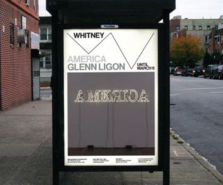
"We try to do everything collaboratively," asserts Brinkers. "We tend to work on the same thing as much as possible, because we think we're really a unit of graphic designers, rather than three separate ones." Although not a football fan, unlike many of his compatriots, Van den Dungen reaches for a familiar Dutch sporting metaphor to continue Brinkers' theme: "We sometimes compare it to Total Football," he grins. "We once saw an interview with Johan Cruyff, where he was explaining this system where every player is able to play each other's role. That's something we aspire to."
Experimental Jetset's Amsterdam-based studio is around 70 square metres; small enough to be intimate but large enough to keep the trio - who have been working together for 17 years, since studying together at the Gerrit Rietveld Academie - from treading on each other's toes. "If we were a studio in New York, we'd probably have 20 square metres," Stolk points out. "It's really all a question of context. For me, it's not the amount of space we have but the amount of time we've been working together that's more worrying."
Certainly it helps to explain how three independent minds can function with such a unified sense of purpose. "Everybody does have different interests," insists Van den Dungen. "It's not that we're three versions of the same designer, it's more like we're different aspects of the same designer maybe. Everybody brings something else to the table." Perhaps the emails being signed 'EJ' acknowledge the studio almost as a fourth personality, greater than the sum of its parts? "Sometimes you look at work as if you were not the one that made it," confirms Stolk.
"Because we create it with all three of us, it's like this other entity. Not that we don't feel responsible, of course - we put our names on it, after all - but it's still all three of our names," she continues. "It's quite abstract, and I think that's quite pleasant."
Obsession by design
The three designers are influenced by the music of The Beatles and The Jam, as well as the films of Jean-Luc Godard and Stanley Kubrick - with whom Experimental Jetset shares an obsessive attention to detail. We move on to discuss how that perfectionism manifests itself.
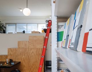
"During the [Design Indaba] lectures there was a lot of talk about mistakes, which is something that we're also interested in," considers Van den Dungen. "At the same time, we think that mistakes only exist if you try to achieve perfection." Brinkers interjects: "If making mistakes is your goal, it's not a mistake anymore," he reasons. "That tragedy of failure is only beautiful if you strive for that idea of perfection. There's something about that struggle of trying to achieve something, when you know you will never get there."
Besides Kubrick, there's another cinematic reference point that can be found woven throughout the studio's body of work - the 1966 film Blow Up, directed by Michelangelo Antonioni. "It's a film about art, memory, photography, music, film, design and life itself," Van den Dungen explains. "The movie also hints at the existential void, the terrifying nothingness."
Of course, compared to the likes of Kubrick or The Beatles, references to Antonioni could pass the average viewer by. Perhaps in some cases, these allusions are as much for the trio's own personal satisfaction as anything else? "Yes," confirms Stolk with a wry smile, leaving Van den Dungen to elaborate.
"We like to compare it to a meal," he explains. "Sometimes you don't know the exact ingredients, but you can still taste them. Even if you don't exactly get the reference, you can understand that it's rooted in something."
Another obscure influence from the 1960s is the Brazilian artistic movement Tropicália. Anyone curious to know more about such things can indulge in some of the explanations on the Experimental Jetset website, or "long, winding, boring stories" as Van den Dungen mischievously calls them. But these layers of allusions aren't about self-indulgence: "It's not like we just add in those references. You need them to create the work," he insists. "It's not some kind of superfluous layer on top of it, we cannot get it out."
Indeed, in some cases the references are themselves the subject of the work - as was the case for the 2003 poster Zang! Tumb Tumb, which remixed John Lennon and Yoko Ono's War Is Over poster using the onomatopoeic words of the Futurist Filippo Tommaso Marinetti, intended to evoke the sound of falling bombs.
Binding all of these layers together is the visual style of Dutch modernism, which surrounded all three designers during their formative years, and which colours everything their studio creates. Or, more accurately, removes colour from it, in favour of stark black sans-serif type on pure white. "It's our language," shrugs Brinkers. "It's what you say with it that matters."
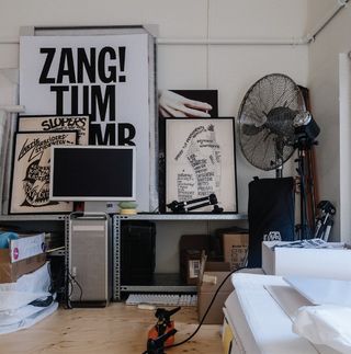
So rooted is Experimental Jetset's signature style in the graphic language of the studio's forebears, particularly the great Wim Crouwel, that some reactions have been negative. "Since the beginning of our career we've been criticised - ridiculed, even - by a lot of people who see us as a nostalgic, almost retro thing," confesses Van den Dungen. "But we were brought up in this language, and we have a certain right to do our own thing with it."
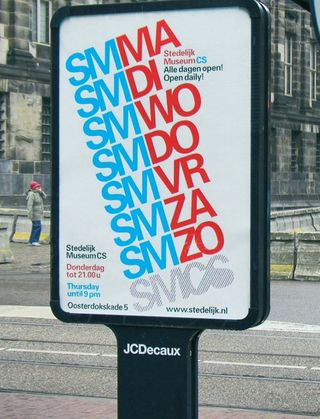
Tasked in 2004 with creating a graphic identity for the Stedelijk Museum's temporary location in Amsterdam, for instance, Experimental Jetset made reference to Crouwel's 'SM' logo, but also used an Airmail pattern to allude to the venue's former use as a Dutch Post distribution centre.
"We wanted to refer explicitly to those two social democratic institutions - historically two of the most important commissioners of design in the Netherlands - and also react to the fact that both of them at the time were in the process of being privatised."
Deceptive neutrality
Ironically, one of the most distinctive features of the graphic palette with which the studio paints is a typeface famed for its neutrality, and that the trio selected because they wanted the conversation to be about the idea, not the font in which it's set. Of course, being interviewed for a documentary about everyone's favourite Swiss sans serif can't have helped.
"Helvetica is our starting point; it's like a blank piece of paper," reflects Brinkers. Stolk goes on to explain how, when the three of them graduated in 1997, typefaces were beginning to proliferate and distract designers from the concept at hand, a phenomenon they were keen to avoid.
"The paradox is really interesting," muses Van den Dungen. "It's like an architect using a really standardised, pre-fab element, and still trying to make it their own. If it's your handwriting, but at the same time it's used by millions of companies all over the world, then what exactly is it that's your handwriting?"
The potential social and political influence of design fascinates Experimental Jetset as much as its cultural value - although, this tends to translate into a particular aesthetic, packed with layers for viewers to unpack, rather than being more campaign-driven.
"Some graphic designers want to provide answers, and some really want to ask questions," muses Brinkers, setting up Stolk's closing thoughts nicely. "Interpretation is very important," she adds. "We try to leave things open for other people to fill in. We don't want to tell people what to think, but we do want to encourage them to think."
This article originally appeared in Computer Arts issue 227.

Thank you for reading 5 articles this month* Join now for unlimited access
Enjoy your first month for just £1 / $1 / €1
*Read 5 free articles per month without a subscription

Join now for unlimited access
Try first month for just £1 / $1 / €1
Get the Creative Bloq Newsletter
Daily design news, reviews, how-tos and more, as picked by the editors.

Nick has worked with world-class agencies including Wolff Olins, Taxi Studio and Vault49 on brand storytelling, tone of voice and verbal strategy for global brands such as Virgin, TikTok, and Bite Back 2030. Nick launched the Brand Impact Awards in 2013 while editor of Computer Arts, and remains chair of judges. He's written for Creative Bloq on design and branding matters since the site's launch.