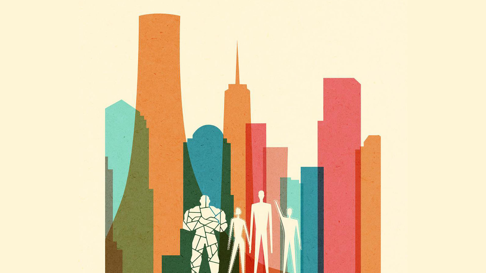
When design meets music and results in beautiful artwork
Here we take a look at three projects where music has directly influenced the subject, medium or message.
Design and music - a partnership that goes together like Simon & Garfunkel, Hall & Oates, Captain & Tennille. Without one, the other may just pale into insignificance. Yes, the influence of music upon professional designers and illustrators is that strong. Of course, we're not saying without one the other wouldn't exist; but you can't help but think that without the influence of music, some of today's most inspired design and illustration projects may have been a little less 'finely tuned'.
We're generalising a little, but poke your head into any design studio across the world and you're likely to see designers - cans on - enjoying tunes whilst they work. Design and illustration - or any creative jobs - are professions where music doesn't act as a distraction; it's a way of mentally dialling in to a project, of escaping into your own thought processes, of getting inspired. But what we're looking at here is how music has inspired projects directly; not those projects where 'music has got you through', but where it has taken centre stage.
Illustrated songs
For Barbara Ana Gomez - an illustrator based in London - her love of music transcended into a huge project entitled Illustrated Songs. In this diverse collection of illustrations, Gomez brings her favourite songs to life in her own unique, hand-drawn-meets-Photoshop style. "Illustrated Songs started as my final project for uni - though it was called Illustrated Music, then," she begins. "I made a long scroll inspired by the lyrics of Space Oddity: almost three metres, filled with drawings. It was a really fun experience and I was very happy with the result, but it was hard work. I ended up exhausted."
But the exhaustion didn't put her off - two years later she decided to resurrect the idea, making much smaller drawings purely inspired by the songs she loves. "Now the collection is slowly growing, new songs being added when I can get around to it. It's a very special project to me, and I can tell that it'll go on for a long time," she smiles.
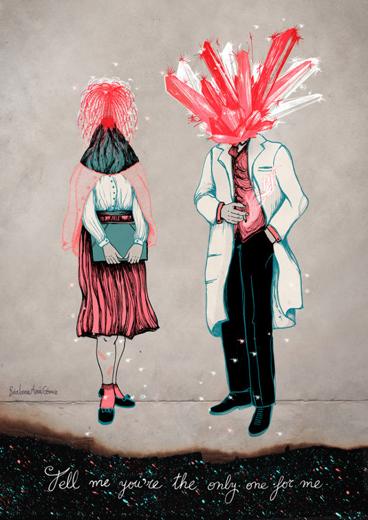
So how does Gomez go about compressing some pretty epic tunes into single pieces? "It's funny because I just realised that it usually happens on a bus," she laughs. "I am listening to music, relaxed, looking through the window, and then a song moves me. I start imagining images or concepts that could portray it visually. I note these ideas in my notebook and I revisit them from time to time - it could be weeks or even months - until I have a defined idea that I like.
"All the songs that I have illustrated are among my favourites," she continues. "But not all my favourite songs inspire me to make an illustration - sometimes I might enjoy listening to a song, but I don't get a mental image to represent it."
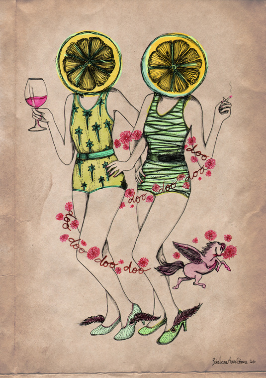
When browsing the collection, it's apparent that one artist is key to Gomez's inspiration - The National. The American indie rock band's 'Gospel' provided the inspiration for an entire sketchbook created for The Sketchbook Project. "This is a fun project by the Brooklyn Art Library," she begins. "You get a blank sketchbook that you have to fill in with whatever you want and post it back to them. They add it to a mobile library that travels around the world and eventually ends up being part of a permanent collection of sketchbooks at the Brooklyn Art Library. I already had this vague idea of doing something special with the song Gospel, and I thought that it was a great opportunity for it. Also, I liked the fact that the book would be archived in Brooklyn, the place where the band was based. It all made sense."
Get the Creative Bloq Newsletter
Daily design news, reviews, how-tos and more, as picked by the editors.
Work inspired by The National spreads through the project, with songs such as Lemonworld and About Today at the heart of it. "I actually have more ideas inspired by their songs, that will come into existence someday," she says. "For now, I'm working on other favourite bands of mine to add some variety to the project and avoid looking like a psychofan." But… "The thing with the National is that their music really moves me, and the lyrics are so amazing that they project a lot of images in my head when I listen to them. Illustrating their songs is so easy and enjoyable for me."
Of course, these personal projects can add a lot to any illustrator's portfolio, and Illustrated Songs, according to Gomez, gives her the freedom to experiment and try new things outside of the client arena. "I consider Illustrated Songs my biggest project so far, and my plan is for it to continue growing for a long time. I am also quite proud of my online shop where I sell prints. It was some work to set up the website, decide which illustrations to print, find nice suppliers, work out packaging costs and so on, but I think it was worth it." See the project in its entirety and buy prints here.
From Radiohead to SOHN
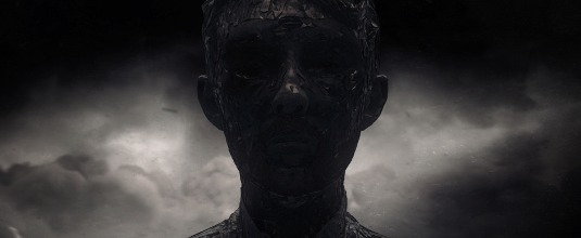
25 year old New York-based illustrator, animator and designer Tom Alex Buch - who has worked at renowned studio Vault49 among others - found inspiration in Radiohead's 'Amnesiac' album. Buch created a stunning short, set to the track 'You and Whose Army?'. "I wanted to raise the bar with my Radiohead piece, invest some serious time in creating something large scale," he says of the piece. "It's in essence a series of experiments inspired by the lyrics and album concept."
Buch continues: "Dark and brooding, I loved crafting my own take on a classic. They [Radiohead] defy convention and prove brilliant inspiration for my more experimental pieces. It's powerful music and I wanted my work to match the tone. Amnesiac's existing cover art is a weeping minotaur from Greek mythology - it triggered ideas for a few of the scenes and now serves as a showreel for my darker work."
The complex, monotone, enchanting short is a technical masterpiece as well as an atmospheric one. "I used a lot of software to create the work - predominantly Cinema 4D, After Effects and ZBrush. I really honed some techniques and am currently finishing up a music video commission of a similar scale. Watch this space!"
Buch's other work inspired by music - namely an animated typeface based on the work of English musician SOHN - is equally impressive. "His [SOHN's] unique sound suits my general aesthetic and I wanted a type piece for my portfolio. I think he will be huge, his brand of electropop is beautifully atmospheric and detailed." He continues: "The piece was just about capturing the atmosphere of the music – his voice is ethereal. The aim was create a type piece so detailed that crops could be taken from sections of the lettering." See more of Buch's stunning portfolio here.
Electronica, in print
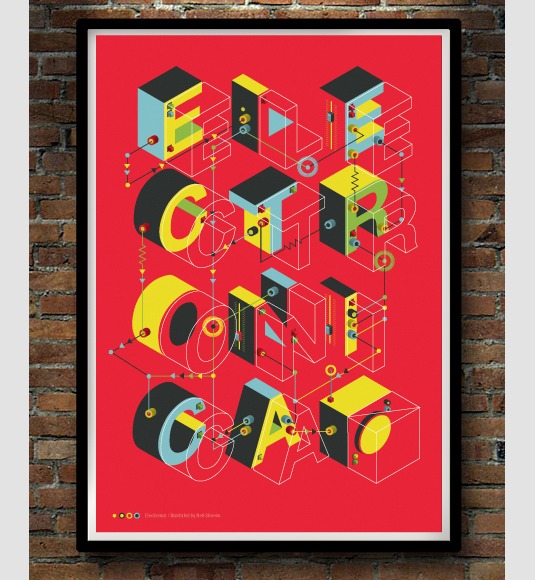
"Electronica is always the genre I go to whilst working when it's crunch time, or I need a kick or a little boost to pick the speed up," says London-based freelance illustrator Neil Stevens - otherwise known as Crayonfire. The accomplished editorial illustrator - whose clients include Wired, The Guardian, Modus and net magazine amongst many others - crafted this beautiful print as an appreciation of his favourite genre.
"Electronic music by nature is very structured, layers building up and connecting in many ways," he continues, starting to build up a picture of how the piece was put together. "Rather than have just flat type, I created the 3D forms to represent the depth in the musical layers of this genre. Added on top I created a wireframe letterform to indicate the travelling sound waves of music through wires - as a nod back to the old ways of connecting music to your ears through headphones and wires."
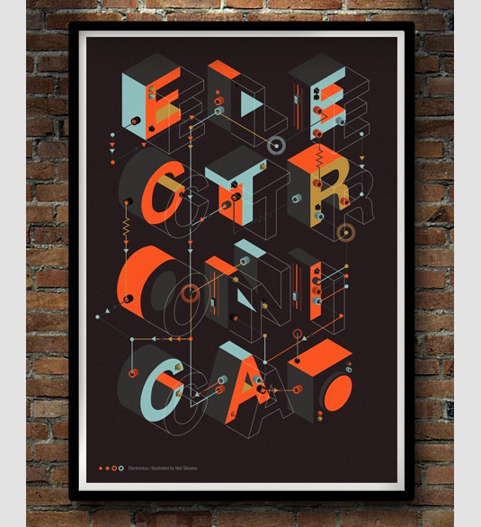
Not only has electronic music directly influenced Stevens' work, it also plays a part daily on getting the illustrator through his sometimes gigantic workload. "As corny as it sounds as the beat and rhythm of the music builds so to can your speed of output and indeed your enjoyment of it," he smiles. "I often try to visualise what these sonic soundscapes would look like, either as shapes or colour. The Chemical Brothers especially have many intricate layers in their music and I try to mirror that in some work."
For Stevens - much like Barbara Ana Gomez - his print shop is central to his portfolio. "Creating prints is a great way of either making your work earn money for you, or giving you the chance to create self-initiated projects that you wouldn't have the chanced to create elsewhere within your commissions," he says. "It gives you the chance to create work you love, to experiment and to get your work seen in areas that commissioned work wouldn't. I'd recommend creating prints of what inspires you to anyone; you never know where it may lead. I once ended up in a hot-air balloon due to a print I once produced." See more of Stevens' work here and pick up one (or more) of his stellar prints here.
Music on the radar
Whatever the genre, whatever the lyrics, whatever the instrument, music will continue to inspire designers, illustrators and creative professionals for as long as both exist. Whether indirectly as a way of tuning in, or directly - like we've seen in these three case studies - it seems as though without sound there may be no vision, in more ways than one.

Thank you for reading 5 articles this month* Join now for unlimited access
Enjoy your first month for just £1 / $1 / €1
*Read 5 free articles per month without a subscription

Join now for unlimited access
Try first month for just £1 / $1 / €1

Rob is editorial, graphic design and publishing lead at Transport for London. He previously worked at Future Publishing over the course of several years, where he launched digital art magazine, ImagineFX; and edited graphic design magazine Computer Arts, as well as the Computer Arts Projects series, and was also editor of technology magazine, T3.
