Wes Anderson's latest movie in a flat design style
Movie buffs will love this latest flat design project that uses The Grand Budapest Hotel as inspiration.
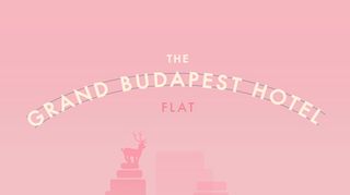
Love it or hate it, there are some examples of flat design that actually work. When flat design is done right, it can look wonderful and this latest project does exactly that. Movie buffs and hipsters will rejoice as Barcelona based designer Lorena G transforms Wes Anderson's latest movie into a flat design wonder.
This tribute to The Grand Budapest Hotel sees Lorena G depict some of the film's most iconic props as beautiful flat design offerings. Including character's hats, cute little cakes and the building itself, it's the perfect homage to the director and his gorgeous aesthetics.
Take a look at some of the creations below and be sure to check out Lorena G's Behance page to see the rest of her illustrations. This is certainly a project to raise a smile and garner some wonderfully beauitful flat design inspiration.
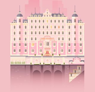






See more designs from this project over on Behance.
What do you make of flat design? Let us know your thoughts in the comments box below!

Thank you for reading 5 articles this month* Join now for unlimited access
Enjoy your first month for just £1 / $1 / €1
*Read 5 free articles per month without a subscription

Join now for unlimited access
Try first month for just £1 / $1 / €1
Get the Creative Bloq Newsletter
Daily design news, reviews, how-tos and more, as picked by the editors.

Sammy Maine was a founding member of the Creative Bloq team way back in the early 2010s, working as a Commissioning Editor. Her interests cover graphic design in music and film, illustration and animation. Since departing, Sammy has written for The Guardian, VICE, The Independent & Metro, and currently co-edits the quarterly music journal Gold Flake Paint.