Want to create your own typeface? Follow this advice
Typeface designer Peter Biľak shares the benefit of his experience for anyone wanting to create their own type.
Can't find the right typeface? Why not consider creating your own? We chatted to Slovakian graphic and typeface designer Peter Biľak, based in The Hague, Netherlands, and he shared his tips and advice for designers creating typefaces.
Should graphic designers create their own typefaces?
I applaud people who try to make fonts. It deepens their understanding of typography and type design. They will also appreciate existing typefaces more. Having said this, type design is dependent on a particular set of skills, which take time to acquire.
I teach type design at the Royal Academy of Art in The Hague, and the usual pattern with our students is that they quickly want to create typefaces that they will publish and sell. It usually takes them a year or so, and by the time they are finished, they develop basic understanding of letterforms and realise that they have to start all over again. Their skills haven't caught up with their critical eye yet.
Type design is like making pancakes. The first one will not be good, but it is important to make it to get the good ones later.
Where do you get your inspiration from for a typeface?
I'm personally interested in things which haven't been done, pushing old ideas further, and looking for new ones. It comes out of drawing a lot. I always cary a sketchbook, where I try different ideas. Most of them are rejected, or lead to other ideas.
It is not a problem to draw any form I choose. The most time consuming thing is to find the idea that is worth developing into a fully fledged typeface. Anyone can learn to control the bezier curves very quickly, but that doesn't make one a type designer, at least no more than mastering basic grammar makes one a writer.
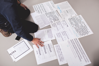
Inspiration comes from the larger world, form the techniques we use, how the typeface will be used, what will it be its typical context, will it be read on screen or on paper.
I often look at other languages, too, and they may inspire different solutions. Our foundry offers not just fonts for Latin-based languages, but also Greek, Cyrillic, Arabic, Armenian, Devanagari, and working on other complex writing scripts.
How do you go about creating a typeface?
After identifying the idea, I test it in a word, usually creating small drawings. When I see potential in these drawings, I take it to the computer, where I explore the details. The devil lies not in the detail, but in the whole image, so it is important to evaluate if the idea works across all letters, rather than just focusing on a single one.
Slowly, a whole set is made, and depending on the intention of the typeface – is it for display or text purposes? – I decide on the character set. Does the design need special glyphs, ligatures, small caps, alternative shapes, extended language support? These choices are dependant on the design idea.
I usually work in a mix of software: from commercially available ones – FontLab, RoboFont – to self-made scripts, or tools made by colleagues. If the design consists of several styles – it's likely there will be two, three or more master styles, which will be interpolated, and outlines need to be prepared for interpolation in Prepolator, a wonderful tool by Tal Lemming.
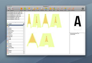
Interpolation is made in Superpolator, a tool made by Erik van Blokland. Those are small tools, which are great for doing one single thing, rather than trying to be a one-box solution. There are special tools for spacing and kerning the fonts, and special tools for hinting them.
There is plenty of testing in all stages, printing, evaluating design, going back to design. The process is not linear, but full of detours, going back and forth, until the typeface is doing what I intended to do.
What problems do you tend to encounter?
A typical problem is that the workflow creating for one project is not working on a new one. Each typeface that I've worked on usually requires modifying our workflow, often creating new tools to make it more efficient. Typefaces are easy to start drawing, but difficult to complete, so overcoming the technical part is the biggest hurdle for most designers. One has to have a certain rigour to finish things, and it may take a very long time to complete and publish them.
I am lucky to work with more people to complete them. It would be, for example, difficult to finish without the help of Nikola Djurek, who has been working with us for many years.
With the advent of self-publishing, and one-man-foundries, a problem is also to recognise a value in the work, since the maker often lacks the outsider's perspective.
In other forms of publishing you have the editor and publisher who provide the feedback and improve the results. In self-publishing, it is easy to publish sub-standard work, because of the lack of critical response. It takes experience to judge what is worth publishing, and what should wait and be developed further.
This article originally appeared in Computer Arts.

Thank you for reading 5 articles this month* Join now for unlimited access
Enjoy your first month for just £1 / $1 / €1
*Read 5 free articles per month without a subscription

Join now for unlimited access
Try first month for just £1 / $1 / €1
Get the Creative Bloq Newsletter
Daily design news, reviews, how-tos and more, as picked by the editors.
The Creative Bloq team is made up of a group of design fans, and has changed and evolved since Creative Bloq began back in 2012. The current website team consists of eight full-time members of staff: Editor Georgia Coggan, Deputy Editor Rosie Hilder, Ecommerce Editor Beren Neale, Senior News Editor Daniel Piper, Editor, Digital Art and 3D Ian Dean, Tech Reviews Editor Erlingur Einarsson and Ecommerce Writer Beth Nicholls and Staff Writer Natalie Fear, as well as a roster of freelancers from around the world. The 3D World and ImagineFX magazine teams also pitch in, ensuring that content from 3D World and ImagineFX is represented on Creative Bloq.
