Video tutorial: Tone and colour stylising in Photoshop
Ben Secret reveals how to contour skin tones and add structure through Photoshop's tone and colour processing tools
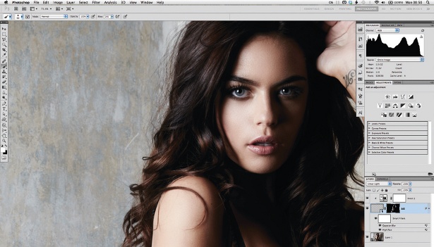
This is a simple tone and colour processing chain. The first stage, using the control points to create a custom tone curve, is a way to selectively contour skin tones in Photoshop. Adjustments made here will usually be subtle, as we want to avoid the curve moving too close to horizontal or vertical. Using these four control points, we can usually soften or add structure to skin and facial features by controlling where the contrast is.
- Check out the latest Photoshop CS6 review
Curves colour adjustments tend to involve either basic colour balancing (moving the middle point up or down), changing the contrast for each channel (with an S-curve or inverted S-curve) or shifting the black and white points – and these basic controls can be used in combination.

01 For the first step, we’re going to create a custom tone curve. With pictures of people, this is useful for controlling the tonality of the skin. Create a Curves adjustment layer, and select the ‘Click and drag in image to modify curve’ button. With this, we’re going to create four curve control points by clicking on four different skin tones in the image: highlights, high midtones, low midtones and shadows.

02 Ideally, I’m looking for each point to give me a control point roughly in the middle of each of the highlight and shadow zones in the Curves GUI. How far I am from being able to do this with existing skin tones can give me an idea of what I need to do. Starting with the highlight point, and working through to the shadows, experiment with the curve, moving each control point up or down until the desired look is achieved.

03 The next step is to stylise the colours. Create a Curves adjustment layer and select the Blue channel in the Curves GUI. Blue is often a good colour to start with as it’s one we can be most creative with. Here, we’re going to add blue to the blacks and yellow to the whites. To do this, take the bottom left control point up to an output of 18, and take the top-right point down to 248.

04 Next we can move on to the Green channel. This usually requires more subtlety, as it can shift skin into unnatural territory. We’re going to add a little green to the midtones, which should just add a colour tint to the background. Create a control point in the middle of the curve and bring the output up to about 136. We can do the same with the Red channel, as a basic colour balance.

05 Now introduce a film-like output tone. Create a new Curves adjustment layer and take the bottom-left point up to raise the blacks to an Output of about 11. Now take the top-right point down to about 250. Finally, about 25% of the way up and down the curve, bring the curve back towards its original position.
Get the Creative Bloq Newsletter
Daily design news, reviews, how-tos and more, as picked by the editors.

Thank you for reading 5 articles this month* Join now for unlimited access
Enjoy your first month for just £1 / $1 / €1
*Read 5 free articles per month without a subscription

Join now for unlimited access
Try first month for just £1 / $1 / €1
The Creative Bloq team is made up of a group of design fans, and has changed and evolved since Creative Bloq began back in 2012. The current website team consists of eight full-time members of staff: Editor Georgia Coggan, Deputy Editor Rosie Hilder, Ecommerce Editor Beren Neale, Senior News Editor Daniel Piper, Editor, Digital Art and 3D Ian Dean, Tech Reviews Editor Erlingur Einarsson, Ecommerce Writer Beth Nicholls and Staff Writer Natalie Fear, as well as a roster of freelancers from around the world. The ImagineFX magazine team also pitch in, ensuring that content from leading digital art publication ImagineFX is represented on Creative Bloq.
