Video tutorial: Match tone and colour in Photoshop
Recreating the aesthetic of vintage film, Mario Testino or Renaissance painting? Ben Secret breaks it down
This is a simple, layered workflow for matching one image to another. The first thing you’ll need to do is load your unprocessed image and the image you’re trying to match it to into Photoshop CS6 (or any version back to 3), then set up a workspace where you can compare them side by side on separate layers.
It doesn’t matter if we have to resize the images to make them fit, because we’re really just finding the settings that will work. Curves layers are particularly powerful for controlling tone and colour. In fact, there’s very little you can’t do with them, apart from Selective Color processing.
01 The first thing you need to do is set up your workspace. Arrange both images side by side on separate layers, with the unprocessed image on the bottom. Create two Curves layers and a Hue/Saturation layer above the unprocessed image, but below the image you’re analysing. Now create a Solid Color adjustment layer, set to 50% grey (RGB: 128, 128, 128) and put it on top of all your layers, along with a Selective Color layer.
02 To match the tonality, make both images appear black and white. To do this, change the Solid Color layer’s blending mode to Color. Then select your lowest Curves layer and change its blending mode to Luminosity. Use your Marquee tool and the Histogram panel to match your black and white points in the Curves layer first. Now experiment with subjectively matching contrast and tonality with a 1- or 2-point curve.
03 To analyse colour, go to your Solid Color layer and change the blending mode to Luminosity. Now you can see your images represented as coloured marks. Select your second Curves layer – keep its blending mode set to Normal – and, using the Red, Green and Blue curves, we can attempt to match the colours we find around our highlights and shadows. Set black and white points first.
04 Now we can move on to matching colour saturation. Go to your Selective Color layer – ensure it’s set to Absolute mode, rather than Relative – then cycle through the colours in the pull-down menu: Reds, Yellows, Greens, Cyans, Blues, Magentas, Yellows and turn the Black slider down to −100%. Then cycle through the neutral colours: Whites, Greys and Blacks, and turn the Black slider up to +100%.
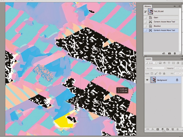
05 This should leave you with strange-looking black-andwhite images, with the white representing full saturation; and the black, full desaturation. Now go back down to your Hue/ Saturation layer (I like to set its blending mode to Color) and simply adjust the Saturation level until you get them roughly matching. You can then turn the Saturation Map’s visibility off and repeat the whole process if you need to.
Get the Creative Bloq Newsletter
Daily design news, reviews, how-tos and more, as picked by the editors.

Thank you for reading 5 articles this month* Join now for unlimited access
Enjoy your first month for just £1 / $1 / €1
*Read 5 free articles per month without a subscription

Join now for unlimited access
Try first month for just £1 / $1 / €1

The Creative Bloq team is made up of a group of art and design enthusiasts, and has changed and evolved since Creative Bloq began back in 2012. The current website team consists of eight full-time members of staff: Editor Georgia Coggan, Deputy Editor Rosie Hilder, Ecommerce Editor Beren Neale, Senior News Editor Daniel Piper, Editor, Digital Art and 3D Ian Dean, Tech Reviews Editor Erlingur Einarsson, Ecommerce Writer Beth Nicholls and Staff Writer Natalie Fear, as well as a roster of freelancers from around the world. The ImagineFX magazine team also pitch in, ensuring that content from leading digital art publication ImagineFX is represented on Creative Bloq.
