Video tutorial: Create a vintage toy camera look in Photoshop
Struggling to emulate the looks of retro film photography? Ben Secret shows you how
The toy camera aesthetic is a great way to practice image-editing in Photoshop, since it really encourages you to push your use of colour processing and blended textures, and to be deliberately spontaneous and careless. While the looks you come up with might seem too heavily stylised for much of your everyday photo-editing work, they can always be toned down and mixed in more subtly where needed, using the opacity controls.
In the first half of this two-part tutorial, we’ll look at colour processing – particularly focusing on how you can use the Selective Colour tool to complement the Curves tool. In the final part we’ll look at various ways to blend in a selection of textures and complete the look.
01 The first step is load your image and add a Hue/Saturation adjustment layer. You can come back to the Saturation control at any point to change how the colour processing is applied. Add +25 to the saturation, to keep your main colours well defined. Reducing the saturation here can result in more subdued looks, where the colour mainly comes from your Curves layer.
02 Next add a Gradient adjustment layer. This is to create the coloured vignette effect. Set the gradient style to Radial, and now edit the gradient itself. Here I used a greyish pink colour #8F7480 for the centre of the gradient, and a dark green, #0B3A24, for the outside. We can change the scale of our vignette and move the centre around manually. I used it with the Soft Light blending mode at 100%.
03 Add a Curves adjustment layer next – this is where we can experiment. I slightly raised and lowered the black and white points respectively, and created a subtle S-curve to add contrast. Using the black and white points of the colour curve, add a lot of extra red tones to the shadows, about half as much green to the shadows and remove lots of blue from the highlights.
04 Now add a Selective Color layer. This is where we can fine-tune the colouring for all of the individual colours in our image. I set it to Absolute, and in the Red channel I added in +23 Magenta and +6 Yellow. Then in the Yellow channel I used +8 Cyan, -3 Magenta and +17 Yellow, and in the White channel I added in +6 Cyan and +4 Yellow. The results of this process are very much influenced by your initial saturation setting.
05 Your image is almost ready to have some textures applied to it, but first I used a Levels adjustment layer to further raise, and also clip, the black point. Here I dragged the black point on the Input level up to 43, then did the same thing again with the black point on the output level. This is another effect that can be fine-tuned and tweaked to your own taste, and just helps to add a subdued, scanned photograph look to your image.
MASTERING CURVES
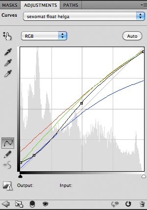
Curves is one of Photoshop’s most powerful tools, enabling you to remap the whole tone and colour palette of an image. But it’s also one of the most difficult to get to grips with. The key to keeping your colour processing looking natural is not to do anything too heavy with the curves themselves, but rather drag the top and bottom points up and down on their axes to shift the image’s black and white points. You can then try changing the shape of the curve to help balance and tint the greys and neutral colours.
The blue curve is usually where we have the most flexibility. The classic ‘cross-processed’ look usually starts with flattening the blue curve to add blue to the shadows and yellow to the highlights. As our colour curves here are mostly reducing the image contrast (by being fairly horizontal), we’re also using an RGB curve to bring some contrast back, particularly in the shadows.
Get the Creative Bloq Newsletter
Daily design news, reviews, how-tos and more, as picked by the editors.

Thank you for reading 5 articles this month* Join now for unlimited access
Enjoy your first month for just £1 / $1 / €1
*Read 5 free articles per month without a subscription

Join now for unlimited access
Try first month for just £1 / $1 / €1

The Creative Bloq team is made up of a group of art and design enthusiasts, and has changed and evolved since Creative Bloq began back in 2012. The current website team consists of eight full-time members of staff: Editor Georgia Coggan, Deputy Editor Rosie Hilder, Ecommerce Editor Beren Neale, Senior News Editor Daniel Piper, Editor, Digital Art and 3D Ian Dean, Tech Reviews Editor Erlingur Einarsson, Ecommerce Writer Beth Nicholls and Staff Writer Natalie Fear, as well as a roster of freelancers from around the world. The ImagineFX magazine team also pitch in, ensuring that content from leading digital art publication ImagineFX is represented on Creative Bloq.
