ustwo: Mouthing off about apps
The self-dubbed ‘Chief Wonka’ of the app world, ustwo’s mascot and co-founder Mills explains why agile development is the best approach
“Our apps are small parcels of candy fresh out of our app factory, designed to give users entertainment, utility, happiness and joy,” begins ustwo’s co-founder and creative director Matt Miller, better known simply as Mills. “Users want and demand quality, and we give it to them. It seems like everyone wants app success, but 90 per cent forget that quality is the prerequisite to achieving App Store glory.”
For Mills, app development is an opportunity to showcase the studio’s passion as well as its technical and creative skills. “It gives us a voice and generates loads of positive attention, lots of love, as well as a little obligatory hate too,” he smiles.

“The beauty of this brave new world is that it’s possible for anyone with the relevant skills to make something special and get it out to a potential user base of millions – or hundreds, in our case – anywhere across the globe. There’s really no reason for companies not to get busy.”
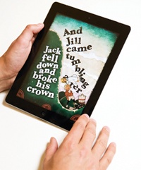
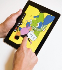
Best known in the creative community for its quirky, playful and beautifully designed apps such as MouthOff, Inkstrumental, Granimator and Nursery Rhymes with StoryTime, the studio’s typical development process breaks down into four key stages.
First up is the discovery phase: “This is all about research,” explains Mills. “Gathering thoughts and shadowing users, talking to clients, competitor research; the list goes on. We immerse ourselves from head to toe in the project we’re working on and its requirements.”
Second comes the concept phase, in which the studio draws up solutions to opportunities or problems exposed during the discovery phase. “Two of the most important principles we adhere to are ‘prototype it’ and ‘get it off the computer’ – unless that’s where it belongs, of course,” continues Mills. “Getting a concept working on a device tells you more about the quality of the concept than 50 pages of wireframes or flows ever will. Actually testing a concept with real users on the intended device is the best way to see if it works.”

Finally, the specification and implementation phases take the idea into reality: “This is purely about pushing pixels and writing code,” he says. “We use Scrum and Agile to run our projects. It’s all about getting design and dev working together.”
Mills reveals that some clients prefer these final two phases to be run separately for large-scale projects. However, the studio always tries to push the benefits of a cross-discipline team delivering a working product in short, sharp bursts (known within the developer community as ‘sprints’) rather than putting days into exhaustive documentation before the first line of code is written.
“Our process is similar to how other design studios approach their work,” he’s prepared to admit. “But the difference is that we add plenty of crme de la ustwo into the mix. That means we actually give a shit about the product and each other.”
As you might expect, there’s no such thing as an average ustwo project. “While we have a lot of experience on mobile, we’re not tied to any one platform, device or sector,” he explains. “Our projects vary widely from super-small handheld screens to large format and distributed systems. We’re experts in creating user experience, no matter the area or platform. It’s what we do best,” he adds, confidently.
When working with a new client or a new platform, inevitably a greater amount of time is spent on scoping out the options first, with more prototypes. “We want to spend just enough effort to prove or disprove the point,” he says. “If paper prototypes are enough to demonstrate and test a feature, that’s what we’ll do. If, for example, the concept requires a high-fidelity Flash prototype using real data, then that’s what we’ll do. A prototype is done to test and validate a concept, so whatever we need to do to make that happen, we’ll just do it.”
Different levels of testing will depend on the overall complexity of the project: “We test with internal users, grab people off the street, organise user groups or hire out fully kitted testing labs – all depending on what it is that we want to test,” explains Mills.
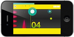
“For Nursery Rhymes we asked people in the studio to bring their kids in for a testing session, and also took early versions of the app to local schools to test with the kids there.” As this example attests, the studio is specific about defining its target market: “They are, after all, the be-all and end-all of everything. They are the user,” he shrugs. “Granimator was aimed at designers, PositionApp at developers, Nursery Rhymes at parents with children, Inkstrumental at ‘inkstrumentals’ and the Dots at graphical gamers.”

User testing takes place at the end of each sprint, and not simply at the end of the process: “It has to be ongoing, so we can iterate and change the approach if needed,” Mills points out. Once the app goes live, it’s equally important to act on feedback on the fly, either by monitoring App Store reviews or responding to direct emails from users. “We update our apps as and when we hear feedback,” he explains, “adding new features and then tweaking them to perfection.”
There are common factors that help to define a great app: “An addictive quality is key, and in the case of utility apps, usefulness helps,” reasons Mills. “For games, it’s all about building utter visual quality on top of gaming mechanics that make your heart skip a beat.”
Strong user interfaces, for Mills, are all about usability. “They should be intuitive and simply lead a user to the end goal, never getting in the way,” is his advice. “Mobile experience is perfectly formed, so it’s all about a shot of interaction offering efficiency to the user. Their time is precious: the UI has to flow and create enjoyment almost subconsciously, no matter what type of app it is.”
For a look at ustwo's new iOS title, Whale Trail, as well as our full Studio Life documentary on ustwo, head this way.
Daily design news, reviews, how-tos and more, as picked by the editors.

The Creative Bloq team is made up of a group of art and design enthusiasts, and has changed and evolved since Creative Bloq began back in 2012. The current website team consists of eight full-time members of staff: Editor Georgia Coggan, Deputy Editor Rosie Hilder, Ecommerce Editor Beren Neale, Senior News Editor Daniel Piper, Editor, Digital Art and 3D Ian Dean, Tech Reviews Editor Erlingur Einarsson, Ecommerce Writer Beth Nicholls and Staff Writer Natalie Fear, as well as a roster of freelancers from around the world. The ImagineFX magazine team also pitch in, ensuring that content from leading digital art publication ImagineFX is represented on Creative Bloq.
