The Ultimate Portfolio
You've done all the hard work and got plenty to show for it, but what's the best way to show off your talents? talks to the masters of folio presentation about building an online gallery.
Image is everything, at least in the world of advertising. Not that many designers consider themselves to be directly involved with advertising work, not even those who work chiefly for marketing executives. But advertising is fundamental to the success of any designer - nobody is going to hire someone they haven't heard of. As Jim Coudal of creative studio Coudal Partners says: "As a designer, you need to look at yourself as a product."
Advertising takes many forms. At the most subtle level it's viral, with word of mouth bringing in new work. But for lesser established freelance artists and design studios working in illustration, web design, 3D, or in fact any artistic discipline, it takes a little more to get people beating a path to their door. The key tool for active self-promotion is the internet, where a website can provide visitors with instant access to a digital portfolio.
When used in conjunction with links elsewhere on the web (typically on forums and other designers' websites), an online gallery helps to reel in clients that may never have heard of you otherwise. And it works equally well as a stop-off point for potential clients who get in touch via other means, giving them an instant insight into what has been achieved when working on previous designs and commercial projects.
"It's now mandatory to have a website where you can showcase your work," says Don Clark at Asterik Studio. "We have many different people visiting our site daily, from students and aspiring designers to art directors. It's an important tool for us and one that we update as often as possible."
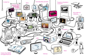
"But can it really bring in that much new work? Freelance illustrator Andrew Rae believes so, suggesting that his own online portfolio has been crucial to establishing his reputation and career. "It brings in new clients all the time. In fact, I never chase work any more; it all comes to me via my site. And because it's easier to view my work it's ideal to pitch with in the early stages of a job."
Acclaimed artist Richard May also reveals that much of his work springs from clients viewing his portfolio, both on his own website and on that maintained by his agent. "It's usually the first port of call for art directors. I have a printed portfolio, but I rarely need to use it any more. I've not used a CD portfolio for ages, either."
Getting it right
Clearly an online portfolio is a useful tool, but like any advertising tool, it needs to be handled correctly. A portfolio has the potential to be interesting, informative and a pleasure to view. Done badly, it can have a profoundly negative effect. As Todd Purgason of Juxt Interactive says, "If you want to make your mark with a portfolio, then you need to be creative, but there are eight million ways to blow it."
Get the Creative Bloq Newsletter
Daily design news, reviews, how-tos and more, as picked by the editors.
The trick is to approach an online portfolio in much the same way as a commission from a paying client, rather than simply fashioning something makeshift during a few spare moments between jobs. As simple as the basic concept of a portfolio is, there are many ways to design, compose, and present it. Getting it right takes forethought, careful planning and an appreciation of what you are actually trying to achieve.
Most crucially a portfolio needs to reflect a designer's own talent and appear as commercially appealing to as many people as possible. "People too easily lose sight of the need to create something that connects with potential clients," says Purgason.
Andrew Rae says that giving the visitor too much to take in, or forcing them to drill down through multiple levels to see all the work on offer, is not a good idea; such complexity can easily turn people off. "I do enjoy getting lost in someone's site, but if you want to build that kind of thing you still need to make it easy for people to take a quick look at your work. Then they can delve deeper if and when they have the time."
Being able to visit someone's website and almost immediately see what they have to offer can make all the difference in the competitive world of design. "People are always rushed for time," says Coudal. "When a company's marketing manager needs to find a designer, the first thing they'll do is look on the internet. If you don't have the presence to make an impact the moment they look at your site, then you won't end up on their shortlist and you won't get the work."
The first task when constructing, rebuilding or refining a portfolio is, of course, to decide exactly what to put in it. Whether to stick with one theme or show diversity, whether to focus only on commissioned work, just how much to content to include, how carefully to cherry pick what's included - it all adds up to a minefield for the portfolio apprentice.
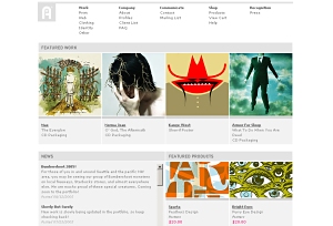
Coudal suggests that less is more: "Just a couple of pieces will do," he says. "A unified presentation is always preferable to a comprehensive folio of half-baked ideas."
Most designers agree that it's better to focus on fewer strong illustrations, than pad out a portfolio with lesser works. But do you have the objectivity to act as judge? "The only way to find that out is to show it to other people and watch their reactions," says Rae. But what about work you've created for a previous client that perhaps doesn't best represent those artistic talents? Rob Corradi of design studio Preloaded warns against including such work. "If you think it's lacking, chances are a potential client will too, and they probably won't care who it was created for."
So should you focus on just one style or show as much diverse content as possible? There's no doubt that showing many different styles or formats broadens commercial appeal with potential clients, but you must be confident that, by attempting to cover all bases, substandard work doesn't accidentally slip through.
"At Asterik, we pride ourselves on the fact that we work in many forms of design and illustration, so I really like seeing diverse portfolios," says Clark. "There's no need to pigeonhole yourself into one style. Unless that's all that you do."
Strong content is a must, but many designers fail to appreciate that the presentation can be just as vital, perhaps requiring even more attention. Most important is the need to display works in a pleasing, easily navigable way - along with any supplementary information and those all-important contact details, of course. Awkward-to-use menus, illegible interfaces that take an age to wade through and unnecessary frou-frou can all detract from the work itself.
"There's nothing more frustrating than a portfolio that is tedious to look at," says Purgason. "All too often, people get carried away with the presentation layer, and then you find that the work itself is rubbish. It's almost like they're trying to hide it using a fancy wrapper."
"When you're putting together a portfolio site it's pure information design, whether there's reams of copy or the briefest of text, or even just images," says Corradi. "A usable navigation that takes the visitor through some well thought out sections is key to making sure people get a solid sense of who you are, what you do and how well you do it."
"I can't tell you the times I've clicked on a link and known within 15 seconds that the person wasn't up to scratch," says Coudal. "Sites obviously hacked together from a Photoshop file and bad use of typography are two typical mistakes. And those working as web designers need to make sure the code for their site and portfolio doesn't contain any gobbledegook from a WYSIWYG editor. It's important to show that you can code by hand."
Reflect your talents
But how do you put together a website that makes viewing the portfolio plain sailing when your area of expertise isn't web design? Corradi suggests viewers will be more forgiving if an illustrator or motion designer doesn't have the most ambitious of websites.
"But whatever your level of competency, you should spend time ensuring that what you show is presentable and markets your work in the best way," he says. "Get a friend who is web-savvy to help you pull your site together if needs be. And if you don't know anyone webby, then search out someone online. The internet is a collaborative place and you'll be surprised how helpful complete strangers can be." But there's more to presentation than ease of use. The style of presentation is equally important. This isn't merely about aesthetics. And it's not only web designers who need to apply creativity in this way. It may be tempting to "resample" a successful portfolio design seen elsewhere, but while this results in something tried and tested, even subtle pilfering is likely to be noticed.
"Being able to emulate trends can be a good thing, but don't make it the core experience by applying it to the interface," says Corradi. "Most design agencies will probably have seen these trends way before you, and will assume that you aren't capable of doing your own thing." At the least, it's wise to tie the site thematically to the message the designer is trying to convey. "A folio can jar if it doesn't reflect the same language as the work," says Rae. But for the ultimate eye-catching portfolio nothing can beat a design that itself is as much a reflection of a designer's talents as the contents within. Just as clients are more demanding than ever, so potential clients are more discerning. As such, they'll expect to see designers treat the portfolio as a creative challenge in itself - failing to impress isn't an option. As Corradi says, "If a designer can't present their own work well, what hope is there that they'll present the work of a client with any competency?"
TO FLASH OR NOT TO FLASH?
If accessibility is a key feature of the successful online portfolio design, where does that leave the use of plug-ins, particularly Flash? Most designers agree that Macromedia's app is so ubiquitous it poses little problem for visitors, although it's wise to avoid creating a site using the very latest version. However, it is better at some tasks than others.
"You need to be careful how you use fonts," says Preloaded's Rob Corradi. "If you have to use small text, stick to pixel fonts that make sure your text remains legible. Flash can be a hindrance if clients want to print out illos from a portfolio, too."
Where Flash does excel is for portfolio sites with a high level of interaction and video presentations. Furthermore, it helps reduce browser/platform compatibility issues, thus minimizing site-testing time. The difficulties with Flash actually arise from how it's used.
"While a clever design might leave the Flash community frothing at the mouth, the people you need to appeal to might just find it annoying," says Todd Purgason of Juxt Interactive. Animations should be kept to a minimum (unless you're trying to demonstrate such Flash skills), particularly when used on laborious splash screens.
"Some people also hate pop-ups, but I like them," says Andrew Rae. "You can keep an image you like on screen while you look through the rest of the site, and it means I can put new work on the site without changing the homepage image."
TOP FIVE INSTANT PORTFOLIO REFRESHERS
1 Pare your portfolio down. Remove work that's too old, unrepresentative or lacklustre.
2 Give your front end a graphical makeover. Tie it in with the styles of the works featured inside.
3 Call in the professionals. Ask a web designer colleague to run you up a new online portfolio, or use the web to find someone who can help. You can always "skill swap" to avoid any expense.
4 Simplify the presentation. Try looking at your site as a client would and ask yourself if the interface gets in the way of the work. Or ask a colleague.
5 Check that all weblinks to sites featuring your work are up to date. Broken links are a sure sign of sloppiness.
DISCWORLD: PUTTING YOUR PORTFOLIO ONTO CD
Nothing beats an online portfolio for accessibility, versatility and ease of updating. But there are times when something more tangible is needed - when meeting clients face-to-face or applying for a job. While illustrators may prefer to take along a traditional portfolio, a digital alternative burned to CD or DVD is just as effective.
An online portfolio must appeal to as wide a client base as possible, but a disc-based portfolio can be tailored specifically to each client or potential employer. "You need to communicate what you know about a company back to them, and make yourself appealing to them," says Jim Coudal at respected design, advertising and interactive firm Coudal Partners.
To be appealing a portfolio must also be concise. If work is presented as a video file, try to keep it under the two-minute mark, focusing on just a few key pieces. A point-and-click presentation of illustrative work should be viewable within roughly the same time frame.
In terms of presentation, there are no hard and fast rules, but be aware of the need to present a unified theme. "That disc represents you and your art, right down to the way the menus are structured," says Coudal.
You may also need to post a CD or DVD for a third party to view. In these cases, include full instructions on how to use the portfolio, along with contact details and suchlike. Don't forget that presentation extends beyond what's on the disc itself. "A poorly kerned headline would be enough to stop me loading a disc," says Coudal. "The packaging is as important as the content."
TEN GREAT PORTFOLIO SITES
Our panel of expert designers show how key design issues relate to their own portfolios

WWW.ANDREWRAE.ORG.UK
Illustrator Andrew Rae taught himself about website design, then created his own portfolio. "There's a lot to learn, but the advantage of doing it yourself is that it's so much easier to update," he says.
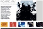
WWW.RICHARD-MAY.COM
Richard May's online portfolio reflects a very selective approach to content. "I only ever update it with work I'm happy with, regardless of which client each illustration was for and how old the work actually is," he says. "I do put big clients at the top of my client list, though."

WWW.ARCHIMEDIADESIGN.COM
Richard May called upon Brett Archibald (www.archimediadesign.com) to put his original site together, using Photoshop mock-ups as reference. "Sam Gilbey (www.personalspaceinvaders.co.uk) also gave it a makeover earlier this year," says May. "Both are close friends and were happy to help me out for nothing."

WWW.JUXTINTERACTIVE.COM
"Try to be memorable," says Todd Purgason, the man behind Juxt Interactive's distinctive website. "A lot of stuff you see online is glossy and boxy. We wanted to make an impact on first view, so went for something a little different without being overcomplicated."

WWW.PRELOADED.COM
Preloaded chooses to showcase just a few of its key projects on its online portfolio. "Always go for less is more," says Rob Corradi. "Often people just want to see the heights that you're capable of achieving."
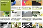
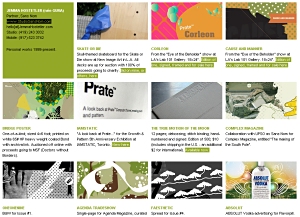
WWW.JEMMAHOSTETLER.COM
Designer Jemma Hostetler takes special care to note the projects that were collaborations and credit them accordingly. "If you've been a member of a team working on a large project, you can save everyone a lot of time and embarrassment by being clear about what parts of the project you did," stresses Rob Corradi.
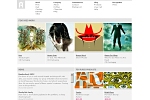
WWW.ASTERIKSTUDIO.COM
Asterik Studio supplements its online portfolio with a range of extras. "We have an online store and a personal bio section where we talk about the things we enjoy and music we listen to," says Don Clark. "It 's a great way to get our name and work out there."
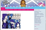
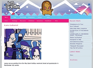
WWW.JONBURGERMAN.COM
Designer Jon Burgerman presents his complex portfolio in as simple a way as possible. "Don't add any "bells and whistles" to the process," suggests Don Clark at Asterik Studio. "Just make it easy for the viewer to find your work and keep them coming back."
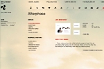
WWW.MAY1REBOOT.COM
The May1Reboot site isn't a portfolio site itself, but is a bookmarking must. "It's a site that every year encourages people around the world to refresh their sites in unison," explains Rob Corradi. "It is a great place to see many personal and promotional sites all in one place, that teaches about how to make a splash on the web."
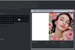
WWW.MECOMPANY.COM
Mecompany has clearly approached its website and portfolio design as a creative challenge in itself. As Andrew Rae says: "Design your portfolio to complement your work, keep it simple, limit the colours and make it enjoyable to use."

Thank you for reading 5 articles this month* Join now for unlimited access
Enjoy your first month for just £1 / $1 / €1
*Read 5 free articles per month without a subscription

Join now for unlimited access
Try first month for just £1 / $1 / €1
The Creative Bloq team is made up of a group of design fans, and has changed and evolved since Creative Bloq began back in 2012. The current website team consists of eight full-time members of staff: Editor Georgia Coggan, Deputy Editor Rosie Hilder, Ecommerce Editor Beren Neale, Senior News Editor Daniel Piper, Editor, Digital Art and 3D Ian Dean, Tech Reviews Editor Erlingur Einarsson, Ecommerce Writer Beth Nicholls and Staff Writer Natalie Fear, as well as a roster of freelancers from around the world. The ImagineFX magazine team also pitch in, ensuring that content from leading digital art publication ImagineFX is represented on Creative Bloq.
