TYPO Berlin: highlights from day one
Computer Arts brings you all the best bits from Berlin’s biggest design conference.
We're not going to lie: it was something of a rocky start for team CA at TYPO Berlin.
Having missed the crucial line in the programme that mentioned some talks would be in German, the first hour of the conference without translation headphones was mostly spent enjoying the inspiring pictures and waiting to pounce on the occasional snatch of English in Holm Friebe's introductory talk about the art of doing nothing (sorry, Holm!).

Those initial hiccups aside, the first day of TYPO - which this year took 'Roots' as its headline theme - turned out to be absolutely packed with insight, inspiration and its fair share of surreal entertainment value too - largely courtesy of the Scandinavian contingent from Stupid Studio and Snask.
So without further ado, here are our top three highlights from yesterday's design extravaganza at the striking Haus der Kulturen der Welt in central Berlin…
I'm with Stupid
It was a truly inspirational early afternoon session from Daniel Gjøde, creative director at Copenhagen-based Stupid Studio.
He presented his 13-step guide to his approach - ranging from jumping in at the deep end and staring failure in the face to the importance of loving the creative process, trusting your gut and perhaps most importantly, putting people above corporate strategy every time.
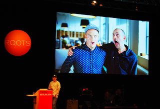
Studio culture was a big theme for Gjøde, who argued that a happy studio is a productive studio - sharing the very personal experience of what happened when Stupid lost sight of this mantra, ultimately dropping from 16 staff to just four when it all became too much: a dark period in the studio's history, he confided to us in the bar afterwards.
Get the Creative Bloq Newsletter
Daily design news, reviews, how-tos and more, as picked by the editors.
It has since built its way back up to that original quota of staff, with a much more people-focused ethos at its core this time.
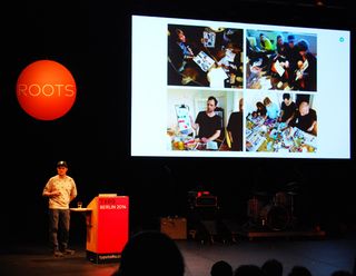
"If you ever consider running a company, forget about business plans. Focus on the people," is Gjøde's advice from experience.
He went on to argue that the final product is just one part of what is truly involved: "Design is not something you can hold in your hand," he said. "It's about the process: creativity is messy."
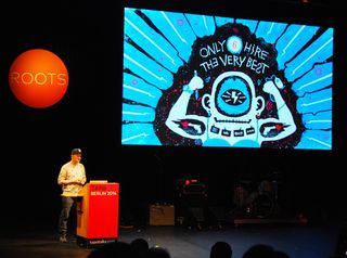
In a rallying cry that provoked cheers and applause from the auditorium, Gjøde also levelled his criticism at the pitching process - relaying a cautionary tale of how the studio wasted 120 hours on a free pitch for a project for an existing client who was required to tender it out, and ultimately went to another agency.
"Pitching forces us to come up with a concept before we have a chance to diagnose the problem," he lamented. "We will never again pitch for free."
Welcome to the machine
The Brits in a Scandinavian sandwich of highlights, graphic designers Hamish Muir and Paul McNeil - who together form the studio MuirMcNeil - gave their unique take on the crafts of type design and typography, arguing the case for a rigid, system-based approach above a more fluid, ideas-driven philosophy.
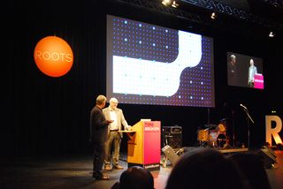
Putting an interesting twist on the conference theme, Muir explained how when he co-founded 8vo with Mark Holt and Simon Johnston, all three of the principals had spent formative years outside their native UK: Holt working in San Francisco for four years, and Johnston and Muir himself studying in Basel.
This gave the studio an outsider's perspective on the British design scene of the 1980s. "8vo hated the Britishness of British design," explained Muir. "The idea of type as the centred grey stuff at the bottom, where it's all about the big idea."
He also reeled off, in no particular order, a hate list of The Face, the work of both Bob Gill and Eric Gill, and any iconic piece of British design that treats typography as second to the concept, or the image. Type, for MuirMcNeil, is at the core of everything.
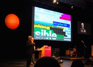
"Text is not language; it's a vehicle for language," declared McNeil. "You can divorce the letter from the meaning of the word."
He went on to talk through several projects that turned familiar letterforms into increasingly abstract, purely visual components as part of a broader piece of graphic design - such as the typefaces Flip H and Flip V, which are totally symmetrical on the horizontal and vertical axes, and and Flip X - symmetrical on both.
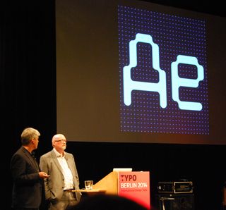
Other examples include Core, which draws on research by German type foundry URW to analyse many different typefaces to calculate the most perfectly average, nondescript alphabet possible; and ThreeSix, another experimental typeface that goes up or down in weight in a perfectly measured way by expanding or contracting contours around the letterforms.
Many of MuirMcNeil's typefaces have been translated into silkscreen posters, printed with fluoro inks for maximum impact.
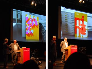
For Muir and McNeil, a mathematical approach to design that relies on geometric calculations and rigid adherence to a grid is more liberating than it is restrictive, and typography becomes part of that.
"We're not interested in ideas. We're only interested in form, and the structure of form," confirms Muir. "Stop thinking about what you like, and work with what the system you've designed lets you. It's about designing a machine to design something, rather than designing the thing itself."
Snask off!
Rounding off the day with an explosion of fancy dress, rock music, light-hearted profanity and all-round silliness was Swedish studio Snask, who for those who know them need no introduction - and for those who don't, no introduction will ever quite do them justice.
It all started with a trio dressed as a bishop, a king and a bunny picking up instruments and blaring out a storming introduction to studio co-founders Frederik Ost and Magnus Berg, who skipped onto stage clad in a shiny silver jacket and a pink panda jumper respectively.
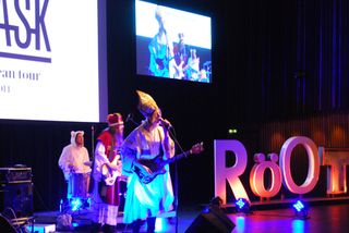
Behind Snask's joy for performance is the no-holds-barred attitude and fun atmosphere that it fosters within the Stockholm-based studio, which swears by the mantra "make enemies and gain fans".
Essentially, its uncompromising and utterly unique philosophy may rub some up the wrong way, but it equally fosters its share of baying groupies chanting 'Snask', which Berg told us afterwards with a grin means both 'candy' and oral sex in his native tongue.
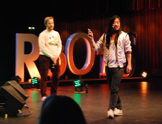
Some of the work they showed included a title sequence for OFFF Lille 2012, filmed in the style of a bad martial arts movie; a promo film for an Eastern European gay club that involved Ost and Berg oiled, topless and shooting lasers out of their nipples.
Berg even treated the delighted audience to a gyrating dance performance to Beyonce's Halo during the talk.
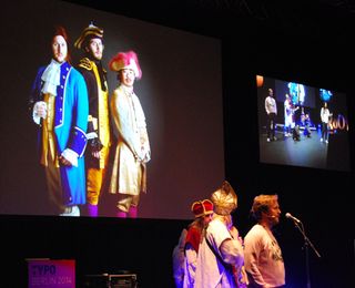
"In Swedish, there's a phrase 'show your balls'," Ost explained in their presentation. "When you rebel, the old world will try and get rid of you. But they have already lost."
The charismatic duo went on to explain the concept of a 'pink lie' - somewhere in between a positive white lie and a frowned-upon red lie, and according to Ost and Berg is something that ultimately ends up being true.
One example is how they ended up on the conference circuit in the first place. It started with lying to design schools in Sweden that they were already design conference superstars, and were prepared to lecture at their college for free, their foot was in the door - and the next step was simply to tell said conferences that they were big on the lecture circuit, leading to their first genuine event booking.
"And here we fucking are," grinned Ost.
Stay tuned for the next lot of highlights tomorrow...

Thank you for reading 5 articles this month* Join now for unlimited access
Enjoy your first month for just £1 / $1 / €1
*Read 5 free articles per month without a subscription

Join now for unlimited access
Try first month for just £1 / $1 / €1

Nick has worked with world-class agencies including Wolff Olins, Taxi Studio and Vault49 on brand storytelling, tone of voice and verbal strategy for global brands such as Virgin, TikTok, and Bite Back 2030. Nick launched the Brand Impact Awards in 2013 while editor of Computer Arts, and remains chair of judges. He's written for Creative Bloq on design and branding matters since the site's launch.