TYPO Berlin: highlights from day three
A new logo for New York, a new magazine publishing model and a redesigned subway map were all discussed on the final day.
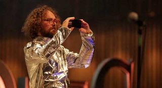
An inspiring consensus is emerging for the Computer Arts team here at TYPO Berlin that transcends the different creative disciplines on show, and extends far beyond the official 'Roots' theme for the conference.
In different ways, both day one and day two at the Haus der Kulturen der Welt have been about finding your own path, and unique ways of approaching projects - whether that translates as studio culture, creative technique or something more abstract and conceptual.
With this sense of fierce individuality in mind, it's certainly fair to say that the final day of the conference started with a bang.
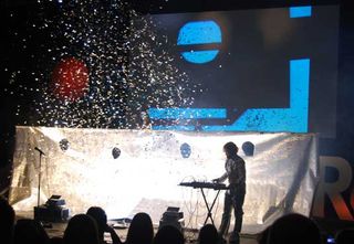
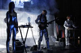
A bang from a glitter cannon, no less - just one small part of Grzegorz Laszuk's ultra-surreal, sci-fi-inspired opening session, which also featured silver space suits, a smoke machine and a video of Ken Garland reading out his First Things First manifesto while a live opera singer echoed his every word.
How do you follow that? Well, TYPO's third day was packed with so many great talks that picking just three highlights is a bit of a challenge. But that's our job, so here goes…
Rethinking publishing
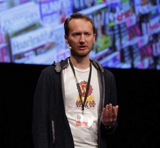
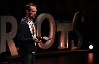
Following Laszuk's performance, it was the turn of Czech-born, Netherlands-based Peter Bilak to turn convention on its head.
Both graphic designer and type designer, Bil'ak also runs the magazine Works That Work - which features fascinating long-form articles exploring "unexpected creativity".
Get the Creative Bloq Newsletter
Daily design news, reviews, how-tos and more, as picked by the editors.
These have included a piece on the huge influence of the shipping container - "the box that shrank the world" - on global trade, and the story of the vast underground bunker in which nuclear waste would be sealed for 100,000 years, and the design challenge of communicating the danger to future generations who might not understand language or established symbols.
Questioning the established model of magazine publishing at a grass-roots level - from its reliance on advertising, to treatment of content, to distribution methods - Bil'ak delivered an inspirational lesson in how thinking differently can carve a global niche.
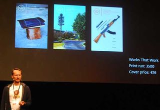
Despite its small circulation of just a few thousand, Works That Work is a truly multi-platform offering - print, web and various different phones and tablets - with the only unifying factor between formats being the typeface, which was of course developed by Bil'ak's own foundry Typotheque.
It's also completely global, thanks to a pioneering new 'social distribution' model that puts the power - and a profit share - in readers' hands.
If someone finds a local outlet prepared to sell the magazine, they can buy a stack of magazines at 50 per cent of the cover price, and sell it to the shop at 75 per cent. The supply chain is thus massively reduced, and everyone is a winner.
Fairytale of New York
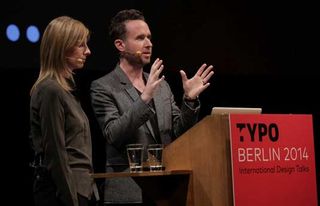
The husband-and-wife studio Triboro punches considerably above its weight, with clients including GQ, Nike, Wired, HSBC and Stella Artois. In line with the Roots theme, the duo - Stefanie Weigler, German, and David Heasty, American - kicked off with why NYC inspires them and their work.
"New York is a candy store for designers," enthused Weigler. "Just when you're about to understand what it is, it starts to change. We try to identify little inspirations in the chaos." The fusion of particular styles, influences and architecture is unlike any other.
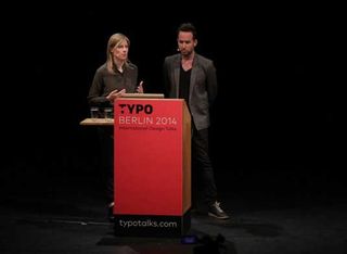
"Even though it's a wealthy city, much of the infrastructure is actually surprisingly run down," Heasty added, drawing particular attention to how "weathered, hand-painted signage" sits alongside "optimistic and future-focused" Art Deco design.
Like many of this year's TYPO speakers, Triboro believes in questioning the status quo - and there's no better example than the studio's self-initiated redesign of the New York subway map, driven by an envy of the clean, iconic design of its London counterpart.
Using Gotham (of course) Weigler and Heasty completely reinvented the map as a graphic, one-colour neon red poster.
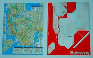
The standout project that the studio presented, however, was a brief from Nike to develop a NYC-specific logo for the brand.
"There are tons of typographic logos representing NYC, and we were wary of creating another," confessed Weigler. Focussing on the 'just do it' tagline, Triboro opted to explore a 'DIY' theme - until they found an effortlessly simple solution.
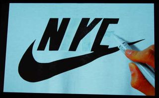
By blanking out parts of the Nike logo itself, it became NYC. Best of all, the 'hacked' Nike NYC logo spread across countless applications, from painting over adverts to unpicking the stitching on baseball caps, and everything in between.
A tale of four countries
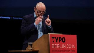
Where the co-founders of Triboro had explored their roots on a city level, Thomas Manss began with an illustration showing the outlines of four countries, tessellated together as one: the UK, Germany, Brazil and Italy, each of which plays host to an outpost of Thomas Manss & Company.
"We have all the politeness of the British, the efficiency of the Germans, the rhythm of the Brazilians and the style of the Italians," grins Manss, himself from the small town of Gütersloh, where "five cars waiting at a red light equals a traffic jam."
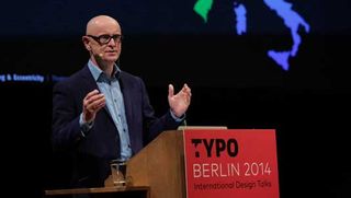
While walking through some of the agency's various identity projects, he introduced several enlightening quotations from iconic designers - starting with the late great Alan Fletcher, who once told Manss: "This is all about ideas. You don't want to be caught in typography." He also quoted Michael Wolff's belief that "processes don't produce ideas, people do."
As for his own perspective, Manss went on to explore the essence of what branding means. "If the logo is the start of the story, corporate identity is the rest of it - complete with a cast of characters," was his rather poetic way of putting it. Developing that story and describing what a company really stands for should be an agency's role.
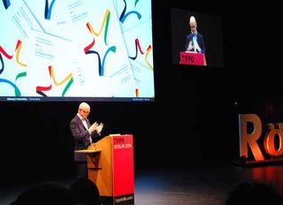
"It's not our task to move graphic elements to and fro until they look pretty," he added, in a bold understatement that nicely sums up three days of incredible talks here in Berlin. From the Computer Arts team, over and out.

Thank you for reading 5 articles this month* Join now for unlimited access
Enjoy your first month for just £1 / $1 / €1
*Read 5 free articles per month without a subscription

Join now for unlimited access
Try first month for just £1 / $1 / €1

Nick has worked with world-class agencies including Wolff Olins, Taxi Studio and Vault49 on brand storytelling, tone of voice and verbal strategy for global brands such as Virgin, TikTok, and Bite Back 2030. Nick launched the Brand Impact Awards in 2013 while editor of Computer Arts, and remains chair of judges. He's written for Creative Bloq on design and branding matters since the site's launch.