Texturing with InDesign
From using textures as canvases through to the power of tactile buttons, Paul Tysall gets all touchy-feely with InDesign
In an industry dominated by slick tech design, bold graphics and colour, there’s a danger of things appearing a little too synthetic, especially when it comes to design that invites us to engage and interact with it. Life comes with smears, cracks and scratches and – in the right circumstances – presenting them in your design work can help ground it in the real world.
Textures can provide that subtle bridge between reality and an artificial arena. The power of touch is as evocative and subtle as the sense of smell – just pick up your iPad and feel that polished metal surface. You’re touching ‘quality’ aren’t you? A surface that appears tactile has us reaching out to feel it, which can become powerfully instinctive, especially when it comes to UI design on touch devices.
In this tutorial we’ll look at settings in the Effects panel that you can apply to imported photo textures when working in InDesign CS6, and how you can use opacity settings to utilise and enhance the appealing traits of various photos.
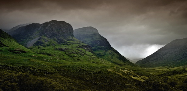
01 To start off with let’s take a look at one of the simplest ways to add texture to your designs – photo texturing. I’ve already created a background pattern in Illustrator and placed the elements into InDesign so they retain their vector paths. This means I can use them later in the design process to import textures directly into specific shapes. Create a new layer and add a binding box that takes up the entire background.
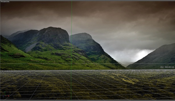
02 Add a gradient to this binding box, running diagonally, to kick off the varying levels of contrast we want to build upon as we add our background textures. The alternating areas of dark and light will give areas of interest. Place your first texture (Cmd/Ctrl+D) and use the Direct Selection tool to select the photo.
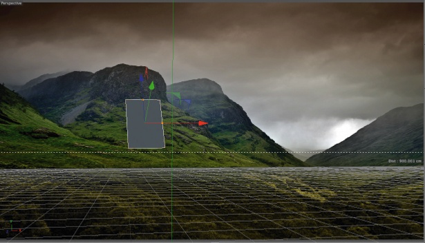
03 The key to successful photo texturing is subtle layering, which is where InDesign’s Effects panel comes into play. To open this, press Cmd/Ctrl+Shift+F10. Change the image (note: not the Transparent Binding box) to Multiply, reducing the opacity to 50%, which enables that underpinning gradient to show through.
04 Now we want to add some scratches to the surface to give it that worn feel and also add a little bite to the background. Duplicate the first binding box, delete the existing image and import your new photo texture. My photo is very contrasty, with the scratches being the lightest parts of the image. Again, using the Direct Selection tool to select the photo, set the opacity to Lighten at 100% so we’re just left with those highlight scratches.
05 The next texture I’ve added is to help establish colour saturation while adding more subtle light to dark transitions. It’s also got some nice grunge to it. Following the same process as the previous two stages, change the photo to Hard Light at 100% in the Effects panel.
06 With the background finished, move on to object texturing. In this case I want to bring some tactility to a set of buttons. Something InDesign sorely misses is a Pattern Overlay creator within its Object Effects settings, so I’ve use Photoshop to create my initial surface texture. I imported this into the shapes and set the opacity to Soft Light. The effect is very subtle, but it has removed that flat-colour look.
Get the Creative Bloq Newsletter
Daily design news, reviews, how-tos and more, as picked by the editors.
07 To build upon this, add another Photoshop pattern of diagonal lines. Duplicate the button shapes and remove the first texture, ensuring the binding box shapes are transparent. After importing the new texture and scaling it down to 50%, change the opacity to Multiply at 60%.
08 When you look at the surface of a real-world object, the texture is more apparent when a light source is transitioning from dark to light. With this in mind, I want this texture to appear on the inner edges as a form shadow. You can do this by selecting each instance of the texture, pressing Cmd/Ctrl+Opt/Alt+M, and choosing Directional Feather. Link the feather widths and bring them in by 250px, setting the shape to All Edges and choosing an angle of 90º.
09 Still in the Effects panel, select Gradient Feather and set the type to Radial. Play around until you establish a subtle gradient that emits from the centre outward. The shapes are then re-aligned to fit directly over the initial set of buttons, creating a patterned inner shadow.
10 The final texture is for a glass-like window that sits over this dial interface. The photo texture is set to Hard Light – to capture the highlights within the photo – but the binding box is set to Overlay at 60%. From the Effects panel, I’ve used a Gradient Feather to establish a fade-in to fade-out, so the transparency feels more natural. A final 65% opacity Outer Glow, with a touch of noise, helps to reinforce a semi-opaque surface texture.

Thank you for reading 5 articles this month* Join now for unlimited access
Enjoy your first month for just £1 / $1 / €1
*Read 5 free articles per month without a subscription

Join now for unlimited access
Try first month for just £1 / $1 / €1

The Creative Bloq team is made up of a group of art and design enthusiasts, and has changed and evolved since Creative Bloq began back in 2012. The current website team consists of eight full-time members of staff: Editor Georgia Coggan, Deputy Editor Rosie Hilder, Ecommerce Editor Beren Neale, Senior News Editor Daniel Piper, Editor, Digital Art and 3D Ian Dean, Tech Reviews Editor Erlingur Einarsson, Ecommerce Writer Beth Nicholls and Staff Writer Natalie Fear, as well as a roster of freelancers from around the world. The ImagineFX magazine team also pitch in, ensuring that content from leading digital art publication ImagineFX is represented on Creative Bloq.
