Technique masterclass
From concept through to completion, six pro illustrators share the intricacies of their individual styles with Mark Penfold.
Creatives of all disciplines can benefit hugely from examining the work of others.
By understanding how another eye has composed an image, solved a problem or drawn a line, it's possible to learn valuable new techniques that could boost your own work immeasurably.
Here we look over the shoulders of six very talented illustrators from around the world - each with their own tried and trusted methods of working - as they dissect their projects and discuss their style, explaining where their ideas came from, and their choice of shapes and tools, mediums and methods.
The approaches might vary somewhat, but an agreement on the huge importance of line and tone, colour, design and composition is universal. The devil, as always, is in the details.
Fernando Volken Togni
Combine soft vector shapes and organic swirls to give your patterns a strong focal point
Initial ideas
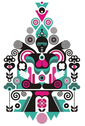
Between Lungs is the result of an open brief for a poster. "This piece is about emptying your mind in preparation for a creative inhalation. It's about an inner feeling," says Brazilian designer Fernando Volken Togni, who created a symmetrical design to help reinforce a sense of balance and serenity.
Composition
When beginning a new composition, Volken Togni constructs a selection of simple shapes into a rough skeleton. Compositional decisions like this can be modified, but are necessary to organise the initial structure of the elements. "I first used a triangle for Between Lungs," he explains, "but I changed the format to a house shape, which was more harmonious."
Get the Creative Bloq Newsletter
Daily design news, reviews, how-tos and more, as picked by the editors.
Development
With a structure in place, Volken Togni built up the detail using increasingly intricate shapes and patterns. He started this piece with concentric circles, before adding organic shapes such as swirls to make the composition more fluid and "human". As the shapes became more detailed, the direction for the piece began to come into clearer focus.
Mystical shapes
To continually evolve his work, he always creates new patterns for his images, combining basic shapes and patterns to produce visually rich elements - everything from circles to flowers, bushes and eyelashes. As shown here, Volken Togni also has a recurring interest in eyes: "I think they are mystical and I always use them. They give life to any shape," he says.
Colour choice
The Brazilian creative used the black elements to guide the viewer's eye to the central focal point of Between Lungs, which is the area between the head and the lungs. He then added pink, saying: "It's the life colour of the illustration. The green tones came last, and balance the composition, making it softer - not so aggressive," he reflects, "and richer too."
Musical tools
One tool that Volken Togni says he can't do without when working is music, which he listens to as he illustrates, using the tone and pace of the music to help inspire the fundamental shapes that comprise his illustrations. "If the rhythm is fast, the final result might be darker or heavier," he explains. "If it's calm, the shapes are usually more intricate and detailed."
Sergey Sbss
Balance striking, angular compositions by starting in mono, then adding colour
Colour
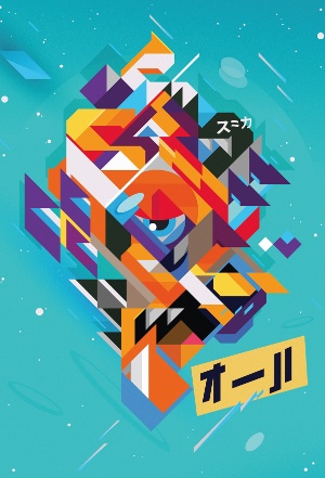
Although colour plays a big role in the work of Sergey Sbss, he starts his projects in monochrome and allows the structure to form before picking out and applying colour. This gives him the freedom to fully experiment with different colours. Gokim Mind started in yellow and developed as Sbss tried different palettes.
Process
Like Fernando Volken Togni, Sbss starts his drawing process using simple shapes with straight lines - "often a triangle or rhombus" - which he develops until they take on a personality of their own. By adding or removing elements, he gradually begins to identify his subject. "I find it's a bit like faceting a diamond," he explains.
The angle
Each shape in this image has a 45° angle. "I mainly used large and small triangles, adding diamond shapes and distinct lines to give an elegance to the final form," he explains. This angular consistency ensures that the image maintains its sense of purpose, and aids the dynamism of the piece, constantly moving the viewer's eye from one shape to the next.
Repeating patterns
Once a harmonious composition started to emerge, he continued to add more geometric elements, building detail and incorporating the occasional flourish into the piece. "I've been trying to create geometric letters and insert them into my work. By chance, the letter 'S' appears twice in the upper part of the image," he reveals.
Outlines
Sbss often uses outlines to create his work, but decided to omit them from the creative process for Gokim Mind, deeming them too restrictive. As a result, he was able to develop the individual forms seen in the piece freely and openly. He could also maintain their internal dynamics to create the "lighter, smoother and deeper" piece that he wanted.
Software
In general, Sbss creates most of his work in Flash, employing simple devices such as the Line and Oval tools to draw his shapes, and the Gradient tool for backgrounds and shadows. He finalises his work in Photoshop using different filters. "Reduce Noise gives the image a subtle roughness and realism, while the Unsharp Mask adds crispness," he says.
Kervin Brisseaux
Battle the creative block of facing a blank canvas by simply changing its colour
Drawing a blank
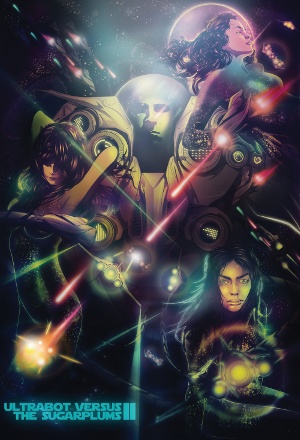
Some might find a blank canvas to be an intimidating start, but Kervin Brisseaux has a rather simple solution: change the background colour. "Sometimes it's as easy as that to spark some inspiration," he says. "I usually know what the primary elements of a piece are going to be, and then figure out the composition."
References
To create a sense of realism, he uses photographic references for his figures, taking pictures of hands, arms, faces, and torsos, and stitching them together to look anatomically correct. He explains: "Lately I've been making figures that are composites of various photos. It's a really good way of getting the perfect pose for the image."
Tools
Brisseaux's primary drawing device is Illustrator - the Pen, Gradient and Line tools, in particular, which he used for this piece: Ultrabot Versus The Sugarplums 2. "I love the flexibility of scaling objects without dealing with pixelation or quality loss. In many ways," he adds, "I find it superior to Photoshop with regard to form-making and illustration."
Layer cake
Continually allocating, naming, and grouping objects into layers is an important part of Brisseaux's creative process, and it's not unusual for some of his more complex works to contain more than 500 layers. "I'm obsessive-compulsive when it comes to organising layers," he admits. "This piece used a total of 188," he adds.
Newness
Brisseaux decided to emulate a comic-book style here, and experimented with a whole range of inking techniques - not an easy task when using Vector tools. To achieve the final effect, he used Illustrator's Outline Stroke tool to convert the lines into shapes, allowing him to mould them into faux ink-line weights, all varying in thickness.
Travel
With so much detail in the piece, it was essential to create an obvious starting point for the eye, so Brisseaux designed the piece to draw the eye to the upper centre of the image and branch out. "Outside of colour and composition, light effects are a useful way to achieve this," he says. "I use Adjustment layers, levels and gradients to get the focus."
Jerico Santander
Add a surreal edge with stock photography, strategic light sources and 3D modelling
Ideation
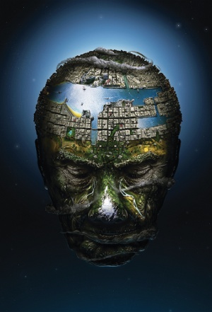
Spanish illustrator Jerico Santander is a big fan of matte artwork. With Own World, he decided to mix a range of multidisciplinary techniques with a dose of surrealism. "I wanted a message to emerge from the landscape - not just a feeling. I started by searching for reference images and making initial sketches," he says.
Photo references
Santander usually begins with stock photography as a base - in this case, a shot of an old man sourced from iStockphoto - to which he gradually adds more and more photographic detail 'til the reference image is completely covered. For this piece, Santander used aerial pictures for the rivers, buildings and terrains, and the forest around the forehead and nose.
3D modelling
When photographic references aren't practical or can't be found, Santander then considers his options, deciding whether to work with 3D software or paint digitally. "If I'm concentrating on a big area, it's probably going to work better in 3D," he explains. For Own World, the illustrator turned to 3ds Max, which let him render his cityscape exactly as he wanted.
Paint
Towards the end of the creative process, Santander started to paint in the finer details, such as the beach and bridge crossing the waterway. "I painted over the buildings to make them look more realistic, and added in the clouds surrounding the head to give a dynamic feel to the composition. I think it strengthens the whole planetary look," he says.
Lightening
Good planning is important when you work with different media. Santander decided where the light sources would be placed at the sketching stage, and then rendered the 3D city with the same rig. "After I'd placed everything, I painted lights and shadows over the image in order to blend all the elements together, and make the whole piece more solid."
Level of detail
Through projects like Own World, Santander is free to experiment, evolve his skill set and practice new techniques. The illustration might not turn out as expected, but there are always lessons to be learned. "It can be frustrating when something doesn't end up like you thought," he says. "But that's what helps you find new ways and create new things."
Mega Munden
Use a montage of reference photos to accurately plan your hand-drawn line work
Theme
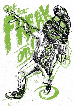
Created for Freakshow, an exhibition curated by Ollie Munden and Johnny McCulloch of Crush Design, this image is a "celebration of freakyness". Loosely based on Frankenstein and the Teen Wolf creature, with a hint of Michael Jackson's 'Thriller', the piece was designed to create a feeling of "going wild".
Running order
"The character came first," recalls Munden, "but I always knew that I wanted the type there too." The phrase 'Get your FREAK on!' was the driving force behind the piece, so it was clear that the text needed to be large and overprinted onto the image. However, the character had to be impressive enough to compete, so its needs were tended to first.
Model
Munden persuaded his brother to pose wearing a punk rock outfit, and took shots from different angles. He then modified the image in Photoshop, using the Warp and Distort tools to exaggerate the angles. "I blew up the foreground hand and stretched it, and I took the back leg from one of the other shots. I then printed it out and began the pencil work," he explains.
Polish
After finalising an ink version of the figure, Munden added loose pencil shading layers, bitmapped in Photoshop. The finished article was destined to become a screenprint, so once the type had been finished and textured, Munden added more layers of texture to the piece to make the most of the "authentic vibe" produced through this process.
Second opinion
The positioning and layout of the type proved tricky to get just right, so Munden saved a range of options and mailed them to a few trusted friends: "I've always found that you learn the most from those around you. There is nothing worse than staring at the same image for hours on end and becoming blind to it. Sometimes fresh eyes hold the answer."
Simplicity
Parts of the linework were duplicated to heighten the sense of movement and make the piece feel a little more "frantic", while other elements were kept minimal. "I find using a limited palette gives really nice results," he says. "I guess it's where my head is at the moment. I'm enjoying making things bold and simple, but with areas of great detail."
Julia Sonmi Heglund
Plan your palette with rough splashes of colour before getting down to details
Energy
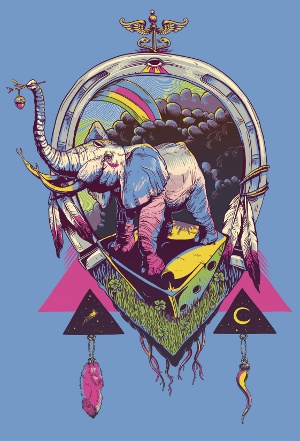
Bona Fortuna was initially sketched in Photoshop. A personal work, many of the compositional choices were impulsive, increasing the energy and spontaneity of the piece. "I don't usually spend much time on composition," admits designer and illustrator Julia 'Sonmi' Heglund. "This sometimes works to my advantage."
Drawing
Sonmi uses several references when drawing animals, sketching out the general pose before adding detailed linework to build up the texture of the piece. To ensure that the colours are balanced when seen from different distances, she zooms out of the image and looks at it from afar, judging what shading or colour fields the piece should have.
Layers
Sonmi frequently sketches out new ideas while in the middle of a project, before lowering the opacity of the layer and tracing out a detailed version. "It's like having a super-efficient light table," she says. As many of her designs end up as screenprints, she keeps the layers low - Bona Fortuna was reduced to less than 10, with each colour separated off.
Balance
The 'unfinished' look of Bona Fortuna is the result of an exploration into the tension between busy, linework-heavy areas and fields of flat colour - an effect that Sonmi finds soothing. As she explains, the linework serves to ramp up the dynamism of the project, while the flat colours help slow down the pace and ground the composition.
Colour method
Sonmi has a rather unorthodox approach to colouring: "I usually slap generic blobs of colour around the composition to designate how colours will be distributed." She then modifies each of the colours until they create interest in the piece. Her palette choices are rarely premeditated, tending instead to vary with mood and taste.
Motif
"I'm drawn to organic forms - especially eyes, limbs, and hair," says Sonmi, "and sometimes I like certain symbols or cultural aesthetics." The iconography of secret societies, Native American artistry and the strength of geometric shapes are all recurring elements too - and outer space: "Who doesn't love space?" she laughs.

Thank you for reading 5 articles this month* Join now for unlimited access
Enjoy your first month for just £1 / $1 / €1
*Read 5 free articles per month without a subscription

Join now for unlimited access
Try first month for just £1 / $1 / €1
The Creative Bloq team is made up of a group of design fans, and has changed and evolved since Creative Bloq began back in 2012. The current website team consists of eight full-time members of staff: Editor Georgia Coggan, Deputy Editor Rosie Hilder, Ecommerce Editor Beren Neale, Senior News Editor Daniel Piper, Editor, Digital Art and 3D Ian Dean, Tech Reviews Editor Erlingur Einarsson, Ecommerce Writer Beth Nicholls and Staff Writer Natalie Fear, as well as a roster of freelancers from around the world. The ImagineFX magazine team also pitch in, ensuring that content from leading digital art publication ImagineFX is represented on Creative Bloq.
