Smart ways to work with images in InDesign
Luke O'Neill shares the wisdom of seven years creating beautiful magazines to bring you his top tips for managing images in InDesign.

InDesign is the trusty stalwart of the magazine and publishing industries: it's the primary tool used to produce everything from Vogue to Computer Arts.
Although layout and publication design lie at the core of InDesign, its versatility can be harnessed for any design project, and its file handling capabilities make it a powerful ally when working with complex, multi-layered layouts.

In this InDesign tutorial I'll run through some tips for working with layered PSDs and multi-page documents, and even how it's possible to do some image editing on the fly directly within InDesign.
01. Import options: Layers
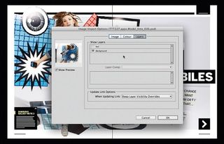
In the Place dialog you'll find the show import options checkbox. Select this when placing an image to bring up a dialog where you'll see a set of options that vary depending on the file type. With a PSD you can turn layers on and off, enabling you to easily get rid of the background of an image, for example.
02. Import options: Alpha Channels
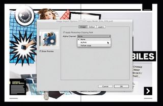
Another advantage of using PSDs in InDesign is the ability to employ alpha channels created in Photoshop straight into your layouts. Simply navigate to the image tab and select the relevant alpha channel. This is particularly useful for importing fine, overlapping details, such as hair.
03. Working with greyscale images
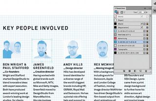
If you're using black and white images, save them as greyscale JPEGs. You can then colour them directly within your InDesign layouts. Use the Direct Selection tool to colour the foreground of the image and the selection tool for the background. This is useful for coloured details like headshots.
04. Gradients within images
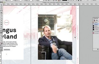
Unfortunately you can't apply a gradient directly to a greyscale image, but there is a workaround. Step and repeat the image on the spot or copy and paste it in place. Next, alter the colour of the image using the swatches panel and use the Gradient Feather tool to fade out part of the image.
Get the Creative Bloq Newsletter
Daily design news, reviews, how-tos and more, as picked by the editors.
05. Gradients with cut-outs

You can't colour greyscale PSDs in InDesign - to colourise a cut-out or masked image, use Duotone in Photoshop and then save as separate files. The above images consist of three files: the original and two duotone files - one with solid colour and the other feathered using the Gradient Feather tool.
06. Place an image within multiple frames
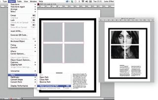
As an effect you may wish to place an image within a number of separate frames. To do this, simply select all of the frames holding Shift and go to Objects>Paths>Make Compound Paths. Now just place your image within the frame and adjust until you're satisfied with the results.
07. Adjusting frame and image sizes
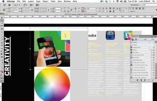
To quickly adjust the size of the image within a frame, select it using the Direct Selection tool and then use Opt/Alt+Cmd/Ctrl++. to increase the size and Opt/Alt+Cmd/Ctrl+-, to decrease. Use the Reference Point grid in the Control bar to increase the size from the top, bottom, side or centre.
08. Make use of the Control bar
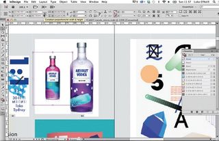
For precise size increases, the Control bar comes in handy. Here, you can incrementally increase either the frame or image size within it by using the arrow keys or by entering a value. When adjusting image size, be sure to check Constrain Proportions For Scaling option so you don't distort the image.
09. Scaling by percentage
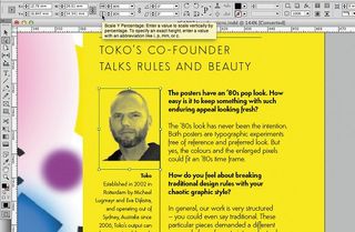
In the Control bar there's also the option to scale images by percentage size. This gives an indication of how big you can take your images on the page. As a rule of thumb, if your images are at 300dpi (for print) then you should try to avoid increasing the size any further then 120%.
Words: Luke O'Neill
Currently art editor at T3 magazine, Luke designed the first two volumes of Computer Arts Collection. His illustration work can be found gracing the covers of Computer Arts Presents. This article originally appeared in Computer Arts issue 227; find an extended version in Computer Arts Studio Training: InDesign.

Thank you for reading 5 articles this month* Join now for unlimited access
Enjoy your first month for just £1 / $1 / €1
*Read 5 free articles per month without a subscription

Join now for unlimited access
Try first month for just £1 / $1 / €1
The Creative Bloq team is made up of a group of design fans, and has changed and evolved since Creative Bloq began back in 2012. The current website team consists of eight full-time members of staff: Editor Georgia Coggan, Deputy Editor Rosie Hilder, Ecommerce Editor Beren Neale, Senior News Editor Daniel Piper, Editor, Digital Art and 3D Ian Dean, Tech Reviews Editor Erlingur Einarsson and Ecommerce Writer Beth Nicholls and Staff Writer Natalie Fear, as well as a roster of freelancers from around the world. The 3D World and ImagineFX magazine teams also pitch in, ensuring that content from 3D World and ImagineFX is represented on Creative Bloq.
