Sex up a product shot
Pete Harrison shares his pro tips for using stock imagery and Photoshop effects to make a lifeless product photo dynamic and eye-catching
Even the most boring of product shots can be elevated with a bit of Photoshop trickery, and it's a technique that's very much in demand in the advertising sector. I've done work like this for Guinness and Sprite, for instance - and the style of this tutorial is similar to a recent piece for organic fruit drink O'ahu.
To demonstrate the biggest possible transformation, I've used a standard photo of a drinks bottle here shot on a basic compact digital camera, although client-provided imagery will (usually) be of a much higher standard in the first place.
You can use any type of product to try out the techniques we'll be applying in this project - if you're shooting it yourself then a bit of photographic skill and a good camera will help, but as you can see over the following pages, you can work wonders with post-production in Photoshop.
Brushes and a variety of techniques will help create some dynamic lighting, while the Pen tool can produce some interesting light effects. We'll also be introducing some additional elements using stock images, all of which are available in the support files.
Click here to download the support files (12.2MB)
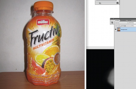
01 First of all, you need a product photo to start with. You can either take one yourself, find a stock photograph online, or use stock0.jpg from the support files. Open Photoshop and import your product shot. Make a new canvas in portrait, and drag your chosen photograph into it. Use the Transform tool (Ctrl/Cmnd+T) to scale it so that it's a nice size in the middle of the canvas.
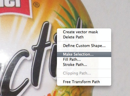
02 Select the Pen tool to create a path around the bottle. Click on the bottle and start tracing it. Ctrl/ right-click the bottle once you've closed the path, and click Make Selection. Set the Feather Radius to 0 and hit OK. Cut and paste it back into the scene, and delete the old layer. You could also use a mask if you prefer.
Get the Creative Bloq Newsletter
Daily design news, reviews, how-tos and more, as picked by the editors.
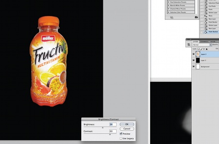
03 Create a new layer underneath the existing bottle layer and fill it with the colour black. You will be working on the bottle layer a bit more over the next few steps so go back to that layer now. Go to Image> Adjustments>Brightness/Contrast and make the Brightness +25 and the Contrast +60 and hit OK.
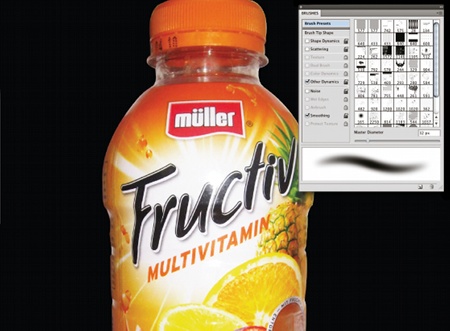
04 Make the canvas actual size (Ctrl/Cmnd+1) and select the Smudge tool. Use a round, soft brush with the strength set between 5% and 10%. Start lightly brushing areas that are grainy to smooth these out. Use the Clone tool to get rid of heavy grain.
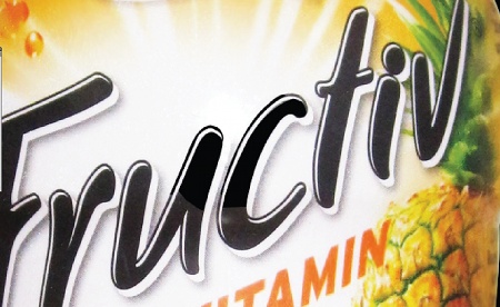
05 You can see areas on the photo where the flash has hit the bottle, especially on the black logo, so let's fix that next. Select the Pen tool and trace around the whiter areas, such as in the centre. Close the path and make a new layer, then Ctrl/right-click inside the path and fill it. Use black as your foreground colour, and click OK. Then Ctrl/right-click and Delete Path. Repeat this for the other areas.
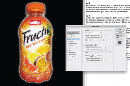
06 Merge all the new black layers you created over the text, then select the Eraser tool and a soft, round brush. Now erase any ugly straight edges on the newly created areas to blend them in - don't worry if you need to go around the whole letter. Lower the Opacity of this black layer to about 60% to blend it with the rest. On the main bottle layer, go to the Layer Style and add an outer glow, adjusting its intensity with the slider.
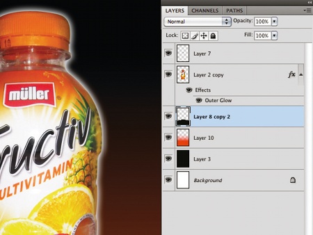
07 Select the Burn tool and set the Exposure to 60%. Using a round brush with soft edges, burn the side of the bottle to bring more focus to the front, so it feels more three-dimensional and the glowing edges really stand out. Use the Pen tool to create a simple black oval shape underneath the bottle so it has something to sit on. Then create a new layer underneath that, and using the Gradient tool, fill it with a dark orange-to-black gradient running up to the top of the canvas.
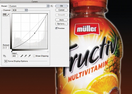
08 Duplicate the bottle layer and go to Edit>Transform>Flip Vertical. Place this under the bottle so it looks like a reflection, then lower the opacity to 16%. Duplicate it again but place it on top of the original layer. Turn off Out Glow, then go to Image> Adjustments>Curves. Make the input level 113 and the output level 162, and hit OK. Use a soft brush or mask to erase the areas of this layer along the centre of the bottle. Now give an outer glow to the base shape, as you did in step 06.
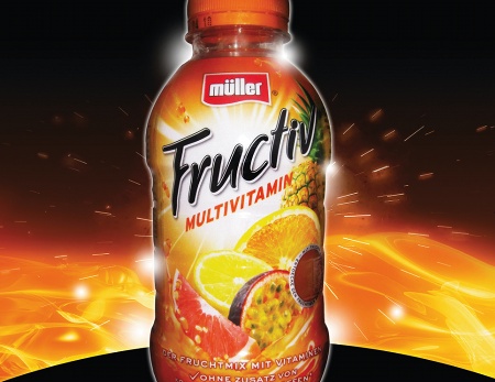
09 Open stock1.jpg from the support files, bring it into the canvas underneath the base layer, place it into position and set the Layer mode to Screen. Go to Layer> Layer Mask>Reveal All, then use a soft brush to paint the area you don't want to be shown in black. Do the same with stock2.jpg, and place it behind the bottle. Import stock3.jpg, adjust the Hue/Saturation to make it more red, and place it on the scene. Select a soft round white brush, create a light spot on the canvas, and place it behind the bottle. Repeat this in front and behind the bottle, with different colours and scales.
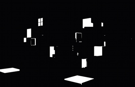
10 Make a new square canvas and now go to the circular Selection tool. Choose a red colour and draw the circle. Then duplicate the layer and press Ctrl/Cmnd+T to transform it. Hold Shift+Alt and drag it smaller, then make this colour orange. Repeat this process with increasingly smaller circles and then make the last circle white. Copy Merge all the circle layers (Edit>Copy Merged), and use the Magic Wand tool to delete the white circle, then use the Rectangular Selection tool to select half the circle, and bring it into the main scene.
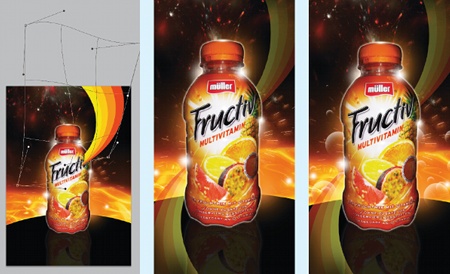
11 On the circles layer you just created, go to Edit>Transform>Warp. Make one end of the half circle smaller than the other, so it looks like it's sweeping down from the top. Repeat this process at the bottom and place these layers behind the bottle layer. Lower the opacity of both of them. Create a circle in white, then use a soft eraser tool to erase the middle and bottom edges - this will create a bubble type effect. Place this new bubble onto the canvas. Duplicate the shape and make some smaller and different coloured bubbles to arrange around the bottle.
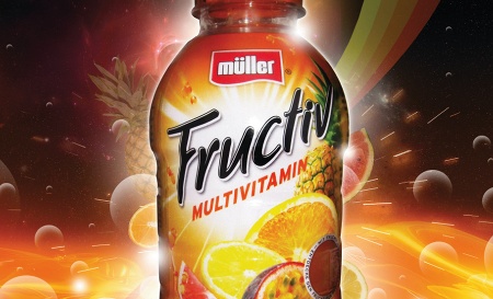
12 Import stock4.jpg and set the Layer Mode to Screen. Go to Image>Adjustments>Hue/Saturation and change it to orange (or to fit your colour palette), position it near the bottom of the bottle and erase some of the edges so it's smooth. Open the fruit stocks (numbered 5, 6, 7 and 8), trace them with the Pen tool and cut them out. Arrange fruit at different scales and opacities behind the main bottle.
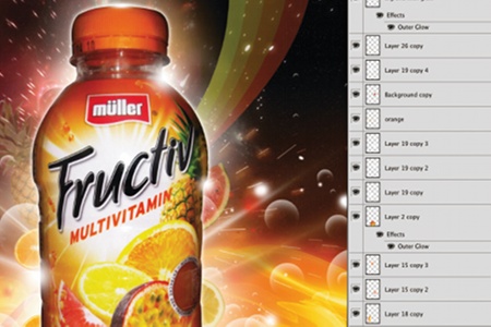
13 Select white again, and create a new layer above all the others. Open the Brushes window and change the Spacing to 100%, click on Shape Dynamics and set the Size Jitter to 80%, and set the Scattering to 440%. Start brushing areas of the canvas, alternating your brush diameter. Give some layers outer glows, and vary the softness of the brush you're using. Here, I've used the same brush but with Spacing set to 15% to create a few streaks before blurring them.
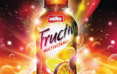
14 Go to your Brushes panel and choose a soft, round brush. Make the brush about half the size of the canvas and choose a colour from the palette you're working with. Next, duplicate the layer (Alt+drag) to make some smaller layers, and arrange these around the bottle. Keep doing this until you've filled the whole scene with light spots, then add a few more outer glows and colour overlays. When you're using a particular colour, set the Layer Mode to Screen or Overlay for some cool results.
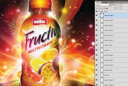
15 Create a new layer and select the Brush tool. Select a soft, round brush and make its diameter 10 pixels. Click Shape Dynamics and make the minimum diameter 10%. Select the colour white and, with the Pen tool, draw a curved path. Ctrl/right-click and select Stroke Path. Ensure Brush is selected and Simulate Pressure is checked, and hit OK. Ctrl/right-click with the Pen tool and select Delete Path. Repeat this with different sized brushes, maybe working in some outer glows or colour overlays.
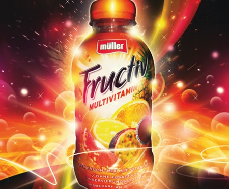
16 Repeat the above steps and add anything else you want. Then, once you think your image is finished, go to Image>Adjustments>Gradient Map. Click on a gradient, then in the Gradient Editor you can load different gradients, or make your own. Here I chose one that made the lighter areas more yellow, and gave the image as a whole a bit more contrast. When you're happy, Copy Merge the whole canvas into a new layer on top of your layer stack, go to Filter>Blur>Gaussian Blur, and use a 3-pixel radius to soften it all down. Add a layer mask to make the bottle and the areas surrounding it more focused - and you're done!
Pete Harrison
Based in south Devon, freelance designer Harrison, aka Aeiko, has worked for various high-profile clients and also runs his own clothing labels, called Funkrush and SuperCombo. www.peteharrison.com

Thank you for reading 5 articles this month* Join now for unlimited access
Enjoy your first month for just £1 / $1 / €1
*Read 5 free articles per month without a subscription

Join now for unlimited access
Try first month for just £1 / $1 / €1

The Creative Bloq team is made up of a group of art and design enthusiasts, and has changed and evolved since Creative Bloq began back in 2012. The current website team consists of eight full-time members of staff: Editor Georgia Coggan, Deputy Editor Rosie Hilder, Ecommerce Editor Beren Neale, Senior News Editor Daniel Piper, Editor, Digital Art and 3D Ian Dean, Tech Reviews Editor Erlingur Einarsson, Ecommerce Writer Beth Nicholls and Staff Writer Natalie Fear, as well as a roster of freelancers from around the world. The ImagineFX magazine team also pitch in, ensuring that content from leading digital art publication ImagineFX is represented on Creative Bloq.
