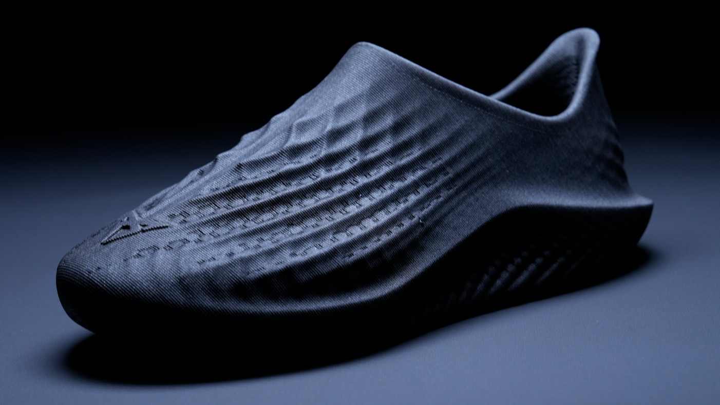
Retouch images with frequency separation
Ben Secret explains how to achieve smooth yet sharp images, without losing realism
One of the black arts of photographic retouching is how to achieve the impossibly smooth, yet sharply rendered skin, textures and fabrics seen in fashion and beauty images. Photoshop has its own high quality smoothing and sharpening filters, but the two processes tend to be somewhat contradictory.
In this tutorial I'll walk you through how I retouch an image from start to finish, using a technique that enables you to selectively process not only different areas of an image, but also different detail levels. Frequency separation involves creating a high detail (high spatial frequency) layer and a low detail layer from a source image - a particularly clever method of doing this was popularised by Sean Baker, a Maryland-based photographer and retoucher. Using this technique enables you to smooth and rework rough and fine details independently, and opens up some very high-quality and non-destructive methods with which to sharpen your images.
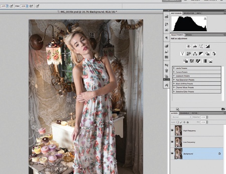
01 In Photoshop, the first step is to ensure you're in 16-bit mode and, using your own photo, create two duplicate layers of your source image. Name the middle layer 'low frequency' and the top 'high frequency'. The bottom is your untouched image, which you may want to reference later.
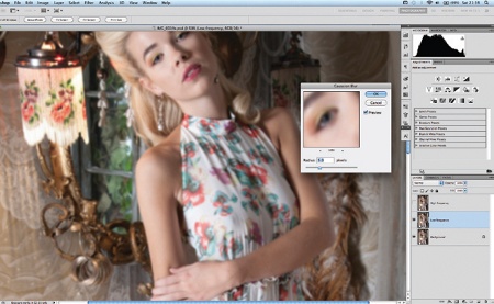
02 Select the low frequency layer. To create your frequency separated image, you need to remove all the detail from this layer. Select Gaussian Blur. The Radius setting determines the crossover point between your high and low detail layers. This should be the point at which very fine details like skin pores and eyelashes blur. Experiment until you're happy.
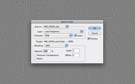
03 Now select the high frequency layer, and go to Image>Apply Image. For Layer, select Low frequency from the drop-down menu, and for Blending, select Add (not Linear Dodge Add). Set Scale to 2, Offset to 0, tick the Invert box and hit OK. All being well, you should now have a faint, fine detail layer. Change the Blending Mode to Linear Light.
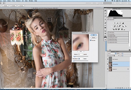
04 Your original image is now reconstructed with no loss in quality. Select the low frequency layer and apply a surface blur (Filter>Blur). You want enough surface blur to smooth out any inconsistencies in skin tone, without smudging highlights and shadows. I'm using Radius: 11, and Threshold: 10.
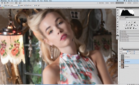
05 With your high frequency layer neatly separated, smoothing and painting on your image becomes much less destructive. The light here has cast some hard shadows on the girl's face. Staying on the low frequency layer, use the Eye Dropper and a soft paint brush with Flow set to 1% to smooth the contours of the face.
Get the Creative Bloq Newsletter
Daily design news, reviews, how-tos and more, as picked by the editors.
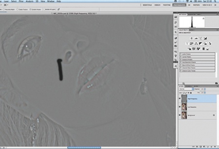
06 Select the high frequency layer and clean up any blemishes, wrinkles and stray hairs. One of my favourite tools is the Spot Healing Brush. Without the low frequencies, this tool becomes even more effective, enabling you to zap unwanted details without then creating patchy colour inconsistencies.
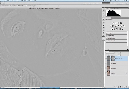
07 This technique also enables you to apply some very high quality sharpening effects. Duplicate the high frequency layer, add a mask to the new layer, copy and paste the high frequency image into its own mask (Alt/Opt+click the Mask window in the Layers palette), and invert it (Ctrl/Cmd+I).
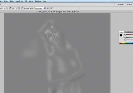
08 Next create a Dodge and Burn layer to bring out highlights and shadows where you want them. Go to Layer>New> Layer, set the Mode to Overlay, and tick 'Fill with Overlay-neutral color (50% gray)'. Paint on this layer with a soft black or white brush set to 1% Flow. (The image here demonstrates how this layer looks with the Blending Mode set to Normal.)
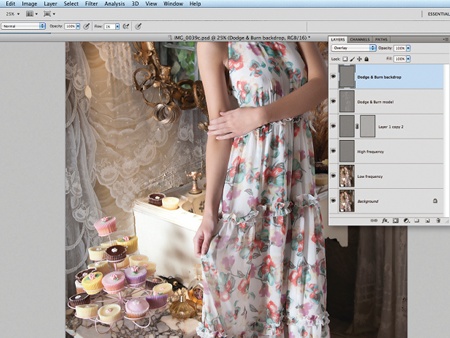
09 Dodge and Burn can be used with large brushes to create dramatic highlights and shadows. I created another Dodge and Burn layer for the background, and added some light to the image elements I wanted to bring out, such as the cupcakes. I also created a little more glow from the light, and darkened the shadows around the model.
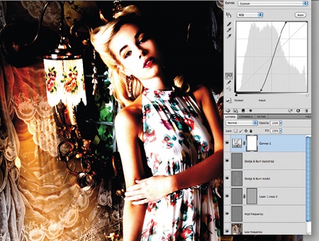
10 After painting, dodging and burning the skin, it's not unusual to find small patchy areas and inconsistencies in your brush work. To check for this, create a Curves adjustment layer with a very exaggerated S-curve: small tonal inconsistencies will be blown up for easier correction.
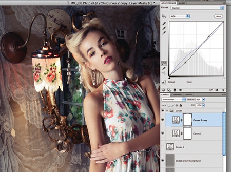
11 Make your exaggerated curves layer invisible and create another Curves adjustment layer to pull the shadows down a bit. Go to the Blue Channel and add some blue in the shadows. When I'm happy with the outcome, I duplicate this layer so I can mix it in further, without having to change anything.
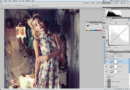
12 Now create another Curves adjustment layer to tweak the colour. For images that need heavy colour correction, this would be one of the first steps in the retouching process. However, here it's more for a creative effect. Select the Blue Channel and rotate the gradient clockwise by about 10 degrees.
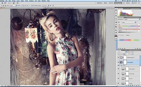
13 Next add a Hue/Saturation layer and a Brightness/Contrast layer, just to balance the image at this stage. Take the Saturation down to -27. When desaturating an image, I set the Blending Mode of the Adjustment layer to Color so that I don't lose any contrast.
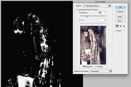
14 To add shine and specularity to the highlights, create a new layer and, with white selected as your foreground colour, go to Select>Color Range. Take the Fuzziness up to a point where you can see only the brightest highlights, hit OK, and then fill the selected area with white.
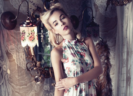
15 For this image I wanted a softer, dream-like quality. The white areas you just filled might be quite grainy, so with this layer selected, add a Gaussian Blur with a Radius of about 5 pixels. This will smooth the white highlights on the skin and add a subtle glow.
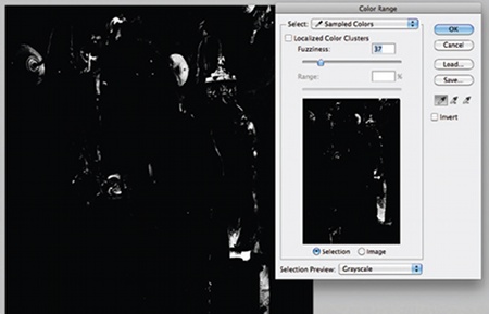
16 I also wanted to add some depth to the darker areas of the image, to make sure the focus is on the model and the cupcakes. To do this, simply do the same thing again on a new layer, this time with black selected as your foreground colour, and fill the area in black. Mix this in at a low Opacity, somewhere around 10-20%.
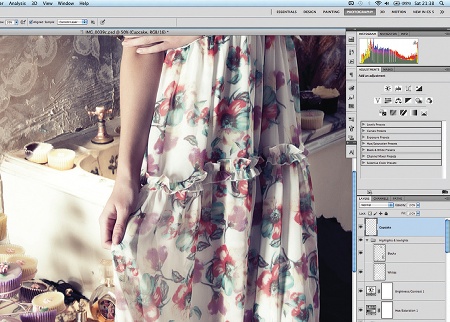
17 Take a look at the image now: one thing dragging the eye away from the model's face and towards the centre is the dark cupcake on the sink. To correct this, I created a new layer, set the Clone Stamp tool to Sample: All Layers in the Tool Options bar, and replaced the dark cupcake with the yellow one next to it.
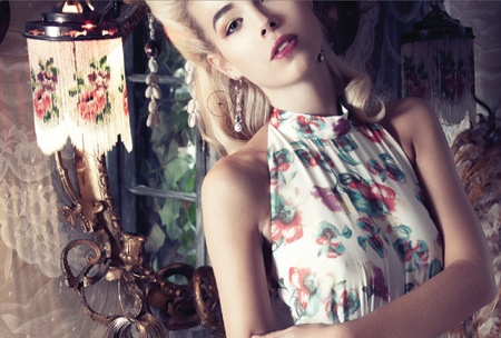
18 When retouching, some creatives like to liquify an image as the first step but I prefer to leave it until last as this is more of a destructive edit. I'll usually save the image as a Photoshop file, then flatten it for this step. Here I made the nose straighter and reduced the stretch from the earring on the earlobe.

Thank you for reading 5 articles this month* Join now for unlimited access
Enjoy your first month for just £1 / $1 / €1
*Read 5 free articles per month without a subscription

Join now for unlimited access
Try first month for just £1 / $1 / €1

The Creative Bloq team is made up of a group of art and design enthusiasts, and has changed and evolved since Creative Bloq began back in 2012. The current website team consists of eight full-time members of staff: Editor Georgia Coggan, Deputy Editor Rosie Hilder, Ecommerce Editor Beren Neale, Senior News Editor Daniel Piper, Editor, Digital Art and 3D Ian Dean, Tech Reviews Editor Erlingur Einarsson, Ecommerce Writer Beth Nicholls and Staff Writer Natalie Fear, as well as a roster of freelancers from around the world. The ImagineFX magazine team also pitch in, ensuring that content from leading digital art publication ImagineFX is represented on Creative Bloq.
