Project diary: Time for Some Action
New York-based designer Darren McPherson brought his passion for handcrafted design to this typographic poster for a travelling exhibition in China
When the Beijing Institute of Graphic Communication asked Australian designer Darren McPherson to participate in a travelling typographic poster show, it was the perfect excuse to return to the kind of self initiated project that gives him the creative freedom he thrives on.
Working on personal projects has always been a passion of mine – away from client briefs and the stresses of gaining approval. Self-initiated work allows me to experiment and get back to working a bit more physically. The idea of being creative to please no one but myself has always been appealing – although often hard to make time for.
I was looking for a reason to get back into my personal projects when I was emailed by a member of the Beijing Institute of Graphic Communication asking me to participate in a travelling typographic poster show in China.

They explained the purpose of the exhibition: ‘to encourage new and innovative typography design, promote the international exchange of typography design ideas and cultural experiences, and to inspire new typographic approaches.’
I took inspiration from the paper sculptures of Yulia Brodskaya and Ramiro Torres, and, similarly, Mario Hugo’s recent work for Zune. Their influence is felt in the techniques employed within this project. However, for me it was also crucial that my own handwriting was central to the piece. I like the imperfections created through handmade character building.
In short, it seemed as good an excuse as any to get back into self-initiated projects.

PROJECT EVOLUTION
FINDING FORMS
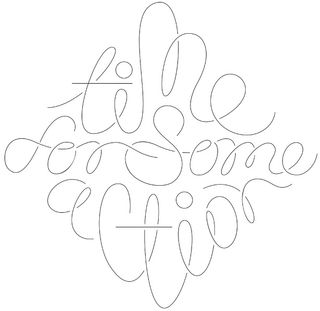
‘Time 4 Sum Aksion’ is a song by Redman that seemed fitting. Initially, the project began as hand-drawn sketches to get the feeling correct and figure out what shape fitted the phrase. I took cues from my own handwriting, which I followed when deciphering the loops and connections between letters.
REFINING THE DESIGN
After tweaking the design for quite some time in an attempt to balance readability and a general filling of the shape, I arrived at my end lockup. It took a pretty substantial change from my initial sketches to get it to this point. The overall technique is based on an old project I never quite got around to completing.
CUTTING OUT
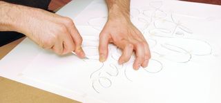
Next, I spent some time printing A guide, which I used to tape to my thicker base board and cut the design through, using an X-ACTO knife. I needed this so I could begin vertically building the letterforms themselves. It’s almost like I’m speaking the words softly to myself – a kind of confidence booster.
STRIPTEASE
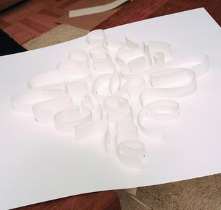
To ensure no flaring of the letterforms between the base and the top, I used thinner printer paper to slide in at even heights. This was a pretty tight squeeze and if I hadn’t backed the paper with some sturdier sections, would have proved quite impossible. I wanted shapes to be defined, not floaty.

LIGHTING OPTIONS
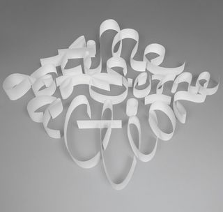
When I was the shooting the project, I honestly wasn’t sure which angle or lighting setup would prove to be the best for the type of image I ultimately wanted. I was initially thinking of snapping them straight on. But, fortunately, I also took multiple shots from both sides, which I compared and contrasted.
HIGHLIGHTS AND SHADOWS
To make working with values easier, I had to greyscale the image, as well as making quite a lot of adjustments to the highlights and shadows. The last step was colourising, as and when it seemed necessary. I also completed the circles on the dot of the ‘i’, and then cleaned up any knife marks or mis-cuts.
FINISHING THE PIECE
I had to do quite a lot of hand-manipulation to the photograph – such as adjusting the lighting and improving consistency. I also refined the edges, for clarity, darkened overlaps, for definition, and then I fine-tuned some of the curves to enhance the overall readability of the piece.

Discover 20 beautiful examples of paper art at our sister site, Creative Bloq.
Get the Creative Bloq Newsletter
Daily design news, reviews, how-tos and more, as picked by the editors.

Thank you for reading 5 articles this month* Join now for unlimited access
Enjoy your first month for just £1 / $1 / €1
*Read 5 free articles per month without a subscription

Join now for unlimited access
Try first month for just £1 / $1 / €1
The Creative Bloq team is made up of a group of design fans, and has changed and evolved since Creative Bloq began back in 2012. The current website team consists of eight full-time members of staff: Editor Georgia Coggan, Deputy Editor Rosie Hilder, Ecommerce Editor Beren Neale, Senior News Editor Daniel Piper, Editor, Digital Art and 3D Ian Dean, Tech Reviews Editor Erlingur Einarsson and Ecommerce Writer Beth Nicholls and Staff Writer Natalie Fear, as well as a roster of freelancers from around the world. The 3D World and ImagineFX magazine teams also pitch in, ensuring that content from 3D World and ImagineFX is represented on Creative Bloq.
