Profile: Non-Format
Anticipation. Very few design studios generate it and then live up to the hype. As Mark Penfold discovers, however, Non-Format is one design studio that does.
The wave of excitement ahead of the Non-Format cover design for issue 163 of Computer Arts was a palpable force. Ordinarily, you'd see this as the kiss of death, but Non-Format has done this so many times before that it's second nature. For music, magazines, fashion, and increasingly for advertising, Jon Forss and Kjell Ekhorn can't help but confound expectations. It's just what they do.
"I'm a bit spellbound by magazines, it has to be said," says Jon Forss, the States-based half of Non-Format, who has a house full of them. One of the things he loves about magazines is their ephemeral quality: "I buy them for the moment but, rather like a good wine, they take about 20 years before they really mature." So, hold on to those back issues. "They become a fascinating snapshot," Forss continues, "not only of that era's visual culture but also, via the advertising pages, of its social preoccupations."
The last decade has seen a boom in magazines, particularly those sexy, expensive titles so beloved of the design fraternity, but that could be about to change. The credit crunch is going to be a challenge, particularly for experimental titles, says Ekhorn, the UK-based half of Non-Format: "If advertising for niche titles dries up then many magazines are likely to disappear. Hopefully this won't happen, but the signs in the current market are not too promising."
This is to be lamented, not least because without that niche circulation we would never have had Non-Format - at least, not as we know them now - because it was here, art directing music title The Wire, that the studio really cohered.
Live wire
The way Ekhorn talks about it, these were magical times. "We spent around two weeks of each month researching material, commissioning photography, designing and artworking each page," he recalls. Every new issue presented a blank slate on which the studio could reinvent itself and the medium, if that was what the duo wanted, and for a while that was exactly what they did.
"We tended to experiment with a new headline treatment with each issue and then discard it for the next issue," Ekhorn explains. After a couple of years doing this, a more thoughtful approach began to emerge from the frantic remaking. "We begun to have more confidence in the headlines we were creating," he continues. "Letting these run for longer periods taught us the value of allowing something we'd created to mature and evolve."
This process has become a cornerstone of Non-Format's way of working. The wheel is no longer reinvented at every opportunity. "We learned the value in taking things much slower and allowing each aesthetic development to have a life of its own," says Ekhorn. This lesson can be applied to pretty much any field and at any scale, which is fortunate because Non-Format's client list is continuing to escalate in terms of both creativity and prestige.
The mainstream
While it almost goes without saying, Forss happily reaffirms the studio's commitment to type design, telling us that "Producing new typefaces, specifically for new projects, continues to be a passion." Interestingly, he also notes that the new faces that are being created are, "Somewhat more sophisticated and crafted than previous attempts."
But that's only part of the picture. "When the type work is combined with new photographic elements, themselves the result of many hours of experimenting in a photo studio, the results are incredibly rewarding," says Forss. It's clear that lot of time and energy has gone into developing these new techniques, making them typography-friendly, and the results are compelling.
This change of focus in part reflects the fact that interest has been growing from larger clients - big campaigns present unique opportunities and challenges. But it's also a product of the need to keep moving forward. "One of the main reasons we try to keep our typographic explorations moving in new directions," says Ekhorn, "is because of how quickly an idea can be appropriated and fed into the mainstream."
Having your style ripped off left and right may be distressing, but it ensures that those with the talent are pushed to innovate across the board. So Non-Format's art direction of Varoom, The AOI's illustration mag, sits smartly alongside work for Nike and even French Elle, each providing a unique creative opportunity. "The most satisfying feeling," says Forss, "is having confidence that something we're working on feels fresh and new to us, and looking forward to having it out in the world for others to see."
Moving images
But what if the world is depressed and has started seeing things differently? How will design respond? The picture is mixed, argues Ekhorn: "I expect we'll see less creative risk-taking from large mainstream corporations and a surge in creativity from the sub-cultures." Luckily, when people with talent aren't being briefed by clients, they don't go into hibernation; they do their own thing.
For its own part, Non-Format is looking to move in an entirely new direction. "We're hoping to be able to hook up with some talented moving-image people" says Forss. "We'd love to have the opportunity to create a title sequence for a movie, and perhaps even to have a hand in the next generation of screen-based music 'packaging'."
What won't change is the craft that underpins all of Non-Format's work. Simplicity is the key here. "Hierarchy is a bit of a preoccupation of ours," says Forss. "We've always felt that whatever elements are going to be included have to work really hard and look the very best they possibly can." If something isn't working this is soon made apparent as the files fly across the Atlantic.
"We have a very open policy of criticism between us, which is based on a decade's worth of trust," Forss reveals. And this, he believes, lies at the heart of the studio's enviably high standards: "If either one of us produces something the other is not happy with, we feel we have a right to veto." This competitive atmosphere has bred something of an obsession with details, but that's no bad thing in a designer. "By being so uncompromising," Forss concludes, "we hope to avoid producing anything mediocre."
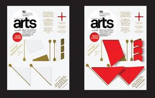
Non-Format's die-cut cover
Forss and Ekhorn reveal the process behind CA163's special cover.
01 Making a start

"After a bit of a false start with simple die-cut shapes, it occurred to us to employ some scored fold lines, in addition to the cuts, to create paper windows which, once opened, would reveal a hidden word. We started with the word NEW - which was taken from the headline - created a new typeface that would work with the folds, and decided on a red and gold colour palette."
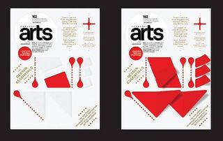
02 Work in progress

"At this stage the type had evolved so that the 'cotton bud' line shapes would now be cut through in a series of dots so that all of the hidden word could be in the same colour, but without the need to print any red on the front cover. Unfortunately, the magazine's editors asked us to move the headline to the top of the cover, which would have divorced our hidden word entirely from the headline. We decided instead to rethink the cover word entirely."
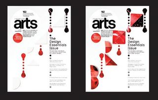
03 Drastic changes

"We decided to use one of our exploding liquid images, which was produced in collaboration with photographer Jake Walters, as the reveal for the inside. This led us to change the word to BIRTH, which is more emotive and adopted a more commanding role when written diagonally across the cover. Added to all this was an instruction from the die-cutter technicians to make the holes much larger. One last addition was to add a spot UV varnish to define the masthead roundel and letter shapes."

Thank you for reading 5 articles this month* Join now for unlimited access
Enjoy your first month for just £1 / $1 / €1
*Read 5 free articles per month without a subscription

Join now for unlimited access
Try first month for just £1 / $1 / €1
Get the Creative Bloq Newsletter
Daily design news, reviews, how-tos and more, as picked by the editors.
The Creative Bloq team is made up of a group of design fans, and has changed and evolved since Creative Bloq began back in 2012. The current website team consists of eight full-time members of staff: Editor Georgia Coggan, Deputy Editor Rosie Hilder, Ecommerce Editor Beren Neale, Senior News Editor Daniel Piper, Editor, Digital Art and 3D Ian Dean, Tech Reviews Editor Erlingur Einarsson and Ecommerce Writer Beth Nicholls and Staff Writer Natalie Fear, as well as a roster of freelancers from around the world. The 3D World and ImagineFX magazine teams also pitch in, ensuring that content from 3D World and ImagineFX is represented on Creative Bloq.
