The pro secrets of a poster designer
Swiss graphic designer Felix Pfäffli discusses his enduring love of posters, and why he feels the format can thrive in any medium.
Swiss graphic designer Felix Pfäffli has been nothing short of prolific since graduating and setting up his own design studio, Feixen, in his hometown of Lucerne in 2010. His website displays a wealth of design projects that include magazine and book covers (Computer Arts has commissioned him in the past), T-shirt graphics, custom typefaces and an abundance of posters created predominantly for arts institutions and exhibitions.
Perhaps the most striking thing about Pfäffli's body of work is that he doesn't work in one particular signature style, but instead shows rare confidence in successfully adapting multiple approaches depending on the particular project in hand and its related subject matter.
Sometimes his work is stark and graphic, with bold type and flat colours. On other occasions he employs brush strokes, different textures, gradients and even collage effects to create rich, illustrative imagery. Here, he shares more about what makes him tick...
For more inspirational design, see our roundup of the best poster design out there.
When did you first realise that graphic design was what you wanted to do?
I've always liked creating stuff. When I was growing up we used to build things. Whatever we wanted to play with, we'd make it ourselves. Actually, it still feels similar today when I start a new design project – there's this amazing moment when anything and everything is possible. This is what I love about what I do.
Today, I work for people that give me the freedom to come up with ideas and respond in my own way to a brief, no matter what it is they want from me. If somebody asked me to design a dress for a clothes company tomorrow, I would jump at the opportunity.
Your website is chock-full of bold and colourful portrait-format posters. Has designing posters become 'your thing'?
I've always been interested in poster design, but for me, it's less about the format and more about the nature of the work. I like to work fast. I like to keep things simple. And as much as I like starting a project, I like to finish it too. Projects that drag on for months are just a pain for me, so I don't really enjoy working on books or designing corporate identities.
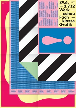
What is it about the poster format that's so appealing to you as a designer? And why is it so enduring as a medium?
When you're designing a poster, there's nothing to hide. What you see is what you get. I like that. It's an honest medium and hugely versatile – I don't see the poster as being solely confined to just being print-on-paper.
I think the idea of a poster is just to have a limited, defined space. How big, or how it is produced is unimportant. I can well imagine that the poster of tomorrow will be animated, responsive, interactive and kind of intelligent. The whole process of how you think and work when making posters will inevitably change. Maybe we won't even print them any more.
What I am certain of is that we will aways need media formats that communicate in an immediate way.
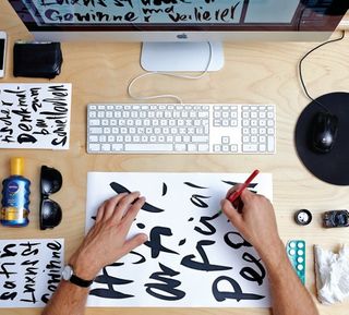
Your work displays a whole range of styles and techniques. Can you tell us how you approach your work and what inspires you?
Some designers feel that they can go through the entire poster design process in their mind before sitting down to actually design it. That approach doesn't work for me, I always have 10 or 20 ideas as soon as I see a brief. And if I have time, I'll try them all.
It often happens that I realise something simply by the act of designing it – something I could never have imagined without undergoing the design process itself. Or I might have two separate sketches and realise that they complement each other perfectly.
That's what I like about my own approach. Sometimes the end result is completely different to my original thought.
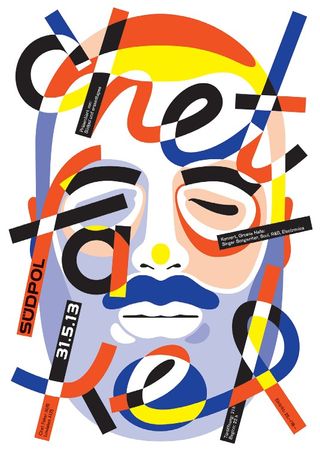
Generally, I try to start from scratch with every poster I design. Of course, that's not always possible because the longer you work and the older you get, the more rules and ways of doing things sway your thought processes.
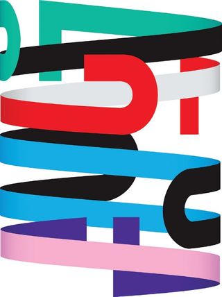
So with my Südpol poster series I found a nice way to avoid being too repetitive: for each poster, I set out to imitate another designer, not in terms of their style so much as trying to understand the series of thought processes behind their work.
In many ways, I'm much more interested in the process behind a work or the person behind a work than I am in the work itself.
Can you tell us a bit about your studio set-up?
I used to work alone, but I travel so much for exhibitions and lectures that it became tricky to keep the studio going, so six months ago I hired another part-time graphic designer to join the studio.
We share a studio space in the city centre on the ground floor of a beautiful old Swiss house with another graphic designer, a photographer and a visual merchandiser.
We have the local youth radio station on in the background and people come to visit us all the time, sometimes for meetings, sometimes to just hang out. It always feels pretty busy in the studio and when the weather permits, we'll often have a barbecue in the garden around noon.
Describe a typical working day?
A perfect working day involves getting up at 9 or 10am. On the way to the studio I'll buy coffee and croissants for everyone. Then I'll answer my emails and kill all the paperwork. It's not the highlight of my day but it all needs to be done.
Then, if we don't have a barbecue, we'll go to one of several restaurants owned and run by friends. Sometimes I wonder whether the only reason I earn money is to eat well.
Back in the studio, of course, I try to get down to work. However, if for one reason or another it's not possible, then I'll do something else. I don't like wasting my time. I believe that when you're properly focused, you can reduce your working day from eight hours to five.
Words: Gavin Lucas Photography: Marco Sieber Fotografie
This article originally appeared in Computer Arts issue 231.

Thank you for reading 5 articles this month* Join now for unlimited access
Enjoy your first month for just £1 / $1 / €1
*Read 5 free articles per month without a subscription

Join now for unlimited access
Try first month for just £1 / $1 / €1
Get the Creative Bloq Newsletter
Daily design news, reviews, how-tos and more, as picked by the editors.
The Creative Bloq team is made up of a group of design fans, and has changed and evolved since Creative Bloq began back in 2012. The current website team consists of eight full-time members of staff: Editor Georgia Coggan, Deputy Editor Rosie Hilder, Ecommerce Editor Beren Neale, Senior News Editor Daniel Piper, Editor, Digital Art and 3D Ian Dean, Tech Reviews Editor Erlingur Einarsson and Ecommerce Writer Beth Nicholls and Staff Writer Natalie Fear, as well as a roster of freelancers from around the world. The 3D World and ImagineFX magazine teams also pitch in, ensuring that content from 3D World and ImagineFX is represented on Creative Bloq.
