Port magazine
New men’s magazine Port is a bold move from three industry veterans. Ed Ricketts talks to its two creative directors about magazine design, the future of print, and doing it yourself
Port, a quarterly men’s magazine launched in March this year, is an unashamed paean to the art of pure magazines. Both words and images are given room to breathe: major articles, for example, feature a simple, typographic-driven opener on a right-hand page, while images are placed prominently and simply, unfettered by anything other than a caption. Body text, too, is treated with a traditional three-column design.
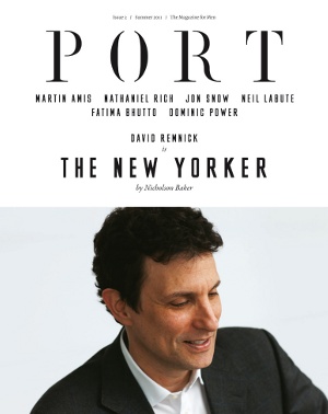
It’s the result of a collaboration between three people who discovered that not only were they tired of men’s magazines as a whole, but that the genre said nothing to them as people. Editor Dan Crowe founded literary magazine Zembla, and Port’s creative co-director Matt Willey, of Studio 8, worked alongside Crowe on that publication. “He’s a genius as far as I’m concerned,” says Willey. Kuchar Swara, the other creative director, has worked for The Spectator and, among other things, currently art-directs interior design magazine Case da Abitare, based in Milan. The trio have now founded design agency DKM Creative together in addition to their other work, with Port being the first result of their collaboration.
“I’ve been involved with start-up magazines for the past 15 years, and this has been a bit of a dream come true, to be able to do this,” says Willey. “The most important thing for me is having a handle on the editorial content. It’s not that I don’t care about the design of it, but we can publish things that are valuable. We’re not owned by anyone – we’re completely independent, so we only publish what we want to. We’re not pandering to a media conglomerate that thinks, ‘This is what a men’s magazine should look like,’ and then comes up with Nuts.”
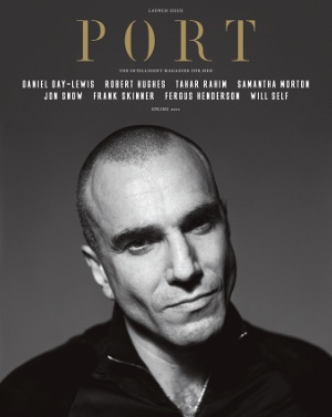
Indeed, Port is about as far from a celebrity-worship mag as you could imagine. While contributors to issue one include the likes of Jon Snow, Samantha Morton and Daniel Day-Lewis – who is also featured on the cover – their brief was to write about topics that interested them, rather than their latest book, film or advert. Thus Day-Lewis’ feature is entitled ‘How to manage the effects of a military attack’, and concerns the current situation in Palestine.
“We talked about what was missing from the men’s magazine market and what we’d like to buy ourselves,” says Swara, of the initial meetings which led to the magazine’s founding. “The interesting thing is that I think all of us really enjoy magazines and buy a lot of them, but not men’s ones. So we talked about the content of these magazines, what sort of tone of voice would attract us – do they discuss profiles that are interesting, or are they just about new movies that they’ve been able to get hold of celebrities for?
“A lot of other mags weren’t aimed at us. Fantastic Man, for example, is mostly gay, and Monocle is aimed at the CEO, and the articles weren’t really up to it. So we felt we represented a large audience that wasn’t being catered for, and decided to go from there.”
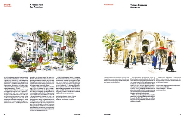
Port’s slow, considered design almost looks likes a conscious reaction to the hectic pace of most modern magazines, and while this is partly true, both Willey and Swara were careful not to simply resort to being contrary for the sake of it. “Kuchar and I were very aware of the magazine market and what things look like,” explains Willey.”It’s difficult not to be influenced by those things, or at least have them in your mind. But we didn’t start out with a complete agenda as to how it should look. I think one of the benefits of having two creative directors is that you can bounce ideas off each other. If I’d done it on my own it would have looked very different, and vice versa.”
“I think we wanted to design something that wouldn’t date very quickly, or wasn’t actively trying to look like magazines from the ‘60s [such as Esquire],” adds Swara. “We love those mags and are inspired by them, but the design of Port isn’t based on them. One mag I really like is The New Yorker, not just because of the content but also the design: it’s so subtle and it hasn’t had to change very much. They have the same headline size that runs throughout, and the contents don’t have to shout. Of course Port has more sections so we did need a play on sizes, for example with the larger headlines towards the end of the magazine, where the main features are. But overall, it’s not based on those old mags – it was designed for a modern problem.”
The design came together quickly in magazine terms, with the pair working on it for around six months. “It was surprising how easy it was, in a way,” says Willey. “We agreed on things quite quickly and dismissed things quickly too. Kuchar was very active in running out spreads and showing them to us in the pub at night, so we’d do things quickly. To be honest I expected it to be more drawn-out and agonising than it was.
“The idea of running features with single pages on the right-hand opener, for example – that came up, we discussed it, we tried it out and it worked. In retrospect – and I’m quite surprised to hear myself say this – it was easy. Obviously we’re tweaking all the time and it will evolve gradually.”
Willey also designed two custom fonts for Port: Port 1, a stencil-style typeface which is used on the cover and section openers, and MFred, which is used for features. Quadraat is used for body copy.
“That was sort of a happy coincidence,” says Willey. “I’d started playing around with typefaces for jobs that I was working on with Studio 8, and I knew in the back of my mind that it would be useful for us to have a typeface we owned. So we tried it out on the page, and as with everything else we were honest – if it hadn’t worked we wouldn’t have used it.”
As with everything else in the magazine, the trio have total control over the photography in every section. That must have been a fantastic freedom? “Fantastic, and also a little bit exhausting!” says Swara. “For the next issue we wanted to do a photo story for a museum in Berlin and it was an absolute nightmare to get permissions and so on. But we’ve been extremely lucky to have such great photographers wanting to work with us. Our budgets are nearly zero but that hasn’t deterred them, because I think again with other magazines that are out there, they aren’t able to vent their creativity; to do the things they want to do.
“For example John Bolsom, who’s a great photographer, had to go to LA to do a story, and while he was there he did our fashion story and paid for all the prints and things himself. He put so much of his time and energy into it and normally you’d have to pay a lot of money for that.”
It wasn’t only the photographers who worked for virtually nothing. According to Willey, Martin Amis was paid in wine, while Jon Snow received a tie for his piece. It’s certainly a testament to the contributors’ enthusiasm that such well-known and sought-after names were willing to help in such a way – and it’s all part of Port’s DIY ethos: “Rolling Stone, when it first started in the 1960s, was just a group of friends who liked music and started putting some sheets together,” adds Willey. “You don’t get people doing that these days.”
In Swara’s eyes, a magazine should take advantage of its unique format – portable, high-resolution and able to be sampled at leisure – rather than trying to compete with more transient online media. “If you look through the pages of Monocle, GQ, The List and so on, they’ll have seven or eight pictures on there with lists of information. There’s a lot to take in and digest,” he points out. “It almost seems like there’s a sense of anxiety that people just won’t be able to consume all the information – and I’m sure publishers will say, well, people haven’t got time to read things, so let’s cut everything down. But in fact, to me and others like me, the opposite happens: you think, ‘Gosh, where do I start? Where do I end? What am I supposed to read?’”
One aspect that wasn’t really considered during Port’s design phase was any capitulation to eventual digital formats. Although Port has a simple website and now an iPad app, designed by Jeremy Leslie, both Willey and Swara were determined to keep their focus on print. “We knew how to do a printed magazine and that was the sole concentration,” Willey says. “It’s still the best part of what we do. We knew we’d do a website and probably an app, but that was all. I really like the idea of the print magazine being at the heart of everything we do, and everything else around that, well – we’ll try to do as best as we can.”
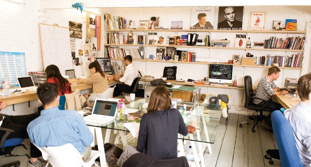
Willey and Swara are under no illusions about the perilous state of the print magazine market as a whole in these digitally-focused times, but the tired idea that print is dead – to be ultimately replaced by some iPad-driven multimedia experience – is greeted all round with polite dismissals. “Are people still saying that?” asks Swara. “In all honesty, I think there will be less print, but it will be higher-quality – because that’s the whole point of it, or you wouldn’t print it in the first place. The quality will go up for sure; there are far more graphic designers around now than there have ever been. I think it’ll become a lot more specialist, and maybe a bit more competitive.”
“The magazine market is definitely oversaturated at the moment, but that will go away over time, and I think that’s a good thing,” agrees Willey. “A lot of the crap won’t be there any more, and you’ll be left with purer magazines with more valuable content. We’ve been obsessed with celebrity for the longest time, and magazines that cover that are much better served online. The same can be said for newspapers. But magazines will continue to exist, I think.”

Thank you for reading 5 articles this month* Join now for unlimited access
Enjoy your first month for just £1 / $1 / €1
*Read 5 free articles per month without a subscription

Join now for unlimited access
Try first month for just £1 / $1 / €1
Get the Creative Bloq Newsletter
Daily design news, reviews, how-tos and more, as picked by the editors.

The Creative Bloq team is made up of a group of art and design enthusiasts, and has changed and evolved since Creative Bloq began back in 2012. The current website team consists of eight full-time members of staff: Editor Georgia Coggan, Deputy Editor Rosie Hilder, Ecommerce Editor Beren Neale, Senior News Editor Daniel Piper, Editor, Digital Art and 3D Ian Dean, Tech Reviews Editor Erlingur Einarsson, Ecommerce Writer Beth Nicholls and Staff Writer Natalie Fear, as well as a roster of freelancers from around the world. The ImagineFX magazine team also pitch in, ensuring that content from leading digital art publication ImagineFX is represented on Creative Bloq.
