Plot your pictures
"One image can depict multiple narrative elements," writes artist Simeon Elson. "And the movie poster is the perfect example!"
It's easy to add a variety of elements to a movie poster through portraiture, colour schemes and composition. This could go some way to explaining why greater numbers of movie posters and DVD covers are being illustrated.
Graphic illustration is a great way to inject a different look into a movie poster while still having a strong sense of realism. The main aim of this project is to use illustration to create a movie poster that's different. Take this opportunity to create an image that has your personal stamp all over it and ticks all the boxes in regards to having elements of realism as well as strong evidence of the movie's plot.
Illustrator and Photoshop enable us to swiftly compose and create illustrations in somewhat unusual colour schemes, and ones that are also full of energy. In this tutorial I'm going to show you how to create a graphic action movie poster that draws people in and also gives a sense of the plot.
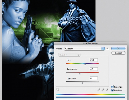
01 Once you've sourced your images it's time to put together a composition in Photoshop. To change the colour of your movie characters, hit Ctrl/ Cmd+U to open the Hue/Saturation window. Click the Colorize tab and adjust the sliders until you find a result that fits. Record the Hue and Saturation values so you can apply these again to your other characters.
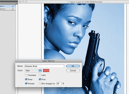
02 Cross over to Illustrator, open one of your reference files, lock it in the Layers palette and name it 'Reference'. To change the colour mode to CMYK, go to File>Document Colour Mode>CMYK. Next create a new layer and name it 'Deepest Blue'.
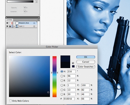
03 Set the Color palette to CMYK by clicking the icon at the top right corner and selecting CMYK. Then set the stroke to None and double-click on the fill colour. Set the fill colour to a very dark blue, as above, and add it to your Swatch palette.
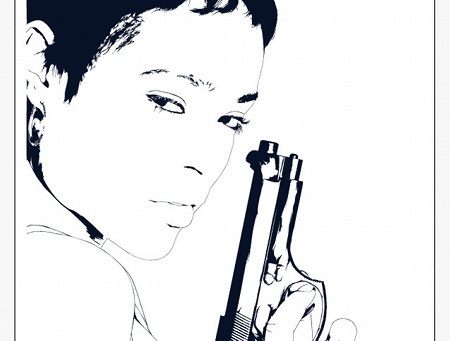
04 Select the Pen tool and begin drawing all the darkest details - for example, the gun, hair, eyebrows and outline features such as the nose and lips - with thin lines. Before drawing your shapes, set Opacity to 10%. This way you can see the photograph beneath while creating your shapes. Keep a check on how your image looks against the white canvas.
Get the Creative Bloq Newsletter
Daily design news, reviews, how-tos and more, as picked by the editors.
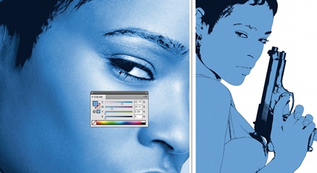
05 Use the Eyedropper tool to find a blue that's in between the lighter and darker tones, and drag this colour to your Swatch palette. Now make a new layer called 'Skin Base' and place it above the 'reference' layer. Use the Pen tool to draw a silhouette around the whole model. Draw shapes around any unwanted areas, then select them along with the silhouette and select the Minus Front icon in the Pathfinder palette.
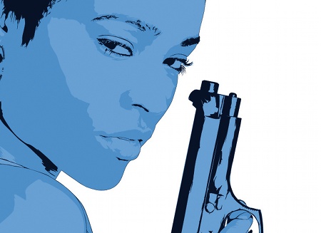
06 It's time to add detail. Create a new layer and call it 'Lighter Shadow'. Use the Eyedropper to pick the lightest shadow, and drag it to your Swatch palette. Then, with the Pen tool, draw shapes that highlight the lightest shadow areas. Follow the same procedure for the medium and darkest shadow areas.
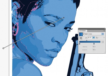
07 As some areas go from darker to lighter, you can use gradients to add a more realistic blend. Combine the darker colour with the lighter blue you used on the layer beneath, then stretch and rotate a Linear Gradient until you've achieved an accurate colour blend. Use this method on other shapes if you feel it's needed; some shapes may require a Radial Gradient.
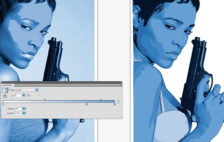
08 Use the same process to create the character's gun and top. Now it's time to inject some light into the image. Create a new layer, name it 'Lower Highlights' and place it above the 'Skin Base' layer. Next create a gradient with white at the 0% location on the slider and the skin base blue at the100% location. Now add a slider around the 75% point and swatch this colour, and use it to draw the lower highlights.
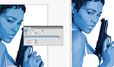
09 Make a Radial Gradient with the lower highlights colour at the 0% location and the skin base colour at the 100% location. Afterwards, make the 100% colour slightly lighter, and the 0% location darker until you get an accurate gradient. Apply this to all of your 'Lower Highlights' shapes. Repeat this process for 'Medium Highlights' and 'Highlights'. Place the 'Highlights' layer at the top.
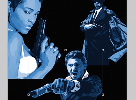
10 Once your characters are drawn, jump back over to Photoshop, create a new A3 CMYK file and use the Paint Bucket tool to fill a new layer with black. After that, open up all your characters and drag them in on separate layers. Position them as per your earlier composition. Select the Eraser tool and set it to Brush mode, with the Size at around 600 pixels, Hardness at 0% and Opacity at around 35%.
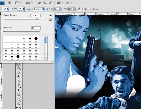
11 Now use the Eraser tool to fade out the characters. Be sure to duplicate each of them before you begin editing. Do the same with the background image and place it above the black background. Hit Ctrl/Cmd+U to bring up the Hue/ Saturation palette. Click the Colorize tab and set the Hue to 170 and the Saturation to 42.
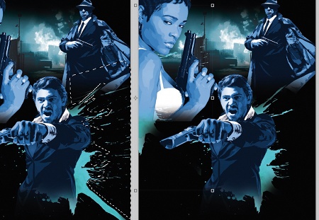
12 I used splatters to add energy to the composition - www.cgtextures.com have some great ones, but I've used my own. Place your splatter behind your character and use the Eraser and Marquee tools to get rid of any unwanted bits. Now duplicate the splatter layer and position it so it sits above the female character.
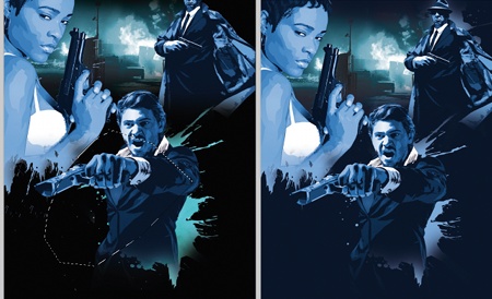
13 Open the Styles palette by double-clicking the layer, then click the Color Overlay tab and use the Eyedropper to make it the same colour as the character's skin. Duplicate the layer again and rotate the splatter until you get an interesting shape, then use the Lasso tool to create a smooth edge. Follow the same theme with any other characters, and change your background colour to the darkest blue used on the vectors.
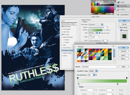
14 Add some more splatters and a piece of rotated text to increase the energy of the poster. I added some Layer Styles; a Linear Gradient with the Blend mode set to Linear Burn (also set to a slight angle), an Inner Glow and a Drop Shadow. Adjust the settings of the styles you applied until you achieve a result that enhances the overall look of the text.
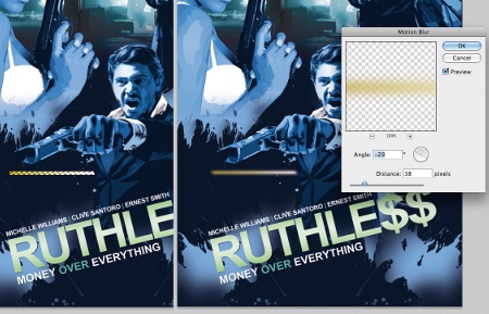
15 Create a new layer and use the rectangle Marquee tool to draw a thin rectangle, then fill it with a yellow and white gradient. Deselect the shape (Ctrl/Cmd+D) and apply a Gaussian Blur of 8.9 pixels radius followed by a Motion Blur angled at -29 and the distance set to 38 pixels. I set the layer Blend mode to Colour Dodge and rotate it to the same angle as my character's gun.
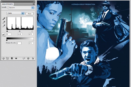
16 Use the Eraser tool at a Hardness of 50% and Opacity of about 35% to tidy up the light strips. I repeat this process for the other side of the gun and for the other characters. Make any compositional adjustments needed then finally enhance the illustration's colour by adding a Levels Adjustment Layer (Layer>New Adjustment Layer>Levels) placed at the top of your layers palette.
Simeon Elson
Simeon is an illustrator and graphic artist. Over the past five years he has produced designs for flyers, books, apparel, websites, branding and magazine editorial. His Clients include: Grazia, Whorrell Rogers design consultancy, Touch magazine and Penguin Books. www.simeonelson.co.uk

Thank you for reading 5 articles this month* Join now for unlimited access
Enjoy your first month for just £1 / $1 / €1
*Read 5 free articles per month without a subscription

Join now for unlimited access
Try first month for just £1 / $1 / €1

The Creative Bloq team is made up of a group of art and design enthusiasts, and has changed and evolved since Creative Bloq began back in 2012. The current website team consists of eight full-time members of staff: Editor Georgia Coggan, Deputy Editor Rosie Hilder, Ecommerce Editor Beren Neale, Senior News Editor Daniel Piper, Editor, Digital Art and 3D Ian Dean, Tech Reviews Editor Erlingur Einarsson, Ecommerce Writer Beth Nicholls and Staff Writer Natalie Fear, as well as a roster of freelancers from around the world. The ImagineFX magazine team also pitch in, ensuring that content from leading digital art publication ImagineFX is represented on Creative Bloq.
