New talent: Manchester School of Art degree shows
Dave Sedgwick picks highlights from MMU's exceptional crop of design graduates.
If you're looking for exciting new graduates for your studio or agency, don't miss Computer Arts' New Talent special, issue 230, featuring our handpicked selection of the UK's best graduates – on sale 24 July.
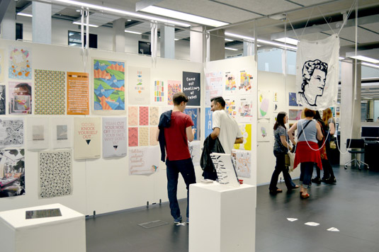
Heading back to your old university is always a little strange. I'm not quite sure why exactly, but the emotions and feelings that often return when I visit Manchester Metropolitan University are hard to put into words.
Not that MMU is the same as it was back in the '90s when I was studying there. For starters it's Manchester School of Art now, and it's been moved to a beautifully polished and highly modern new building.
The open-plan aspect of the building is mirrored in the way the courses are offered. Graphic design shares spaces with illustration; photography moves in the same corridors as textiles. There are less closed doors and more 'Look at what we're doing' going on. And there's an awful lot going on...
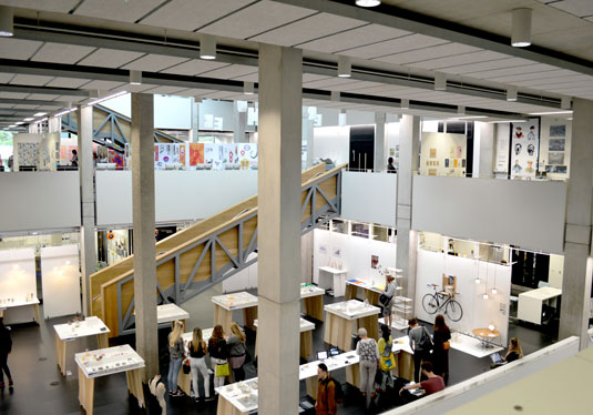
This way of thinking and working is also reflected in the setup of the degree shows themselves. Illustration with Animation flows seamlessly into the Graphic Design areas. If you blink you might even miss the fold marks.
One glance over the balcony and you can see the 3D show; a quick look up and I can see most of the photography work. If the School of Art is trying to show off all its students then it's doing a wonderful job.
But I was here to focus my time on two particular areas. The Graphic Design and the Illustration with Animation courses.
Illustration with Animation
The first thing to say is that the level of ability on display from the Illustration with Animation students was exceptional. Each student's work was beautifully displayed, clearly labelled and easy to digest.
I spent some time talking to senior lecturer Sharon Scholey who explained how this year's students were some of the best they've ever had - a reflection on the rather vigorous selection process the course goes through to decide which students get offered a place.
Steph Coathupe
- Course: BA (Hons) Illustration with Animation
- Website: www.cargocollective.com/StephCoathupe
- Project: Crimelines Anthology
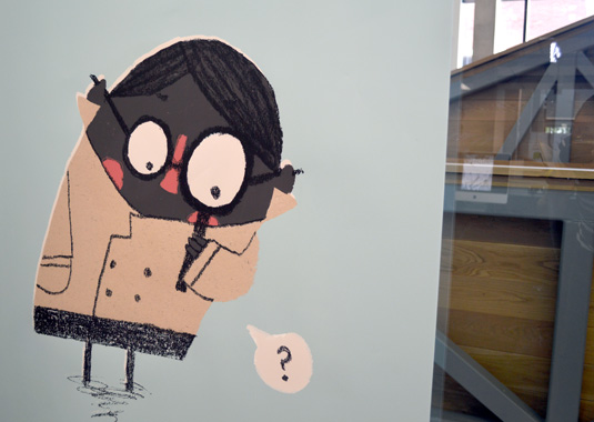
The first student to catch my eye was Steph Coathupe, whose colourful and stylish illustrations had a childlike simplicity to them - but when studied closer showed really intricate details and marks.
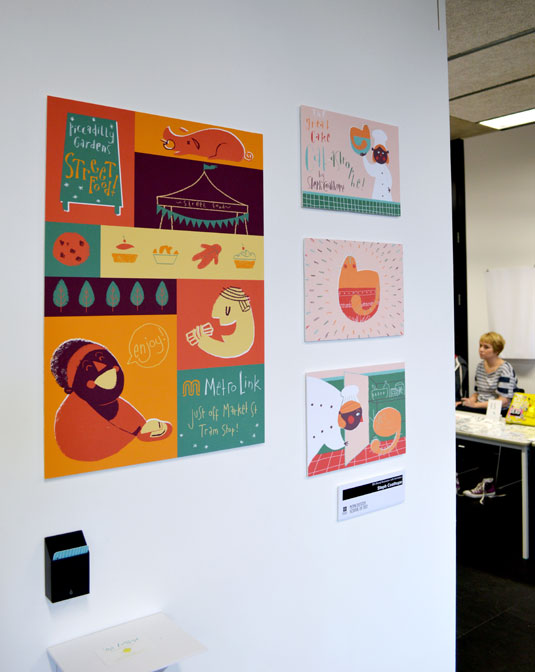
Steph had collaborated with the MA Creative writing course on a project called Crimelines Anthology and created a character that oozed personality and intrigue.
Jessica Ip
- Course: BA (Hons) Illustration with Animation
- Website: www.jessicaipillustration.co.uk
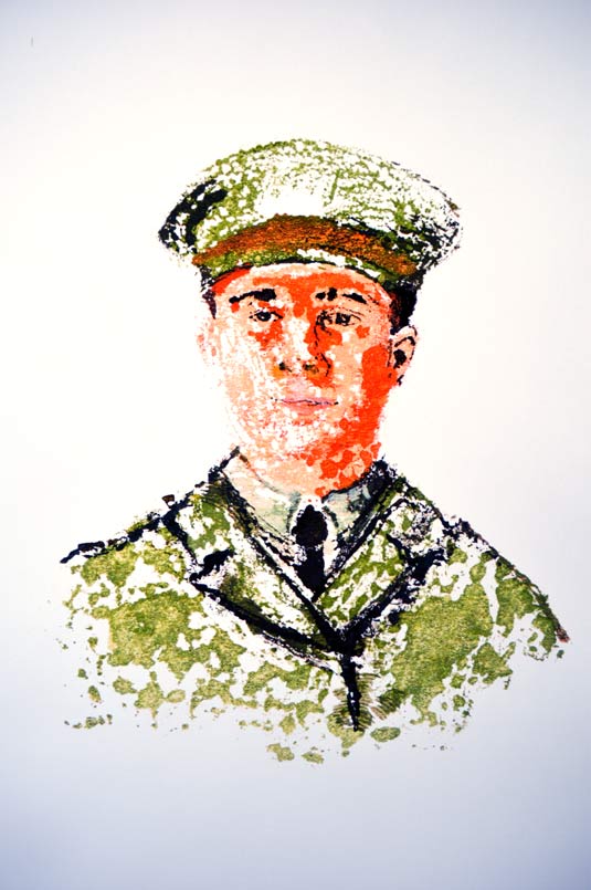
- Project: World War I Portraits
Jessica Ip had an equally unique style, something I noticed almost immediately when I entered the space. Jessica had created a series of illustrations depicting World War I soldiers. She explained how the process involved painting onto glass, then laying a sheet on top before pulling it back to reveal the prints.
The chance-based method gives an element of unpredictability, which is reflected in the concept of the work; the idea that soldiers were sent off to war with the lottery of what might happen to them always apparent.
Kevin Craig
- Course: BA (Hons) Illustration with Animation
- Website: www.cargocollective.com/kcraig
- Project: The Swedenborg Institute
I then found myself in a room with Kevin Craig. Kevin describes himself as an artist and film-maker. He explained how he'd been a designer working on record sleeves for small labels before moving into video work. Three years ago he decided to "jack all that in and start a course in illustration".
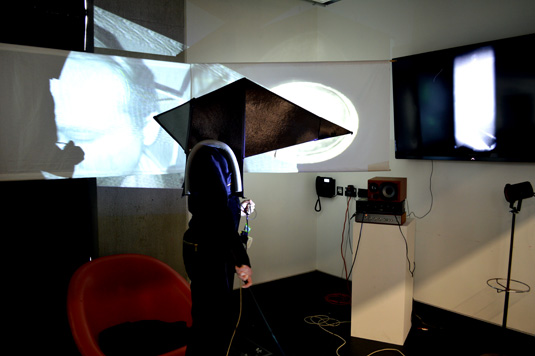
Kevin's piece was extremely haunting and very interesting. Titled The Swedenborg Institute, the performer (Kevin) walks between a series of projections, undergoing a real-life experiment. Truth is, I had no idea what was going on. But I liked it.
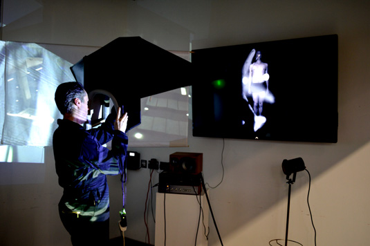
Kevin got into character by wearing a dark boiler suit and oversized head mask. Strange sounds and white noise reverberated around me as moving image, mark-making, performance art and imagery happened everywhere.
I felt pretty uncomfortable but as soon as Kevin took the mask off he was back to his normal cheery self. I asked him what he thought of the course. "The best part is the journey," he said. "I've been allowed and encouraged to take my own direction and I've embraced this in my final piece."
Becca Hall
- Course: BA (Hons) Illustration with Animation
- Website: www.beccahallillustration.co.uk
- Project: From Kendal to Keswick
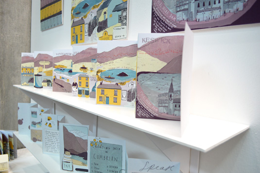
The final student whose work I really liked was Becca Hall. Becca had created a concertina book illustrating the journey from Kendal to Keswick.
What I liked most about Becca's work was how she'd captured the real emotion of the Lake District in her illustrations, but without resorting to the overdone, twee style so often commonly associated with the region.
She'd also shown a level of typography skill sometimes overlooked in illustration, and the two combined resulted in a lovely piece of work.
Graphic Design
I then moved onto the Graphic Design course. As an alumni I'm always keen to see what the course produces.
I lectured at the university a few weeks back and had seen how much passion, dedication and perspiration each member of the course had. There were levels of panic not seen in Manchester since the last few weeks of the football season.
Sadly I was a little confused and overawed by the show itself. Firstly, it's important to say that the design work on display is, again, fantastic.
As a collection of individual pieces the work looks amazing. It represents the course very well indeed, but it's extremely difficult to ascertain which student has worked on which particular project.
As a collection of individual pieces the work looks amazing
John Walsh, third year senior lecturer explains: "We allow each year group to pretty much curate their own show. It's very much what they want to do."
I can't help but feel that a few name tags below each of the pieces of work would help, though. After all I'm interested in finding new talent, highlighting individuals and knowing more about the students themselves.
That said, Manchester School of Art do have some very talented graduates. The body of work is huge and you could spend hours digesting it all.
There are posters, logos, brochures, leaflets, acrylic etchings, advertising campaigns, stickers, illustrations, typography, sketchbooks, websites and even an infographic explaining how much alcohol one student consumed in the summer of 2013. (It was a lot. How they're still alive I have no idea.)
Mathew Scott
- Course: BA (Hons) Graphic Design
- Website: www.mathewscott.co.uk
- Project: You Are Here
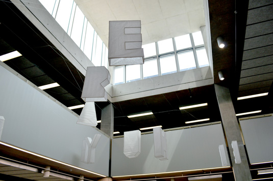
The first piece of work and probably the largest on show is by Mathew Scott. Titled 'You Are Here', Mathew has made a collection of individual letters suspended on fishing wire from the university ceilings.
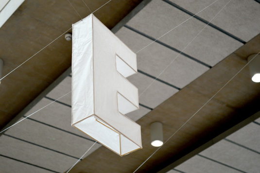
'Viewing points' are located on the floor and visitors are invited to stand in certain positions to appreciate the full quote.
There's amazing dedication visible in how Mathew has made this particular piece and the message behind it is simple. To truly enjoy the now, we must live in the now - the concept is at the core of ACT (Acceptance and Commitment Therapy).
Harriet Sleigh
- Course: BA (Hons) Graphic Design
- Website: www.behance.net/harrietsleigh
- Project: Make Your Mark: Fractures
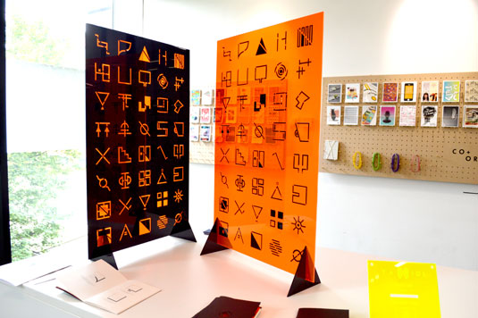
Harriet Sleigh's work also stood out for me too. Harriet has used orange and black Perspex to create a series of different symbols.
Each icon represented an idiosyncratic aspect of her own, personal life. There was a small book to accompany the piece and I felt I knew more about her just by looking through it.
I spent some time reviewing the portfolios that were also on display. I find the whole notion of a degree show a little uncomfortable at times. It's almost like speed dating but without the chatting part - judging someone based purely on their looks alone.
Without the student to explain the concept, background and journey behind each piece, you're sometimes left appreciating the work based only on aesthetics, which can leave a little sour taste when you know a student has spent the last few years of their life working towards a finished piece.
I was asked recently by the course to judge the Best In Show award and had been fortunate to view a number of folios from each student. I gave the award (after lots of careful consideration) to Ellie Thomas and so was keen to see how her show looked.
Ellie Thomas
- Course: BA (Hons) Graphic Design
- Website: www.ellie-thomas.co.uk
- Project: Harassment Is Not A Compliment
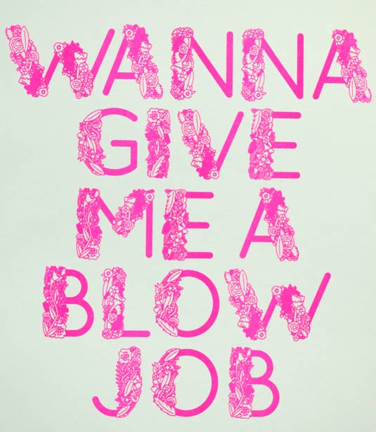
Ellie had a number of pieces of work on display and her level of design style is very high. But more importantly, she has considered every aspect of her work. There's a thought behind the aesthetic.
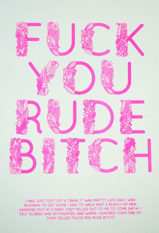
Her street harassment project shows a number of school children sniggering away to each other, but behind the words is a particularly serious message.
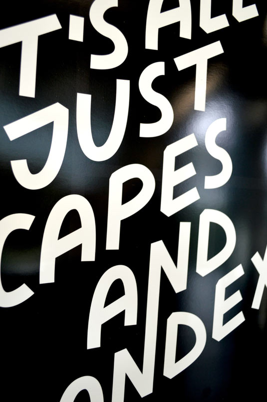
Ellie has taken direct quotes from women who have been subjected to abuse and juxtaposed them with traditionally feminine illustrations, showing that street harassment is never just a compliment and asking people to think again before making derogatory comments.
Adam Green
- Course: BA (Hons) Graphic Design
- Website: www.behance.net/adamgreen
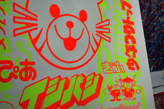
- Project: Join In! Find Truth! Be free!
Adam Green is another student who visually has created something very interesting. His set of three A1 screenprinted posters instantly drew me in.
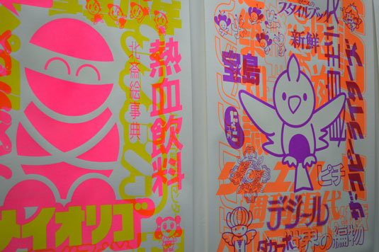
To be viewed in natural and UV light, the posters are based on the concept of branding different terrorist organisations.
In normal light the posters appear to be fun, light-hearted and almost cartoon-like. But when the glow-in-the-dark layer is viewed, the imagery reveals the true agenda behind each character.
Emily Coxhead
- Course: BA (Hons) Graphic Design
- Website: www.emilycoxhead.com
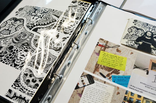
- Project: Studio Zoo
The final student's work to take my eye was that of Emily Coxhead. Emily has been working as a photographer with a number of artists and musicians over the years.
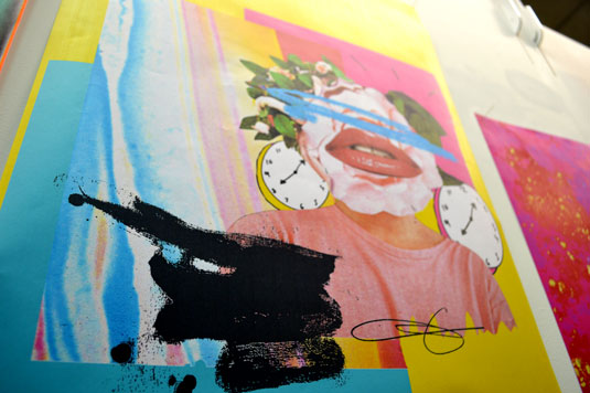
Music is apparent in all of her work and she has a level of illustration, combined with design ability, that is really beginning to feel like her own unique style.
Emily's Studio Zoo project stood out in her folio due in part to its level of detail. But she has a great number of interesting and considered pieces of work in her book.
New talent
I left the show feeling, as always, very proud to be an alumni of the university. The competition is fierce for students leaving university this year and more than ever it's crucial to stand out.
I hope that some of my fellow professionals allow these young creatives to flourish. After all, we were all students once.
Words: Dave Sedgwick
Dave Sedgwick studied Design & Art Direction at Manchester Metropolitan and now works under the name of Studio DBD. He also organises BCNMCR - a design exhibition and event involving creatives from Barcelona showcasing their work in Manchester.
Half-price CA subscription offer!
We know it isn't always easy being a recent graduate. So to help, we're offering an incredible 50% off an annual subscription to Computer Arts magazine - whether you're a new graduate or not. For just £39 you'll receive an entire year of industry insight, opinion and inspiration, delivered directly to your door.
Plus: sign up by 10th July and you'll receive our New Talent issue, featuring our guide to 2014's most outstanding design graduates - and a very special cover designed in response to a joint brief with D&AD New Blood.

Thank you for reading 5 articles this month* Join now for unlimited access
Enjoy your first month for just £1 / $1 / €1
*Read 5 free articles per month without a subscription

Join now for unlimited access
Try first month for just £1 / $1 / €1
Get the Creative Bloq Newsletter
Daily design news, reviews, how-tos and more, as picked by the editors.
The Creative Bloq team is made up of a group of design fans, and has changed and evolved since Creative Bloq began back in 2012. The current website team consists of eight full-time members of staff: Editor Georgia Coggan, Deputy Editor Rosie Hilder, Ecommerce Editor Beren Neale, Senior News Editor Daniel Piper, Editor, Digital Art and 3D Ian Dean, Tech Reviews Editor Erlingur Einarsson, Ecommerce Writer Beth Nicholls and Staff Writer Natalie Fear, as well as a roster of freelancers from around the world. The ImagineFX magazine team also pitch in, ensuring that content from leading digital art publication ImagineFX is represented on Creative Bloq.
