A new look for USA Today
How much is web design being influenced by the functionality of touch screen tablets? Quite a lot if the new sites for USA Today and Sony by Fantasy Interactive are anything to go by...
Fantasy Interactive - or Fi - has been on the up lately, opening a London office and forging ahead on the innovation front with very impressive, image-led websites for USA Today and Sony. Both the new sites make advances on how you might expect a website to work, bringing a tablet feel to the design, interactivity and navigation.
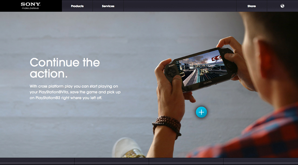
The Sony Connected World website aims to showcase the company's Xperia Mobile products and how they connect with other Sony gear to let users create, listen, watch and play. The approach is bold and colourful, with barely any text. Though a product showcase, it could provide great inspiration for a designer or illustrator's portfolio site.

"The Sony visuals were quite powerful, and we felt they were clear enough to communicate ideas on their own without much explanation. The same goes for UI navigation. If you have to explain to somebody in detail what to do, it’s probably not a very well designed UI," says Maria Ho, lead UX designer.
USA Today website revamp
The same simple and intuitive slickness Fi is known for can be seen with the new USA Today website, although it has a lot more information to convey. The American tabloid needs to balance its big political stories, populist showbiz news and sports scores with updates from the markets and share prices. Even if you're on a laptop or desktop computer, you can 'flick' through the online newspaper's various sections with arrows to the left and right. Again, it feels a bit like using a tablet rather than a normal website.
Still in beta, the USA Today site is image- and video-led, though it does have to accommodate a lot of copy. Roll over an image and you get a little more detail on the story before clicking to read it, or moving on to something else. Advertising drops into some sections with an X button to close it if you're not interested.
"The goal really was to have it be interactively more aligned to what you currently see on iPads," says Fi founder David Martin. "We were very, very influenced by iPad design, and I think that’s probably the one thing that most users so far have commented on, is that they feel like the best of the iPad was brought to the web. And that was really our goal from the beginning."

Get the Creative Bloq Newsletter
Daily design news, reviews, how-tos and more, as picked by the editors.

Thank you for reading 5 articles this month* Join now for unlimited access
Enjoy your first month for just £1 / $1 / €1
*Read 5 free articles per month without a subscription

Join now for unlimited access
Try first month for just £1 / $1 / €1

The Creative Bloq team is made up of a group of art and design enthusiasts, and has changed and evolved since Creative Bloq began back in 2012. The current website team consists of eight full-time members of staff: Editor Georgia Coggan, Deputy Editor Rosie Hilder, Ecommerce Editor Beren Neale, Senior News Editor Daniel Piper, Editor, Digital Art and 3D Ian Dean, Tech Reviews Editor Erlingur Einarsson, Ecommerce Writer Beth Nicholls and Staff Writer Natalie Fear, as well as a roster of freelancers from around the world. The ImagineFX magazine team also pitch in, ensuring that content from leading digital art publication ImagineFX is represented on Creative Bloq.
