The new era of type
Digital typography is about to explode across a screen near you. Best brush up on your web fonts, says Monotype's Daniel Rhatigan
We’re a few decades into the era of digital typography – long enough to take for granted that we have access to computers, printers and a vast range of typefaces. The desktop publishing revolution gave everyday users and professionals alike access to tools for typesetting, but it’s taken some time for things to settle into a general understanding of the possibilities of these tools.
Many have proved useful for web design, too, although ironically the text experience has been one of the most constrained aspects of web development. Thanks to a reliance on users’ installed fonts, the searchable, scalable, accessible content of the internet has been deprived of the potential richness of a full typographic palette, which we’ve grown to expect in print.
The dynamic delivery of fonts required by a web page might not seem like much on the surface of things, but just think about how much we communicate with typography. We can clarify complex information with type; we can convey emotion and tone; we can add an implicit message to the words we exchange. In a world of many different devices for many different users, typography remains the most adaptable way to enrich a message or improve an experience.
In the early days of desktop publishing, type designers and users had to adapt to the limitations of the coarse resolution of the printers available at the time. Similarly, the current spread of web fonts finds designers and users grappling with the resolutions of a variety of displays, most of which are still very low compared to the printed page.
If designers and users want to judge the quality of their typefaces in digital media, they need to look closely at what happens to screen pixels rather than printed dots. Do the letters in a given font align with one another? Do their outlines appear jagged, or do they achieve the illusion of smooth angles and curves? Do some of the letters look too dark or too light? Do they collide when they shouldn’t? In the same way that we expect hardware and software to improve, typographers need to look closely at the way that their type appears in use. The recent explosion of type designed for the screen introduces just a few different variables compared to the handful of reliable choices we have had so far.
Web font services represent the real shift in the way we can work with type today. Since fonts are delivered from a central server on the fly, the most current version of the font data will always be the version seen by the user. This means that foundries and type designers can continually improve their fonts, propagating updates in a way that is impractical with offline fonts. As OS rendering and browser support evolves, users can enjoy the benefits of fonts with better and better hinting, language support and typographic features.

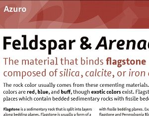
As we get used to the spread of a digital environment, designers and foundries are responding with more than refined data for existing designs. We’re also seeing designs adapted for screen displays – such as Webtype’s Reading Edge series – or even typefaces that anticipate screen-use right from the start, like Microsoft’s ClearType collection or Georg Seifert’s Azuro. In projects like these – and more are certainly on the way – the shapes of individual letters, the spaces in and around them, and the overall feel are all designed to be as clear as possible on a variety of screens, giving designers and readers alike the best-quality building blocks for their digital projects.
This might all sound as though the state of typography for the screen is in the hands of type and software vendors, but this isn’t entirely the case. They might provide the raw materials, but the real potential of screen typography lies in the hands of the people who use the type. Typography is, after all, the art of using typefaces. Now that the tools are improving, the industry is waiting to see what designers and other users do with them. How will they – how will you – show the world what digital typography is capable of doing?
Get the Creative Bloq Newsletter
Daily design news, reviews, how-tos and more, as picked by the editors.

Thank you for reading 5 articles this month* Join now for unlimited access
Enjoy your first month for just £1 / $1 / €1
*Read 5 free articles per month without a subscription

Join now for unlimited access
Try first month for just £1 / $1 / €1
The Creative Bloq team is made up of a group of design fans, and has changed and evolved since Creative Bloq began back in 2012. The current website team consists of eight full-time members of staff: Editor Georgia Coggan, Deputy Editor Rosie Hilder, Ecommerce Editor Beren Neale, Senior News Editor Daniel Piper, Editor, Digital Art and 3D Ian Dean, Tech Reviews Editor Erlingur Einarsson, Ecommerce Writer Beth Nicholls and Staff Writer Natalie Fear, as well as a roster of freelancers from around the world. The ImagineFX magazine team also pitch in, ensuring that content from leading digital art publication ImagineFX is represented on Creative Bloq.
