The minimalist side of L2M3 Kommunikationsdesign
From exhibition graphics and wayfinding systems to entire identity solutions, L2M3 Kommunikationsdesign is already a big name in German design, and it’s set to go fully international.
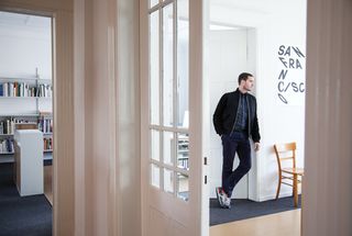
On the day we catch up with him in his Stuttgart studio, Sascha Lobe has just returned from London. He was attending the AGI Open event, where he took part in an all-star creative panel debating whether or not less is more in graphic design. "Guess which side I was on?" is his challenge. It's a tricky one, but looking at the work of L2M3 Kommunikationsdesign, the studio Lobe co- founded in 1999, it seems likely he was on the minimalist side of the debate.
"Michael Bierut was the moderator. Stefan Sagmeister and Marian Bantjes were the other side, and on my team I had Sean Perkins from North, and Dean Poole from Alt in New Zealand," says Lobe. "When they asked me to join that team I wasn't really sure if it was the right box for me because although I sometimes use the language of minimalism, I'm not a modernist. If you asked me what I am, I'd probably say I'm something like a humanist. Our work isn't about the style or about the attitude of modernism."
He recalls his verbal duel on the stage with Sagmeister, who raged against white space. But afterwards, they met up and had a chat, agreeing that they could easily have swapped positions and come up with similar arguments for the opposite points. Like design itself, debates in the industry can be very subjective affairs.
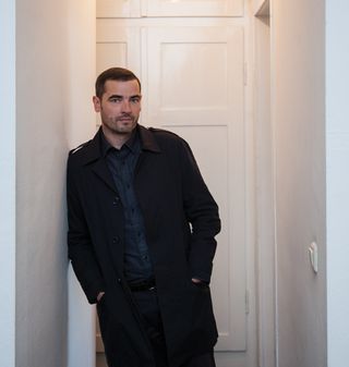
Surrounding Lobe as he talks are several in-progress posters. Many of them are for the courses he teaches at Offenbach University of Art and Design, where he is chair of Typography. A new year of study is about to start and he's preparing his materials. Situated near Frankfurt, it's just over an hour by train from Stuttgart - two hours, door to door - but for Lobe it's worth the effort.
In the studio, meanwhile, Lobe oversees a team of 10 who seem to have a staggering amount of work on their hands. L2M3 has a long-standing pedigree in wayfinding systems and exhibition design, but it also designs books and posters, and does an ever-increasing amount of identity work as well.
"It was 2003, 2004 - we won some really big pitches and the whole thing changed slowly but steadily," explains Lobe. "Today, we have one or two exhibition graphics or exhibition projects, but it's not as important anymore. Most projects are really complete design projects, signage systems or books. So, what graphic designers do."
Bauhaus without borders
At the moment, L2M3 is working on one of its most prestigious projects to date - a new identity for the Bauhaus Archive in Berlin. Although the studio was approached by the Archive to pitch for the work, the Bauhaus movement's worldwide reputation for creativity makes the job a daunting one, not to mention the fact that the building itself is a German landmark.
Get the Creative Bloq Newsletter
Daily design news, reviews, how-tos and more, as picked by the editors.
"It's scary," admits Lobe. "Our idea is not to do a marketing or branding project, but to work like an archive would. An archive collects and does research. We thought maybe we could transform this idea, and bring that attitude to the work. So we started looking at Bauhaus typography and we realised that it's not the 'less is more' thing that everyone assumes. The school did everything you can imagine. It was very playful and experimental. There were no borders, there were no rules, there was no taboo."
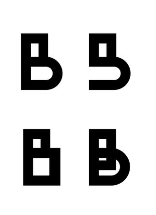
So in a bold and daring move, L2M3 is designing a new typeface for the project using characters that approximate a number of the original Bauhaus letterforms. Within the typeface there are regular characters, as well as alternative - slightly stranger - options. Work is underway, with final completion expected in early 2014.
There are bundles of other projects on the boil as well. The studio has been working on a project for Kunsthaus Zürich, the city's gallery of fine art. It's also working for a huge South Korean company, in collaboration with the architect David chipperfield. "It's the headquarters of Amorepacific, a cosmetics company. We're doing all the communication for the building, which means signage, of course, but also branding for the building. That's really huge. It's really the next big adventure."
Closer to home, L2M3 has been doing work for the Stuttgart-based car giant Mercedes-Benz. Previously having done the signage for the Mercedes museum, now the studio is designing three books and a magazine for the company. The studio does ongoing work for the Kunstsammlung Nordrhein-Westfalen in Dusseldorf - L2M3's most important client in the art world at the moment.
Current projects are also in progress for the Art Museum in Stuttgart, the Landesmuseum Münster in Northern Germany, a theatre in Ingolstadt and the Pforzheim Jewellery Museum. L2M3 is also designing a book about the artwork of the post-war abstract painter Willi Baumeister, a key figure in German art.
"If you have a big signage project or even a big corporate design project, then you realise very quickly that the creative part is only maybe 10 or 15 per cent. The rest is to roll it out, to defend it. So we always develop the main idea in a team of two or three, and when we have the go-ahead, then my part will decline and I will work as a firefighter if something goes wrong," says Lobe.

Culture, interior design and engineering
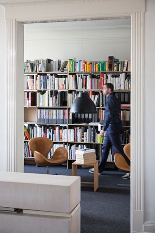
The L2M3 studio itself is based in an old apartment in Stuttgart. The work area consists of three rooms opening onto one another via double doors to create a huge space - 280 square metres. Built in 1909, it's one of the rare buildings that survived the bombing of Stuttgart during World War II. Apart from modern architecture, today
the city is best known for its engineering.
"How much do you know about Stuttgart? Nothing?" jokes Lobe. "We have Mercedes here, we have Porsche, and Bosch, of course. We have a relatively strong design community but it's spread between architecture, cinematography, interior design and graphic design. It's connected in different ways. It's not that big, like Berlin, but the scene here is very good. It's a very comfortable city because it's the southern part of Germany, which is of course the most beautiful part.
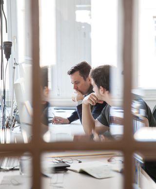
"It is a modern city because it was largely destroyed in the Second World War so it's relatively new. But the most important thing is it's very open-minded, the different directions in art and music. We have a perfect opera here and ballet is very strong, theatre is very strong, and what's really special about Stuttgart is the connection between art and engineering. We don't have problems with that, so for me it's a very good city."
A focus on architecture
It's no accident that L2M3 has so much work relating to buildings and architectural projects - whether they're exhibition graphics in museums or signage systems in colleges, banks, leisure centres and innovation centres. Lobe himself has always loved architecture, and was considering it as a career before he decided on graphic design instead.
However, he maintained an interest in it and while he was a student an opportunity came up to work on a major exhibition in Berlin. After German reunification, it was the first exhibition to be held in the refurbished Neues Museum, which had sat derelict since WWII.
This project put him in contact with the architect HG Merz. They stayed in touch, and in the late 1990s, decided that perhaps it was a good time to bring the disciplines of graphic design and architecture together. Thus, L2M3 Kommunicationsdesign was born. "'L' is my name, Lobe, '2' is two-dimensional and 'M' is Merz, '3' - three-dimensional. It was a fun idea. I've kept it," he says.
To get started, the pair took on one big project, the graphics for an exhibition that was held at Sachsenhausen, the former concentration camp. After two years, however, the two heads of the studio were pulling in different directions so they decided to part company. Lobe kept L2M3, and HG Merz continues to run HG Merz Architekten Museumsgestalter. Happily, they still collaborate on projects frequently.
Being the sole head of a studio makes it easier for Lobe to accept projects that take his fancy, without having to justify them. "It's also a question of budget. When you start a studio and you want to do something crazy, you just to do it. If you have a partner it's always, 'Hmmm. Do we need that? What? Two hundred euros?' So it was really a good decision to split up," he says.
"The studio's still connected to its history and its reason for being," Lobe continues. "In the first years we worked on mainly exhibition graphics and some signage projects, and it's only because we did some exhibition graphics and were really unhappy about the identity of the exhibition they were for that we decided to do both. That's simply the story."
Signage solutions
The work itself, however, is anything but simple. To each new project, L2M3 brings an innovative approach. While on the surface, it sometimes appears as if less is more, there's usually a bigger idea governing the design. When it comes to creating signage and wayfinding systems, Lobe's aim is always to do something that doesn't just rely on simple arrows.
One excellent example is the internal signage that L2M3 created for the Krieseparkasse in Ludwigsburg. Krieseparkasse is a loosely connected chain of local banks in Germany. The one in Ludwigsburg has several sections, connected by corridors 140 metres long. To identify various sections of the building, it would have been easy to attach signs to the walls.
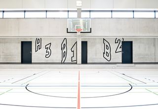
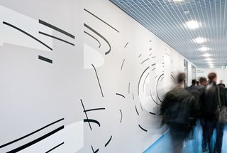
Instead, L2M3 worked out where and when knowing your position in the building would be important – such as when you're going to go up some stairs or turn into a particular set of offices. With those locations worked out, they had the letters and numbers applied to the walls so they could be viewed perfectly from those specific spots. Often, it means the signage is stretched and distorted when viewed from other angles. The abstract forms instantly give an otherwise bland building more character. The former garrison town has a baroque history, and that's where the idea stems from.
"The idea with these wall paintings which you only can read from one certain point is a baroque idea. It's a trick of the eye," says Lobe. "If you walk down the corridor, it's only an abstract graphic but at the moment when you have to decide, 'Is this my exit or not?' you can read it. That was the idea. It's about improving the atmosphere as well. It's like the last stone of the architecture."
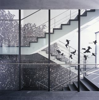
In the Kreissparkasse building in Tubingen, a town with 'green' associations, L2M3 took a different approach. One of the highlights of the studio's work there is a huge, life-sized tree painted on the wall all the way up the building's staircase. "If we are doing signage, we always try and understand the structure, the language and the atmosphere of that building, and then we try and develop something from that context."
He continues: "We try to be innovative, of course. It has to be fresh and relevant. Form versus content - blah, blah, blah - I don't believe in it. I believe in a certain feeling of elegance, so it must feel right. It's kind of a fight to find the right solution. It's not only about finding the right function, it's also about finding the right picture or the right atmosphere or the right feeling for it. I think that connects every project that we develop."
Now, the way forward for L2M3 is for its design work to reach other countries. And with that project for Amorepacific in South Korea underway, Asia is a land of huge opportunities for Lobe. "Our plan is to work more and more internationally, and at the moment it's developing in that direction. Identity and signage will be the two main roads for us," he concludes.
This article originally appeared in Computer Arts issue 221.
Liked this? Read these!
- Create a perfect mood board with these pro tips
- The ultimate guide to logo design
- Discover what's next for Augmented Reality

Thank you for reading 5 articles this month* Join now for unlimited access
Enjoy your first month for just £1 / $1 / €1
*Read 5 free articles per month without a subscription

Join now for unlimited access
Try first month for just £1 / $1 / €1
The Creative Bloq team is made up of a group of design fans, and has changed and evolved since Creative Bloq began back in 2012. The current website team consists of eight full-time members of staff: Editor Georgia Coggan, Deputy Editor Rosie Hilder, Ecommerce Editor Beren Neale, Senior News Editor Daniel Piper, Editor, Digital Art and 3D Ian Dean, Tech Reviews Editor Erlingur Einarsson, Ecommerce Writer Beth Nicholls and Staff Writer Natalie Fear, as well as a roster of freelancers from around the world. The ImagineFX magazine team also pitch in, ensuring that content from leading digital art publication ImagineFX is represented on Creative Bloq.
