Matthew Carter
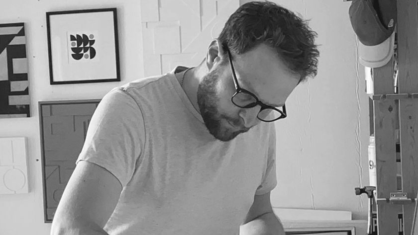
"When I was starting out an awful lot of people said to me, 'You don't want to be doing that, there's no future in it' " says Matthew Carter. Garrick Webster finds out how he became a legend in type design.
Matthew Carter's latest font, Carter Sans, has just been released by Linotype. However a quick look at the vast range of fonts he's created in his 55-year career - Miller, Verdana, ITC Galliard, Caslon and more - will leave many designers asking, 'Where would we be sans Carter?' Earlier this year he was honoured with a MacArthur Foundation Fellowship - one of the greatest prizes that can be bestowed on a creative person. We caught up with the observant and intelligent designer to find out how he sees the current state of type design.
Computer Arts: You've been designing type for over 50 years - what is it that inspires you about this field?
Matthew Carter: The Latin alphabet has existed in its present form since way before there was type. We can't just wake up one morning and decide we're really bored with the letter 'D'. You can't do that. A pact was established a very long time ago about what a 'D' is. You are constrained, and I think if you are going to be a type designer you need a temperament that is interested in working within certain constraints.
On the other hand, you really want to find some degree of your own expression in your work, otherwise it would get boring. The tussle between those two things is what inspires me.
CA: You've designed both body text and display faces. Do you feel drawn to one over the other?
MC: Partly because of my background, I am more drawn towards text types. They are more limited and you've got less freedom to express yourself because of the absolute imperative of legibility, but to me that is more interesting. I have done a few display types and I like doing that for an occasional change, but I'm much more drawn to the problems of text type myself.
CA: Many creatives see a letter or numeral as a piece of graphic art in itself, and are drawn to experimentation, illustrative type, or even deconstruction. How do you feel about these trends?
MC: It's something that I enjoy looking at very much. I'm not someone who does that myself. I work at the raw material end of this and, like any type designer, I'm a hostage to the people you're describing who use my work - and use it for whatever the hell they like.
I'm always interested to see that, and it's useful to me as a learning experience because sometimes when a typeface is used in a way that's completely unexpected and comes out of the blue you can learn more about it - either good or bad - than if it's just used in the way you anticipated it would be used.
I don't regard my work or anyone else's as sacrosanct. I'm tickled pink if people use typefaces that I've designed in bizarre and unexpected ways.
CA: Your father was a book designer and a type historian. Did he influence you?
MC: I suppose he must have done, yes. But he wasn't one of those fathers that pushes his sons to follow in his footsteps, and I guess I did become interested in it of my own accord.
CA: Early in your career you worked in the Netherlands, then the UK, and also went to New York. What was that like?
MC: When I first went to New York in 1960 I was stunned by what I saw in the way of graphic and typographic design. That might just be because I was badly informed - you know, sitting in England and not really knowing a great deal about American type. But the fact of the matter is that I was gobsmacked when I saw what was going on in America, and that was what made me want to move.
CA: How are things different today?
MC: In 1961 I worked on a typeface for signs for a new terminal at Heathrow airport for Colin Forbes. Colin had been commissioned to do some new signs and we did a sans-serif typeface, which, if you look at it today, you'd think was a rip-off of Helvetica. But we'd never seen Helvetica in 1961 in London, although it had been produced in Switzerland near Basle at the Haas foundry in 1957. Even if we had seen it, and wanted to have it typeset in London, we'd have had to get on a plane and fly to Basle and have it typeset there, because the British typesetting trade was so conservative that typefaces like that were simply unobtainable. Contrast this with the situation today, where somebody releases a new typeface in Tokyo or Buenos Aires or Madrid, and people are using it within minutes around the world.
CA: It's hard to imagine now...
MC: It is hard to imagine that, but it was an important stage in my life. I did a lot of work for a small group of very good graphic designers in London, who were wanting to work in what you'd call a modernist, international style but were frustrated. They couldn't find the type. So I spent three years drawing - sometimes just the lettering, sometimes the whole alphabet - and that was an excellent training for me. This was before film type, and it was before you could get a good range of Letraset or anything like that.
CA: You worked with handmade metal slugs, photocomposition typesetting, and you now create digital typefaces. In design terms, how much does the technology matter?
MC: I would say something like 80 to 90 per cent of what goes into designing a typeface is the same whether you make it in metal, film, digits, wood, potatoes or anything. There are exceptions, and they tend to be where the type is used in difficult circumstances. I can think in my own case of working on typefaces for setting phone books, which is not an ideal situation to be setting type - very high speed presses on newsprint. Or, working on screen fonts for Microsoft in the mid-90s on what became Georgia and Verdana. The coarse resolution screens are a fairly inhospitable medium for typography.
CA: Do you think a type designer needs to know the history of type, or is it okay to grab some design software and spontaneously get to work?
MC: Many of the typefaces I have designed have, to some extent, been based on historical sources. Miller is a good case in point. Miller is what is called a Scotch Roman, and Scotch Romans originated in the type foundries of Edinburgh and Glasgow around the 18th century. I liked that style of type very much and there weren't, in my opinion, any good digital versions of Scotch. So I started to research them with the help of the St Brides Library in London, and started to produce Miller.
But I would never say to a student that this is the right approach or the only approach to designing type. If a student said to me, 'I have absolutely no interest in the history of typography, does that mean I can't be a type designer?' I'd say, 'Absolutely not. Go for it.'
CA: What advice would you have for somebody who wants to design type today?
MC: If you're interested in type design you're in a good situation. It's not hard to find a Mac with the right software on it today. The type design industry is a lot more accessible than anything I did 55 years ago and, not only is the technology there, the market is there.
As I look around the whole typographic scene at the moment, there are more good young type designers at work now than at any other time in history - there's a kind of boom in type design.

Thank you for reading 5 articles this month* Join now for unlimited access
Enjoy your first month for just £1 / $1 / €1
*Read 5 free articles per month without a subscription

Join now for unlimited access
Try first month for just £1 / $1 / €1
Get the Creative Bloq Newsletter
Daily design news, reviews, how-tos and more, as picked by the editors.
The Creative Bloq team is made up of a group of design fans, and has changed and evolved since Creative Bloq began back in 2012. The current website team consists of eight full-time members of staff: Editor Georgia Coggan, Deputy Editor Rosie Hilder, Ecommerce Editor Beren Neale, Senior News Editor Daniel Piper, Editor, Digital Art and 3D Ian Dean, Tech Reviews Editor Erlingur Einarsson and Ecommerce Writer Beth Nicholls and Staff Writer Natalie Fear, as well as a roster of freelancers from around the world. The 3D World and ImagineFX magazine teams also pitch in, ensuring that content from 3D World and ImagineFX is represented on Creative Bloq.
