Master Photoshop masks and selections
Graphic designer Luke O'Neill shares his tips for taking your Photoshop selection skills to the next level.

Creating selections and masks in Photoshop is a fundamental part of any professional creative workflow. Whether you're a junior designer, illustrator, animator, or even a creative director, at some point you will have to create a mask and cut something out in Photoshop - even if it's only because you're working late and the repro department has all gone home.
There are many varied ways to create selections in Photoshop, ranging from the quick and easy techniques that we're all familiar with - such as using the Magic Wand tool to cut out objects from a high-contrast, flat background, or switching to the Pen tool for greater accuracy - through to more precise, time-consuming techniques that take a while to master.
In this workflow guide I'll walk through some more advanced, non-destructive ways of creating masks.
01. Non-destructive layer mask tricks
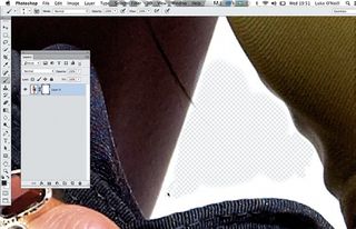
Add a layer mask to any Photoshop layer, and click on the white linked thumbnail to edit it. For fine adjustments, a white or black brush adds or removes areas, toggle using Shift-X - or use the Magic Wand for large areas. Shift-click on the mask background to toggle effects on and off .
02. Working with clipping masks
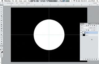
Clipping masks are another invaluable non-destructive technique. Set up a document with a solid background, add a new layer with a shape in it, and paste in a new, detailed layer above it. In the Layers panel, select Create Clipping Mask to mask out areas based on the layer below.
03. Easy type masking
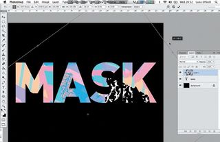
Clipping masks can also be used in conjunction with type. Paste in a texture layer above your word, and go to Create Clipping Path. You can resize and rotate the top image within the bounds of the clipping path, and the type layer will also remain editable.
04. Using channels for areas of detail
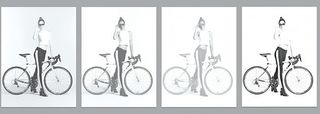
Channels are particularly useful for working with high levels of detail like hair or bike spokes, as seen here. Open the Channels panel, pick the channel with the highest level of contrast and duplicate it by dragging it to the Create New Channel icon.
Get the Creative Bloq Newsletter
Daily design news, reviews, how-tos and more, as picked by the editors.
05. Using adjustment layers
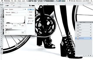
With only the duplicated channel selected, go to Image Adjustments Levels and increase the levels to punch up the black and white. Be careful not to go too far and create jagged edges. You can also experiment with the curves to a achieve a similar result.
06. Brushing in detail
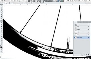
As with layer masks, you can use Photoshop's Brush tool to add or subtract detail to the mask. When doing this, work carefully around the channel, brushing on black and white to create your mask. This is where a Wacom tablet really comes into its own.
07. Highlighting detail with the Burn tool
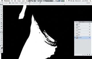
The Burn tool is useful for picking out details. Select it, making sure that Shadows is selected in the drop down menu. Brush over the areas you want to pick out, adjusting the exposure as you go. If you want to preview the mask overlaid on the original image, hit the tilde (~) key.
08. Inverting the image
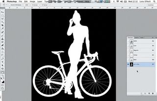
Once you've filled in all the areas of the mask, hit Cmd/Ctrl-I to invert the image. Alpha channels work in much the same way as layer masks so, here, the black area will be masked off. In this case, it's the background that we want to remove from the model and the bicycle.
09. Alpha channels in InDesign layouts
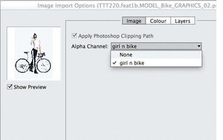
This is where alpha channels really come into their own. When placing an image in InDesign, select Show Import Options and chose the alpha channel from the image menu. The image will be imported with the alpha channel applied, so you can run it over the top of text and images.
Words: Luke O'Neill Photography: Richard Grassie
Currently art editor at T3 magazine, graphic designer and illustrator Luke O'Neill launched and designed the original Computer Arts Collection series. This article originally appeared in Computer Arts issue 224.

Thank you for reading 5 articles this month* Join now for unlimited access
Enjoy your first month for just £1 / $1 / €1
*Read 5 free articles per month without a subscription

Join now for unlimited access
Try first month for just £1 / $1 / €1
The Creative Bloq team is made up of a group of design fans, and has changed and evolved since Creative Bloq began back in 2012. The current website team consists of eight full-time members of staff: Editor Georgia Coggan, Deputy Editor Rosie Hilder, Ecommerce Editor Beren Neale, Senior News Editor Daniel Piper, Editor, Digital Art and 3D Ian Dean, Tech Reviews Editor Erlingur Einarsson, Ecommerce Writer Beth Nicholls and Staff Writer Natalie Fear, as well as a roster of freelancers from around the world. The ImagineFX magazine team also pitch in, ensuring that content from leading digital art publication ImagineFX is represented on Creative Bloq.
