Mark Boulton Design: Rapid response
Believing that a website is more than a static page, Mark Boulton Design has been forging ahead in the field of adaptive web design
There’s something quite attractive about websites created by Mark Boulton Design. They’re organised, precise, functional and the typography is impeccable. After just a few minutes chatting with founder Mark Boulton you’ll understand where the approach comes from. Trained in graphic design and typography, he’s become a web design expert over the last 15 years, and he believes we’re only just scratching the surface of what’s possible.
‘We don’t make pictures of websites’ is one of the statements on MBD’s site. For the studio, the last 18 months have been all about responsive web design – the idea that a website’s design structure should adapt to the browser, screen size and capabilities of the user’s device. It’s one of the topics Boulton talks about at design events around the world.
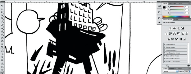
“Recently, because of responsive web design, we’re finally acknowledging that on the web you can’t control the design process in the same way that you can for print,” he explains. “We’re finally getting our heads around this 10 or 15 years after the fact. What’s jolted us out of that has been a book on responsive web design, and a whole movement really, coming via Ethan Marcotte. If you’re embarking on a responsive web design project it’s not really viable any more to just do it in Photoshop. The old processes don’t apply. You need to get out of an environment like that and into a browser.”
Rather than a Photoshop mock-up being central to the design process, the responsive web design approach centres on the content. There are too many designs out there with a picture box asking for a picture to be created, and text boxes filled with Latin script waiting for the content to be written. “One of the harder things in a project is content, and if you’re making a picture of a website it’s really easy to put any old text in, any old image, because you’re focused on the deliverable of the picture that you’re giving the client.”
He continues: “So we get it in a browser really quickly, and we only ever use real content. If no content exists, we leave it blank, or we write some of the headlines, or we have a go at writing some of the stuff ourselves. If it’s totally inaccurate it really lights a fire underneath our clients – sometimes they can get a bit upset. Sometimes they’re like, ‘Why have you written that content?’ It’s like, ‘You haven’t written it yet, so we have to use something and we’re not going to put Latin in. We’re going to face up to this problem right now, client, and one of your problems is you’ve got no content.”
However when a client has great products, and a story to tell, things come together. This was the case with the site MBD built recently for Hiut Denim, a jeans company set up by David and Clare Hieatt, who previously founded Howies. It’s not just a site that sells jeans, it has something to say. The company is based in Cardigan, west Wales – a town that used to have a big jeans factory that produced 35,000 pairs a week, until one day it was closed down. Hiut means the town is making jeans once again, keeping people and skills in Cardigan. There’s all sorts of information, photography, video and blogging on the website based around this story.
However, you can’t take responsive web design so far that it challenges certain web conventions: “We designed their site earlier this year and it’s all responsive, and we did an e-commerce site as well. It’s interesting from that perspective because you have to take into account quite well-established conventions for payment and checkout, and that kind of thing,” says Boulton. “You want them to feel absolutely comfortable that they’re in a check-out procedure and they know what’s expected of them.”
Like Hiut Denim, Mark Boulton Design is based in Wales. The studio is in Penarth, just outside Cardiff, and there’s a team of eight creatives including user experience experts, designers, developers and Mark’s wife Emma as studio manager. Their journey to work each day is dominated by agrarian hillsides, livestock and the occasional tractor. But not far away is the Welsh capital, attractive because it’s seen so much investment in recent decades. Boulton himself has had a career that’s taken him from his hometown of Manchester, to London and on to Australia, before setting up in south Wales.
The list of outfits that have benefited from MBD’s expertise is impressive. Clients include the Belgian newspaper De Standaard, ESPN, English Heritage, British Energy Direct and a whole range of web initiatives including Drupal. However, it’s still a learning process, and developing features for responsive sites can be time-consuming, as the team discovered when working on a site for World Skills – an Olympics-style competition for tradespeople, such as electricians, plumbers and hairdressers.
“One of the things we did was to design a responsive map of the event. It was produced isometrically, so it was all 3D pixel art, and we produced a map that had hover states and things like that, and it could shrink to small screen sizes. It took Nathan, one of the designers I work with, a week to do it. It turns out after the event that about 20 people looked at it. That’s it. So I guess my point is that before you embark on some of these projects you really have to weigh up whether the benefit is there,” he says.
One of the trickiest aspects of responsive web design is setting up grids that adapt to different screen sizes. To help other designers with this process, MBD has set up Gridset, an online app that automatically calculates column widths and gutters for web page layouts, enabling designers to focus on the content rather than the maths. “We want it to encourage play and experimentation,” Boulton concludes.
We caught up with Mark Boulton at the Reasons To Be Creative convention in the Influxis Lounge.
Discover 10 underrated web design tools over at Creative Bloq.

Thank you for reading 5 articles this month* Join now for unlimited access
Enjoy your first month for just £1 / $1 / €1
*Read 5 free articles per month without a subscription

Join now for unlimited access
Try first month for just £1 / $1 / €1
Get the Creative Bloq Newsletter
Daily design news, reviews, how-tos and more, as picked by the editors.

The Creative Bloq team is made up of a group of art and design enthusiasts, and has changed and evolved since Creative Bloq began back in 2012. The current website team consists of eight full-time members of staff: Editor Georgia Coggan, Deputy Editor Rosie Hilder, Ecommerce Editor Beren Neale, Senior News Editor Daniel Piper, Editor, Digital Art and 3D Ian Dean, Tech Reviews Editor Erlingur Einarsson, Ecommerce Writer Beth Nicholls and Staff Writer Natalie Fear, as well as a roster of freelancers from around the world. The ImagineFX magazine team also pitch in, ensuring that content from leading digital art publication ImagineFX is represented on Creative Bloq.
