The making of this lippy vector image
How Andreas Neophytou's stylised spread of colourful lipsticks for The London Magazine's latest issue was put together.
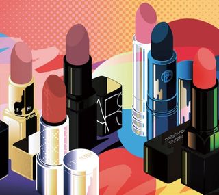
Andreas' penchant for compositions of real and imagined objects attracted the attention of The London Magazine. A cosmetics illustration project soon followed for its beauty section, depicting eight different lipsticks.
The art director for The London Magazine saw my work exhibited in the Outline Artists (my illustration agency) room at Somerset House during the Pick Me Up 2014 festival in April. He got in touch with my agent and mentioned a couple of new pieces of my work in which I'd created illustrative compositions out of real and imagined objects so that they formed messages – typographic still life, if you will.
I'd begun to incorporate cosmetics into some of these illustrations and I guess The London Magazine saw an opportunity for an editorial piece. They asked me to create a full double-page spread illustration in a similar style for the beauty section of a forthcoming issue, depicting eight specific lipsticks.
The picture editor at The London Magazine sent through some photos and other visual reference material relating to the eight products and also some details on the feature. The brief consisted of a mood board of my work, and a few notes on why they thought it was relevant to the project. One requirement was that each lipstick be identifiable, but other than that, the DPS was a blank canvas for my illustration.
01. Understanding the brief
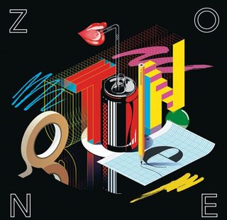
Unlike my work as a creative director, which involves creating unique expressions for a variety of brands, here I'm trading a visual language that is representative of my personal aesthetic. I always like to prepare with an audit, looking at the work that attracted the client and deciding how best to evolve or maintain the style.
02. Initial sketching
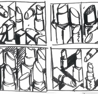
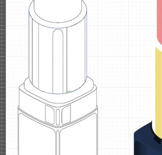
First I examine product photos and sketch basic compositional layouts on paper, thinking about how the basic shapes translate onto an axonometric grid. I then start to ink lighting details and graphic reflections in much the same style as traditional comic book illustration, experimenting with fluid shapes in a rapid and intuitive way.
03. Vector approach
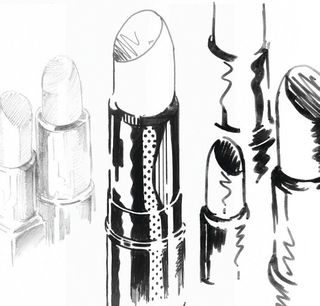
Next, I scan the drawings to create vector line art. My illustrations are simple and do not require too much digital labour. Vectors allow solid and even planes of rich colour that can be scaled to any size. This helps lend an industrial quality to my images, which harks back to technical illustration found in instruction manuals.
Get the Creative Bloq Newsletter
Daily design news, reviews, how-tos and more, as picked by the editors.
04. A new twist on FontLab
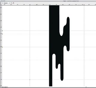
I'm constantly experimenting with typography, drawing fonts and letterforms, and have found FontLab to be the most comfortable software tool for drawing Bezier curves and intricate detail. The application enables me to capture more closely what I have drawn by hand. The rest can be achieved in Illustrator.
05. Chop and change
Once I have a digital version I might start to reshuffle the composition to achieve the right balance. The scale dictates the level of detail needed. I love to constantly print details and various compositional arrangements for closer inspection. Sometimes I shelve a project for a day or two and come back to it with 'fresh eyes'.
06. Introducing colour
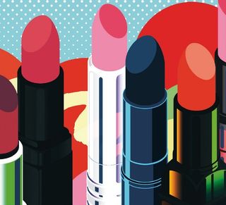
With the composition of the illustration sorted, it's time to think about what colours to use. Using original product photographs and other archived reference, I start to build colour concepts. For this particular piece, I wanted to give each product a golden accent to introduce some summer colour.
07. Final touches
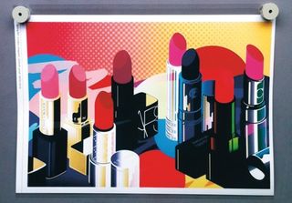
I like to have colour inspected by a post-production house. Viewing prints under calibrated lighting is important to ensure accuracy. The colours have to be as rich and vivid as any other beauty image. It's really useful to supply clients with a colour proof to give them the best chance of reproducing the artwork accurately.
Words: Andreas Neophytou
Andreas Neophytou is a New York-based creative director, graphic designer and illustrator. This article originally appeared in Computer Arts issue 230.

Thank you for reading 5 articles this month* Join now for unlimited access
Enjoy your first month for just £1 / $1 / €1
*Read 5 free articles per month without a subscription

Join now for unlimited access
Try first month for just £1 / $1 / €1
The Creative Bloq team is made up of a group of design fans, and has changed and evolved since Creative Bloq began back in 2012. The current website team consists of eight full-time members of staff: Editor Georgia Coggan, Deputy Editor Rosie Hilder, Ecommerce Editor Beren Neale, Senior News Editor Daniel Piper, Editor, Digital Art and 3D Ian Dean, Tech Reviews Editor Erlingur Einarsson and Ecommerce Writer Beth Nicholls and Staff Writer Natalie Fear, as well as a roster of freelancers from around the world. The 3D World and ImagineFX magazine teams also pitch in, ensuring that content from 3D World and ImagineFX is represented on Creative Bloq.
