Make your type pop with Layer Styles
João Oliveira shows you how to turn flat typography into rich and vibrant lettering
Illustrated typography is often an ideal fit for poster design, editorial lettering and other occasions where you want something more visually appealing than flat lettering. Over the following pages, I'll show you how to quickly illustrate typography, turning flat lettering into a metallic, vibrant and sleek illustration.
We’ll focus on developing these effects with the aid of a few simple techniques. We’ll detail our letters with rich and structured gradients, creating reflections and a sense of depth, and we'll take full advantage of what Layer Styles can offer.
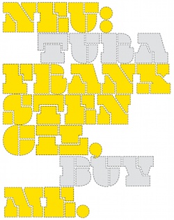
01 Start by designing your lettering in Photoshop. Any font will work, but for this tutorial I'm using Bohema Uppercase Regular, part of the Bohema family – a typeface designed by me that fits extremely well in this situation because of its robust body and tight, empty spaces. Convert the lettering to a Smart Object.
02 Now start colouring the base shape. Choose Blending Options from the Layers panel menu, and select Gradient Overlay. Change the angle to 45 degrees and click on the Gradient field: in here you can add the colours of your choice – I recommend leaving a lot of white colour for this step. The settings I’ve used are: #ffffff at location 0%, #e97c9b at 11%, #fffff at 15% and 48%, #f16e92 at 52%, #ffffff at 55% and 71%, #e67f9c at 76%, #ffffff at 80%, #e77998 at 90% and #ffffff at 92%.
03 Duplicate the layer, go to Blending Options and in Advanced Blending turn the Fill Opacity to 0%, turn off the Gradient Overlay and active the Stroke. Then turn the Position to Inside, set Size to 24px and fill with white. Convert the current layer to a Smart Object and once again go to Blending Options, activating the Gradient Overlay with an angle of 60 degrees. Create a gradient similar to the previous one, but tweak the positions of each colour until you’re happy. Leave a few white areas to give some nice reflections.
04 On the same layer, go to Stroke and set the Size to 6px, Position to Outside and Fill Type to Gradient with an angle of 60 degrees. Edit the gradient, making it similar to the previous ones but moving the colours to where the stroke gradient contrasts with the base gradient of the shape. Play with it until you get a detailed stroke. Now add a drop shadow, setting Blend Mode to Normal, Distance to 15 and Size to 0.
05 The main lettering’s finished, but we want it to glow. Go to the bottom layer, duplicate it and convert it to a Smart Object. Now go to Filters>Blur>Gaussian Blur and give it a 30px radius. Confirm the changes and set Blending Mode to Linear Dodge.
06 The lettering is starting to look shiny, but now we need to make it more interesting. Open the layer’s Blending Options and add a Gradient Overlay set to Darker Color with an angle of 60 degrees. Edit the gradient and play with the colours, adding whites where you want it to shine more, and variations of the main colour in other areas to give different tones and strengths to the glow.
Get the Creative Bloq Newsletter
Daily design news, reviews, how-tos and more, as picked by the editors.
07 To add a bit more variation to our lettering, let’s add some more typography. I'm using Bohema Uppercase Light to create a contrast between the two letter forms.
08 Go to the Blending Options panel and add a stroke. Set Size to 9, Position to Center, Angle to 60 degrees and create a gradient with a different colour. It’s important to have a light and dark tone, along with the white, to give depth to this shape.
09 Once again, we want the lettering to glow, so duplicate the layer, convert the new layer to a Smart Object and then add a Gaussian Blur (Filters>Blur>Gaussian Blur). Set it to 98px and leave Blending Mode as Normal.
10 The illustration looks good, but it’s missing detail. Start by creating two rounded white rectangles at the top and bottom of the lettering. Now select the Custom Shape tool: in the top menu bar you’ll find a field named Shape. Click on the arrow, select Ornaments and pick one that you like, placing it on the top and the bottom of the rectangles.
11 The two rectangles look like neon bars, so let’s give them what they want: select one and go to Blending Options. Add an Outer Glow with a #54bdb4 colour, setting Blend Mode to Linear Dodge, Opacity to 28%, Technique to Precise and Size to 38px. Now do the same with an Inner Glow, but with Blend Mode set to Normal, Opacity to 100%, Source to Edge, Size to 8px and Contour to the second option available. Confirm the changes, copy and paste the Layer Style to the other rectangle.
12 Select one of the ornaments, go to Blending Options, add an Outer Glow (I set the colour to #54bdb4), and set Blend Mode to Linear Dodge, Opacity to 28%, Technique to Precise, Size to 38px and Range to 50%. Do the same to the Inner Glow, but this time with Opacity set to 25%, Source set to Edge, Size to 38px, Contour set to the second curve and Range to 100%.
13 Now let’s put the whole illustration together and add the final glow effects. Create a new layer and set Blending Mode to Overlay. Select the Gradient tool, change Gradient from Solid Color to Transparent and the colour to #71e0d1. Now add some glow to the letters – I like to put it on top of light areas to create a nice effect.
14 Create another layer, once again with Blending Mode set to Overlay, and do the same to other areas. This time I’ve also used #e92a5a to cover some areas with a strong colour. Add #71e0d1 gradients in areas where you want to have glows – small areas like corners work really well.
15 Finally, create another layer with Blending Mode set to Overlay and add the final details. I’ve created soft, coloured glows (#e27d99) to make some areas more interesting. Experiment to find out what works best. You can also transform your gradients with the Transform tool. This will give your glows different shapes and help to increase the interest of the lettering in the finished illustration.

Thank you for reading 5 articles this month* Join now for unlimited access
Enjoy your first month for just £1 / $1 / €1
*Read 5 free articles per month without a subscription

Join now for unlimited access
Try first month for just £1 / $1 / €1

The Creative Bloq team is made up of a group of art and design enthusiasts, and has changed and evolved since Creative Bloq began back in 2012. The current website team consists of eight full-time members of staff: Editor Georgia Coggan, Deputy Editor Rosie Hilder, Ecommerce Editor Beren Neale, Senior News Editor Daniel Piper, Editor, Digital Art and 3D Ian Dean, Tech Reviews Editor Erlingur Einarsson, Ecommerce Writer Beth Nicholls and Staff Writer Natalie Fear, as well as a roster of freelancers from around the world. The ImagineFX magazine team also pitch in, ensuring that content from leading digital art publication ImagineFX is represented on Creative Bloq.
