Make your print design greener
From recycled paper to vegetable ink, Emmi Salonen of Studio EMMI explores the eco-friendly options available for print
As designers, we can try to make environmental considerations a central part of the design process by being continuously aware of the choices we make. Although it’s hard for any design to claim to be 100 per cent ‘green’ – partly because the term carries so many definitions – there are lots of steps you can take to make your work more environmentally sustainable.
There’s a wealth of information available on different environmental choices and being confronted with it all at once can be daunting, but it’s best to decide carefully what’s most important to you or your project. For example, you or your client may want to focus on using recycled material or on reducing your carbon footprint. Each approach brings different focus points to the fore during the design process.
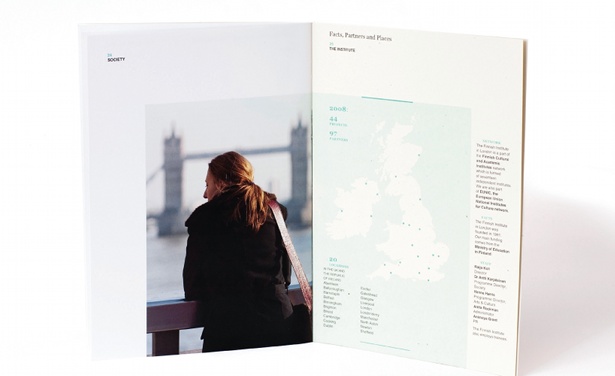
Using the example of (p)review, an annual review booklet I created for the Finnish Institute in London using environmentally-friendly design, materials and printing techniques, I’ll show you how to reduce waste and lower your environmental impact without compromising on style and appearance.
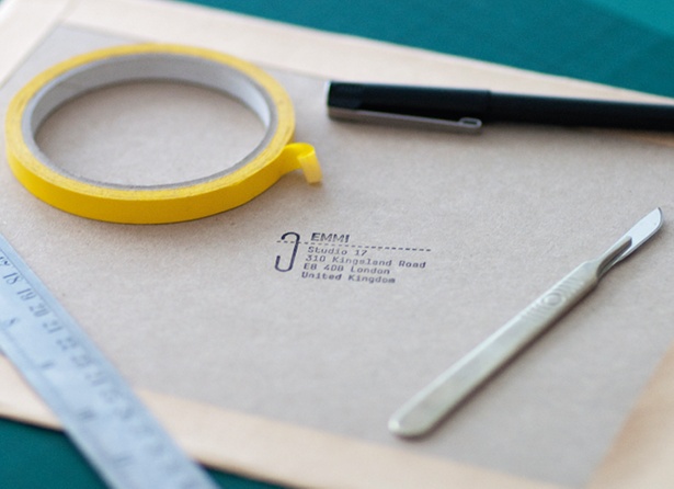
01 If designing an environmentally friendly printed item is part of your brief, then great. If not, then as a designer you can still offer a green solution. The Finnish Institute did not specify that (p)review be environmentally friendly, but our design proposal not only benefited the environment but saved on production costs. Clients appreciate this extra effort.
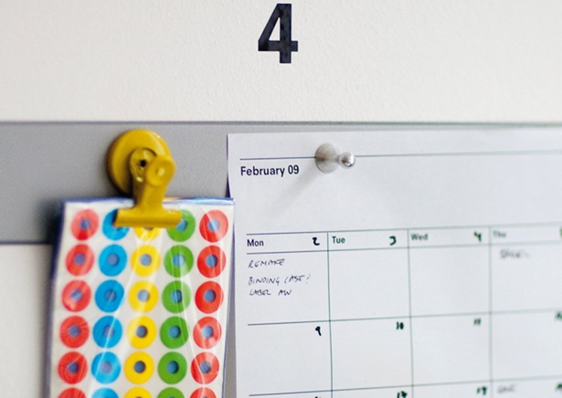
02 Planning is important for all projects, but when designing with the environment in mind it becomes the most valuable part of the process. You can reduce waste and costs by making conscious decisions on the following: the size of your item, the weight of the paper used, and its planned life cycle.
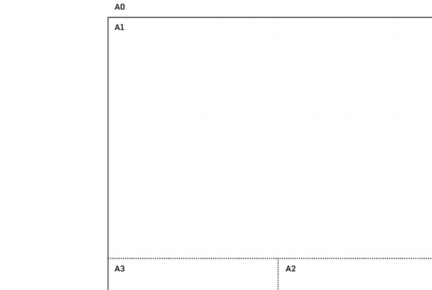
03 Using standard size papers reduces costs and waste in the production. If you are keen to stay away from A5s and A4s, then a short A4 (210mm x 267mm), for example, will give a different feel to the item but still deliver more pages from a standard sheet. (p)review was printed on A5 and therefore was easier and more cost effective to mail out. Imaginative use of folds can work as an alternative design solution.
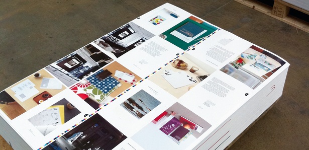
04 Recycled paper that is certified by the Forest Stewardship Council (FSC) is always a good choice. However, there are multiple other options available and the percentage of recycled content varies hugely between papers. Some is made using wind power, whilst others take into account the amount of water and emissions involved in the process. Choose what is most suited to your project and its message. Also, using a lighter weight paper saves material and costs.
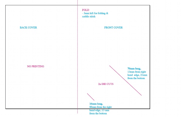
05 (p)review’s brief included incorporating a business card into the brochure, so we made two die-cuts on the cover to slot the card in. The logo is visible on the card, making printing on the cover redundant. The front and back covers also fall short on the top and sides, so the title and index from the first inner page are visible. This reduces ink and materials as well as offering a functional, eye-catching solution.
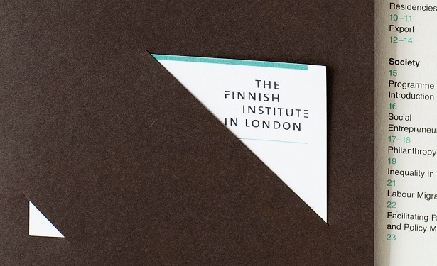
06 Increasing the life cycle of a product is an important part of green design. If the item needs to be updated, how could the design reflect this? Are there possibilities for multi-purpose use? The business card slotted on the cover of (p)review is changed according to who hands the booklet out. This way the contact details are always correct and the design has an added personal touch.
Get the Creative Bloq Newsletter
Daily design news, reviews, how-tos and more, as picked by the editors.
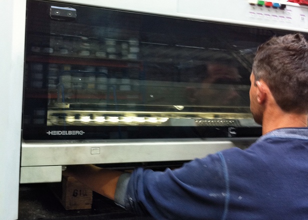
07 Find a local printer as this will reduce transport and emissions, and check they have FSC certification and environmental industry standard ISO14001. Ask if they measure their carbon footprint and if they use 100 per cent vegetable based inks and renewable energy. Get the printer involved in the project early on so they can help with any production enquiries. (p)review was printed by a carbon neutral company with FSC and ISO14001 verification.
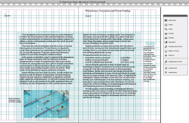
08 In the (p)review booklet, the inner pages’ layout corresponds to the short front and back covers. The grid allows quotes to sit on the outer columns, whilst the main text takes over two inner columns. When deciding your format, keep continuity in mind throughout the layout and emphasise certain elements through the use of colour and white space.
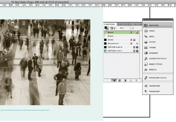
09 (p)review uses no print on the covers, two-colour print (Pantone 3258 and Pantone Black) on the outer pages and full colour on the inner text pages. These solutions keep the costs down, reduce ink use and bring a different feel and design element to each section. Print with vegetable based inks if possible and think carefully when choosing metallic inks and foil blocking, as these may make the finished product impossible to recycle.
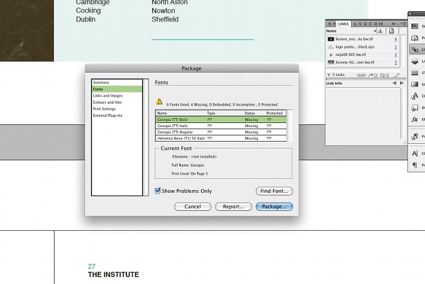
10 When you begin artworking, if you are using print and production methods that differ from the norm always check with your printer how they would prefer to receive the job. If you have more than one project ready to print at once you can maximize the use of ink, paper and energy, and save on deliveries and time. As mentioned in point two, planning is vital to any design, so you could also make printing multiple items at one time part of the project.
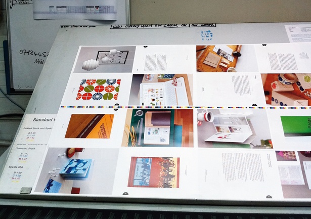
11 Before sending the artwork to the printers, make a mock-up of the item in the studio. Seeing the design printed often shows mishaps that would be easily missed onscreen. Proof your design thoroughly for any mistakes: alignments, fonts, images, format, folding. We tested the die-cuts for the business cards several times to ensure the logo but none of the names were visible. This helps avoid costly reprints, waste and, of course, disappointment on all sides.
12 Once you’ve had the item back from the printers and your client has received their copy, ask for feedback from both – could something have been made more efficiently, therefore saving resources? What could you improve next time? The Finnish Institute was happy with the project and commissioned us to create their next booklet the following year.

Thank you for reading 5 articles this month* Join now for unlimited access
Enjoy your first month for just £1 / $1 / €1
*Read 5 free articles per month without a subscription

Join now for unlimited access
Try first month for just £1 / $1 / €1

The Creative Bloq team is made up of a group of art and design enthusiasts, and has changed and evolved since Creative Bloq began back in 2012. The current website team consists of eight full-time members of staff: Editor Georgia Coggan, Deputy Editor Rosie Hilder, Ecommerce Editor Beren Neale, Senior News Editor Daniel Piper, Editor, Digital Art and 3D Ian Dean, Tech Reviews Editor Erlingur Einarsson, Ecommerce Writer Beth Nicholls and Staff Writer Natalie Fear, as well as a roster of freelancers from around the world. The ImagineFX magazine team also pitch in, ensuring that content from leading digital art publication ImagineFX is represented on Creative Bloq.
