Make Layer Masks The Easy Way
Gone are the days of messing around with multiple filters and menus. Paul Tysall demonstrates how to speed up your masking.
Adobe really did its research for the release of Photoshop CS4, bundling together all the useful 'stuff' designers regularly use. A great example of this is masking tools.
In the past, you would have to go into various filters and menus to edit and refine your masks, be it for the most straightforward cutout or more complex density masks - but not anymore. In this tutorial I'll show you just how easy masking images has become through the new Masks menu, and how you can shave hours of frustrating detail work off your creative day.
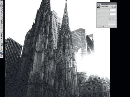
01 First thing I do is duplicate (Ctrl/Cmd+J) this image and place it under the original layer. For demonstration purposes I need a visible difference between both versions, so I desaturate (Ctrl/Cmd+Shift+ U) the lower layer and ramp up the levels. I'm feeling arty, so I throw in the film grain filter too. I call up the Masks panel from Window>Masks.
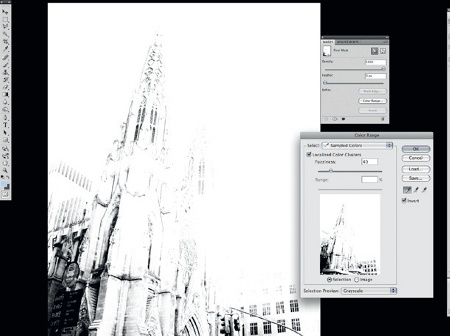
02 I make the original colour image my target layer and click the 'Add a pixel mask' icon. The layer masking options are now editable. The first option I go for is Color Range. I check the Invert box, and set the Fuzziness setting low (between 40 and 50).
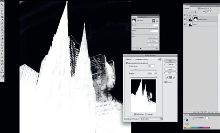
03 The areas I'm looking to preserve are the reflected sky blues on the buildings. I place the Eyedropper tool on the background building then, using the Add to Sample eyedropper, I start to build my mask by sampling the background. I 'OK' my edit and, in the Masks panel, click the Invert button.
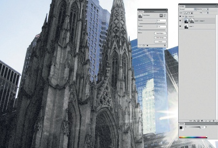
04 In the Masks panel we have two sliders: Density and Feather. Both are dynamic so can be readjusted. Density acts on the grayscale range of the mask, which effects the opacity; I don't need to bring this down too low. Feather is self-explanatory but I'm leaving this set to 0 pixels to show you the Refine mask.
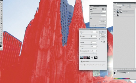
05 In Mask Edge, the first option I set is the Quick Mask style preview. This helps make my mask edits clearer. I keep the Radius and Feather very tight. The sliders I tend to set high are Smooth and Contract/Expand, but each image is unique which is why Quick Mask preview is so useful. It also helps indicate areas of the mask I need to erase once the mask is applied.
Get the Creative Bloq Newsletter
Daily design news, reviews, how-tos and more, as picked by the editors.

Thank you for reading 5 articles this month* Join now for unlimited access
Enjoy your first month for just £1 / $1 / €1
*Read 5 free articles per month without a subscription

Join now for unlimited access
Try first month for just £1 / $1 / €1

The Creative Bloq team is made up of a group of art and design enthusiasts, and has changed and evolved since Creative Bloq began back in 2012. The current website team consists of eight full-time members of staff: Editor Georgia Coggan, Deputy Editor Rosie Hilder, Ecommerce Editor Beren Neale, Senior News Editor Daniel Piper, Editor, Digital Art and 3D Ian Dean, Tech Reviews Editor Erlingur Einarsson, Ecommerce Writer Beth Nicholls and Staff Writer Natalie Fear, as well as a roster of freelancers from around the world. The ImagineFX magazine team also pitch in, ensuring that content from leading digital art publication ImagineFX is represented on Creative Bloq.
