Interviewed: the creator of Fotoshop by Adobé
Filmmaker Jesse Rosten talks about his spoof Photoshop ad that's had over 4.5 million views since release last week
Last week January's gloomy atmosphere was lightened by the appearance of the hilarious viral Fotoshop by Adob. The film pokes fun at both the beauty industry and media, bringing together the ironies and home truths of image retouching in a light-hearted way. With 2.9 million views on Vimeo, and another 1.7 million on YouTube it's become a phenomenon far beyond the creative industries. We decided to talk to Jesse Rosten, the California-based freelance director and filmmaker behind it.
How did the idea for this spoof come to you?
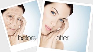
Don't think less of me if I admit to watching an informercial for some beauty product. I know, I know, but it was late at night and I was trying to fall back asleep so I picked the most boring thing I could find. The informercial showed a bunch of before and after photos of people that used the product. To me, the 'after' photos looked exactly like the 'before', but with generous amounts of Photoshop applied. That made me laugh. That's when this idea was born - in the middle of the night.
How did it come together?
I did some research online and found that, while this joke isn't new, surprisingly no one had put together anything like what I wanted to make. First step was to write a script to see if the idea had legs. I'm a fan of comedy and satire but had never done anything quite like this before so developing the message was a slow process for me. We shot back in August. Everyone involved volunteered. I had to table the project for a while to focus on client work, and finally got around to editing in December. I kept rewriting it as I edited, trying to make the jokes more punchy.

To what extent were you aiming for humour, and to what extent is there a more serious message in this?
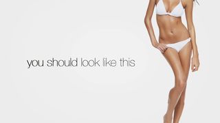
As the saying goes, 'It's funny, because it's true.' My main objective was humour, but I knew the truer the social commentary the funnier it would be. About half way through writing the concept, the project went through a bit of an identity crisis. I had to determine if this wanted to be a parody or a satire. In the end, the spot walks the line between both. For me, the 'ha ha' moments were parody - the pseudo-science bit, the extreme before and after photos. Then lines like, 'You don't have to rely on a healthy body image anymore' were definitely in the satire camp.
The ethics of Photoshop and retouching is not a new topic and you don't need to study art history to know that the idealisation of the human form has been around for thousands of years. That being said, anorexia and other eating disorders are on the rise in our culture. Where are people getting the idea that they should look a certain way? Who is distorting their image of what is considered normal? As far as I can tell, that message is only coming from one source - media. In this image-saturated culture, that comes from every direction. The model is simple: exploit people's insecurities, make them buy your product.

How far would you yourself go in altering or perfecting someone's face or body for a job you're working on?
Tricky isn't it? When communicating visually, one of the goals is to eliminate anything that might be a distraction. I get why retouching exists, but I think artists need to use more discretion when the tools (like Photoshop) are so powerful. Honestly, after doing research for this project, I think I'll be toning down the retouching a bit.
Why do you do projects like this?
To see if I can. I really like the challenge of making things. My tools just happen to be cameras, lights, and concepts. It's easy to justify spending resources on these types of projects if you think of them like a dry run for the next paying gig. The team I've got works really well together and we have a lot of fun.
Get the Creative Bloq Newsletter
Daily design news, reviews, how-tos and more, as picked by the editors.

What media and software did you use?
I shot the spot on a Red One camera with Red ProPrime lenses and a 17-50mm zoom. The spot was edited in Adobe Premiere CS5, graphics were animated in Adobe After Effects, and the product renderings were done with Cinema 4D by my buddy Paul Conigliaro. Some of the before and after photos were created in Photoshop, and yes, the irony of using Photoshop to create Fotoshop is not lost on me.

Thank you for reading 5 articles this month* Join now for unlimited access
Enjoy your first month for just £1 / $1 / €1
*Read 5 free articles per month without a subscription

Join now for unlimited access
Try first month for just £1 / $1 / €1
The Creative Bloq team is made up of a group of design fans, and has changed and evolved since Creative Bloq began back in 2012. The current website team consists of eight full-time members of staff: Editor Georgia Coggan, Deputy Editor Rosie Hilder, Ecommerce Editor Beren Neale, Senior News Editor Daniel Piper, Editor, Digital Art and 3D Ian Dean, Tech Reviews Editor Erlingur Einarsson, Ecommerce Writer Beth Nicholls and Staff Writer Natalie Fear, as well as a roster of freelancers from around the world. The ImagineFX magazine team also pitch in, ensuring that content from leading digital art publication ImagineFX is represented on Creative Bloq.
