Image of the day: We Are Here
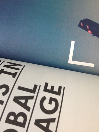
Designed on a laptop, with all photographs taken on a smartphone, We Are Here is a travel magazine that 'combines the lo-fi and the high-end.' We caught up with founder and editor Conor Purcell to find out more ...
Computer Arts: Can you tell us a bit about the production of WAH, how it's put together and how long it takes each issue takes to complete ...
Conor Purcell: I use InDesign and Photoshop. Photos play a large part in the design, so, often, I'll work on the design of a story without having the final text. It takes a month or two to design everything – I'll go back to a design four or five times and tweak it, and often it’s a case of taking elements away, rather than adding new ones. In this way, the design process is a bit like the editing process, in terms of constant tweaking.
It's myself and a designer, Roui Francisco – he helps with the production process and packaging the files for the printer, and is someone I can bounce ideas off. He's a very talented young designer in Dubai. Ultimately, though, this is a magazine set up so I could create it myself on a laptop and so everything is done after asking the question: Can I do this myself?
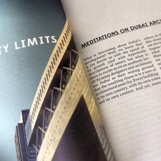
CA: How would you describe the overall look of the mag?
CP: I think the design is simple and structured. I wanted a template that I could design myself – a coherent use of space, a simplicity that will move across all the issues. I want people to be able to pick up any issue and know it’s We Are Here.
I was influenced by Apartamento magazine and Teller magazine – both of those use very few elements in the design, but both are very compelling. I guess the magazine is quite lo-fi, which might set it apart from other titles. I wanted it to be the anti-Conde Nast Traveller – no glossy photos, no PR-dominated articles and a sort of granular look throughout the design. This hopefully works with the text, which is ground-up look at a city.
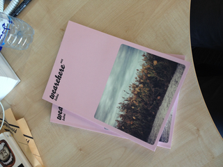
CA: All photography is taken on smartphones: why is that?
CP: This was down to simplicity – I wanted the design to be clear and uncluttered and something I could do myself. This extended to the photography. I'm not a trained photographer and wanted to able to travel to places and take photographs on my phone and use Instagram filters.
Instagram does get a bad rap, but it levels the playing field – the composition becomes more important than the equipment, and that was interesting. In more practical terms, it’s easier in certain places such as Afghanistan to take pictures on a phone – it’s definitely more discrete.
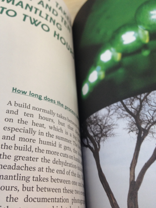
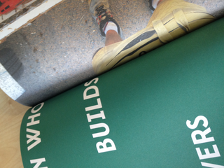
Subscribe to Computer Arts for your monthly fix of the world's best inspirational design work. Available on iPad, in print or on other digital devices.
Get the Creative Bloq Newsletter
Daily design news, reviews, how-tos and more, as picked by the editors.

Thank you for reading 5 articles this month* Join now for unlimited access
Enjoy your first month for just £1 / $1 / €1
*Read 5 free articles per month without a subscription

Join now for unlimited access
Try first month for just £1 / $1 / €1
The Creative Bloq team is made up of a group of design fans, and has changed and evolved since Creative Bloq began back in 2012. The current website team consists of eight full-time members of staff: Editor Georgia Coggan, Deputy Editor Rosie Hilder, Ecommerce Editor Beren Neale, Senior News Editor Daniel Piper, Editor, Digital Art and 3D Ian Dean, Tech Reviews Editor Erlingur Einarsson, Ecommerce Writer Beth Nicholls and Staff Writer Natalie Fear, as well as a roster of freelancers from around the world. The ImagineFX magazine team also pitch in, ensuring that content from leading digital art publication ImagineFX is represented on Creative Bloq.
