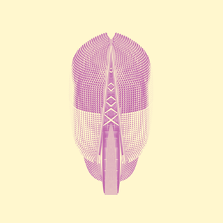
Image of the day: Floating Structures by Andy Welsh
Newcastle upon Tyne-based graphic designer and photographer Andy Welsh tells us more about today's image of the day, a project fusing his love of architecture and digital manipulation
Computer Arts: Tell us about the project ...
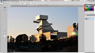
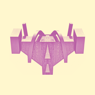
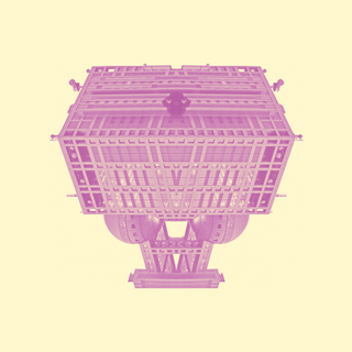
Andy Welsh: My project is called Floating Structures and features interesting buildings I’ve photographed and digitally manipulated to give a completely new look. These include the Sydney Opera House, Singapore’s Esplanade, Theatres on the Bay and The Central Los Angeles Area High School #9.
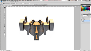
I didn’t work from a brief, as the first image that I created in this series was the result of an evening experimenting in Photoshop. Once I’d realised how a building can take on quite an aggressive and out-of-this-world persona when reflected in this way, it was then just a case of taking the right photographs. Many people have mentioned the movie Inception when viewing this work and it's nice to think they have a certain cinematic quality.
CA: How did you put each piece together?
AW: This project really came to life when I spent 12 months travelling around the world. I knew it would provide a great opportunity to add some fantastic buildings to this set and just required a little bit of research into the architecture in each city beforehand. I took the photos using my Nikon DSLR and was quite surprised to find what a challenge this stage could be. I'm a big fan of patiently composing a shot and not just rattling off photos because I've got a got a memory card waiting to be filled.
However, with this project I had to be so conscious of anything that would detract from the buildings, particularly elements in the foreground such as people, trees and cars. In busy cities, finding a clear line of sight was often easier said than done. When I returned home to the UK, I sorted through the photos in Bridge and then moved on to Photoshop. This stage of the process was fairly straightforward and just involved removing the background, experimenting with colours and then converting the image to a duotone. By carefully taking the photograph in the first place, very little was needed to be done to the actual buildings.
CA: How did you get into design?
AW: I’ve always loved drawing and creating from a very early age. In fact, when I was 11, I entered a road safety poster competition sponsored by McDonalds and won myself a year’s supply of burgers! I’m not sure they’d get away with that these days but at least I’ll always remember to “NEVER run across the road ... even for a McDonalds!” I actually studied Business at University and then worked in management and marketing for some great companies. However, in 2008 I really wanted a more hands-on creative role and decided to enrol at Shillington College in Melbourne. This gave me a great foundation in design and soon after I was taken on as Graphic Designer by a marketing company in Newcastle.
I know many people dream of doing what they love and for me it’s worked out pretty well so far. In terms of developing my own style, I do have a desire to keep things simple, organised and uncluttered, which is often reflected in quite a pared-down aesthetic. I’d love to be like Steve Simpson or Reg Mombassa, who produce work that's so instantly identifiable, but this requires time, talent and a bit of luck. I don’t think I’m quite there yet. What I do know is that I love learning and experimenting in areas that are new for me. For example, next month I'm taking a Letterpress Course and in September I'm doing a Screenprinting Workshop, both at the brilliant Northern Print. I also continue to find inspiration from so many brilliant designers and photographers working today. Recently these have included Alberto Seveso’s amazing photography work and the retro graphic style of Christopher DeLorenzo, along with many talented Newcastle artists including Muro Buro and Hush.
Check out more from Andy Welsh at andywelsh.net
Get the Creative Bloq Newsletter
Daily design news, reviews, how-tos and more, as picked by the editors.
Subscribe to Computer Arts for your monthly fix of the world's best inspirational design work. Available on iPad, in print or on other digital devices.

Thank you for reading 5 articles this month* Join now for unlimited access
Enjoy your first month for just £1 / $1 / €1
*Read 5 free articles per month without a subscription

Join now for unlimited access
Try first month for just £1 / $1 / €1
The Creative Bloq team is made up of a group of design fans, and has changed and evolved since Creative Bloq began back in 2012. The current website team consists of eight full-time members of staff: Editor Georgia Coggan, Deputy Editor Rosie Hilder, Ecommerce Editor Beren Neale, Senior News Editor Daniel Piper, Editor, Digital Art and 3D Ian Dean, Tech Reviews Editor Erlingur Einarsson, Ecommerce Writer Beth Nicholls and Staff Writer Natalie Fear, as well as a roster of freelancers from around the world. The ImagineFX magazine team also pitch in, ensuring that content from leading digital art publication ImagineFX is represented on Creative Bloq.
